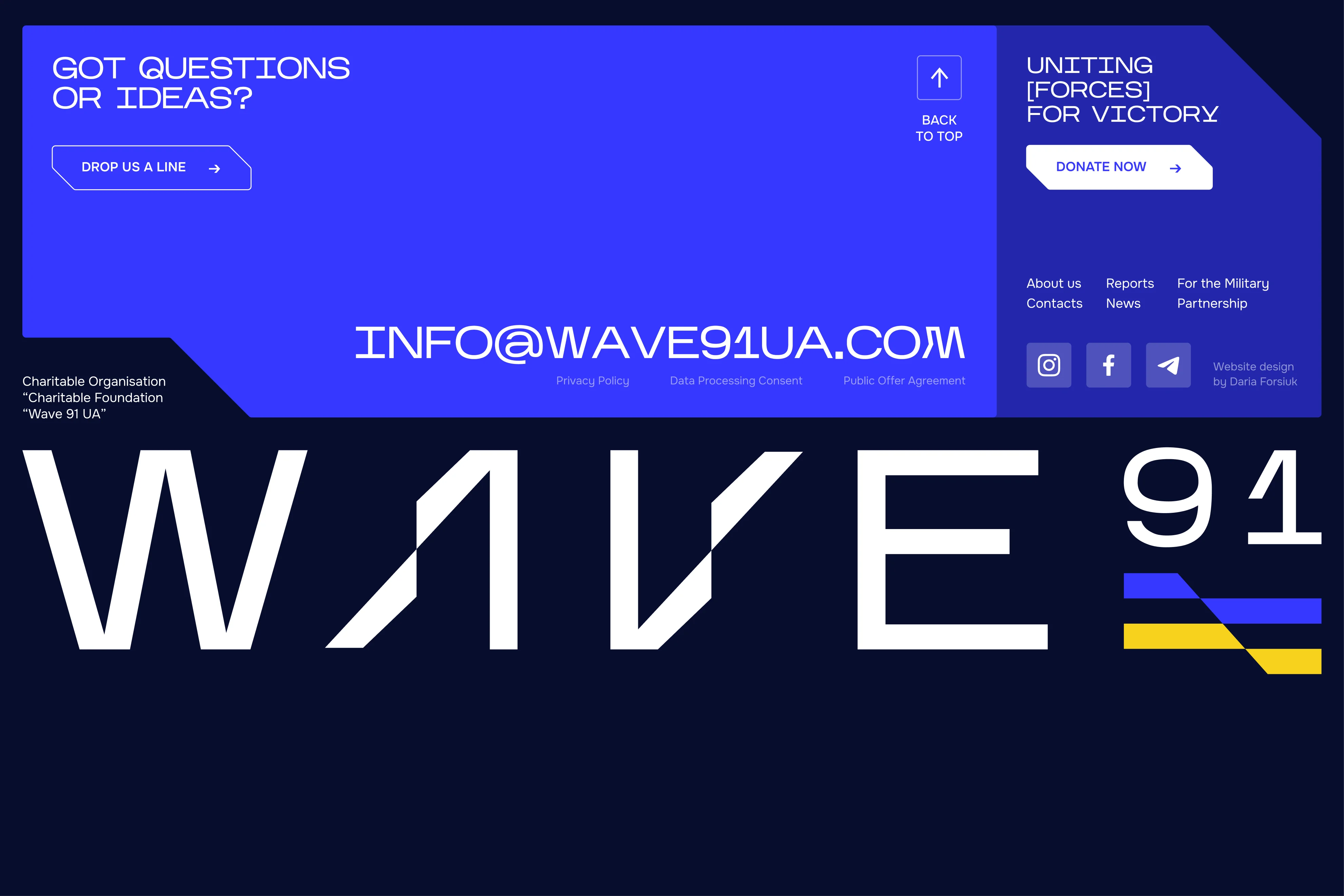
CHARITY FOUNDATION
SITE REDESIGN

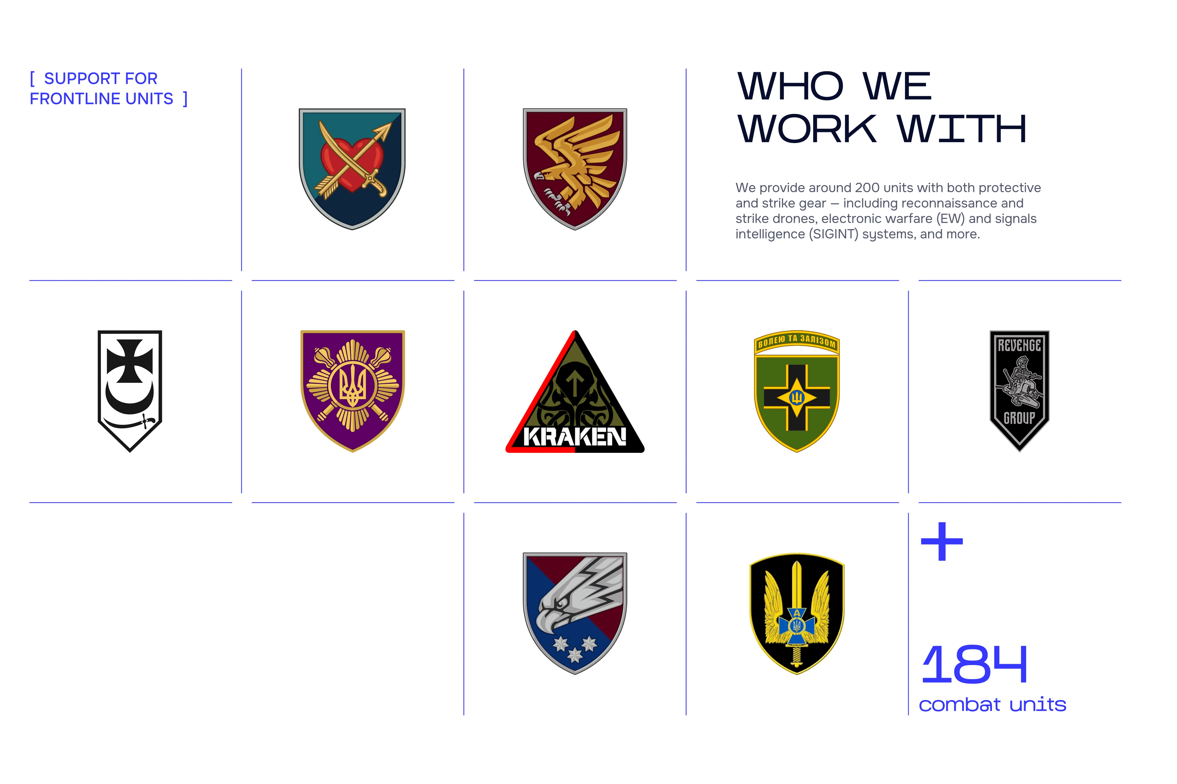
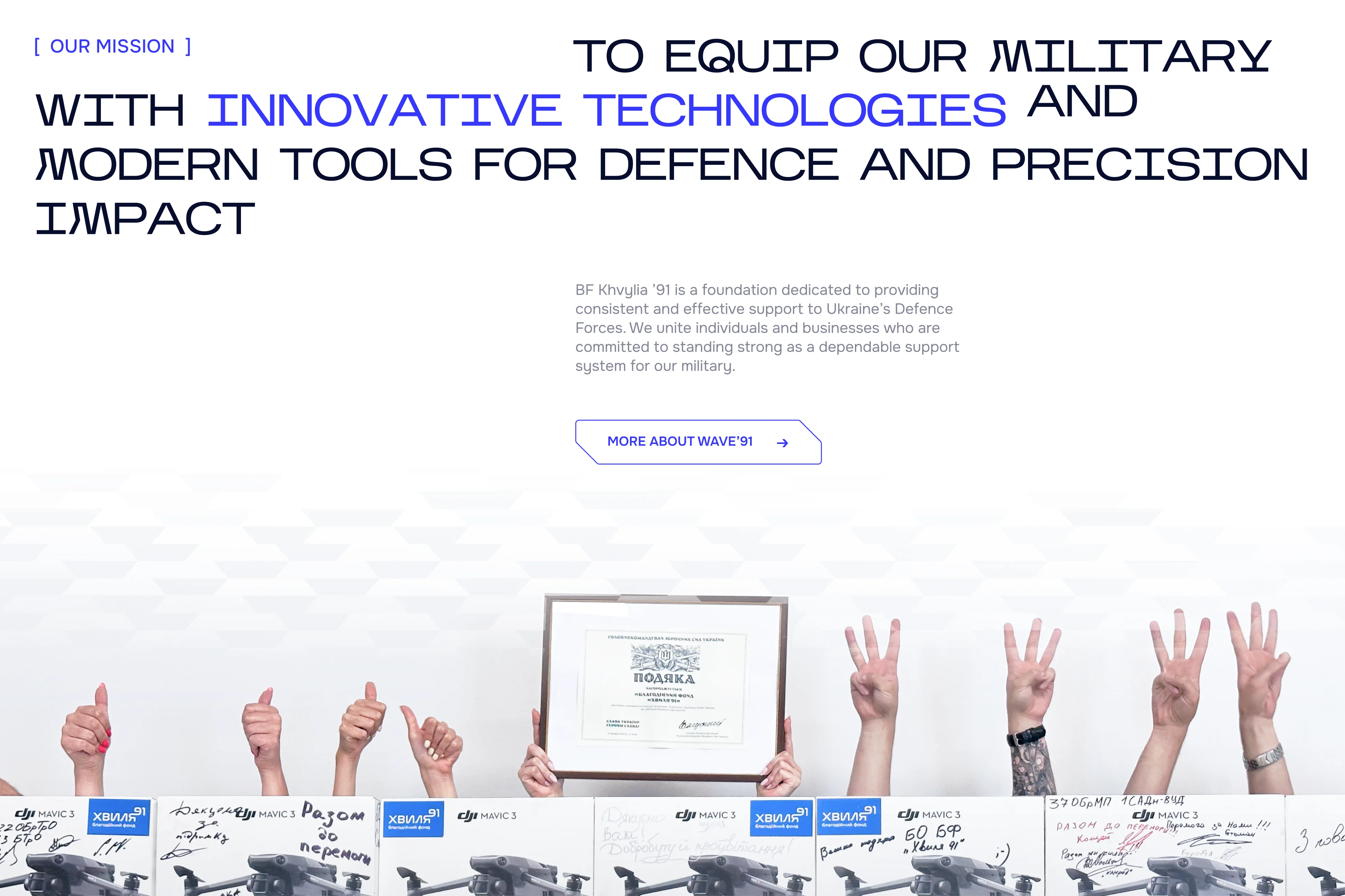
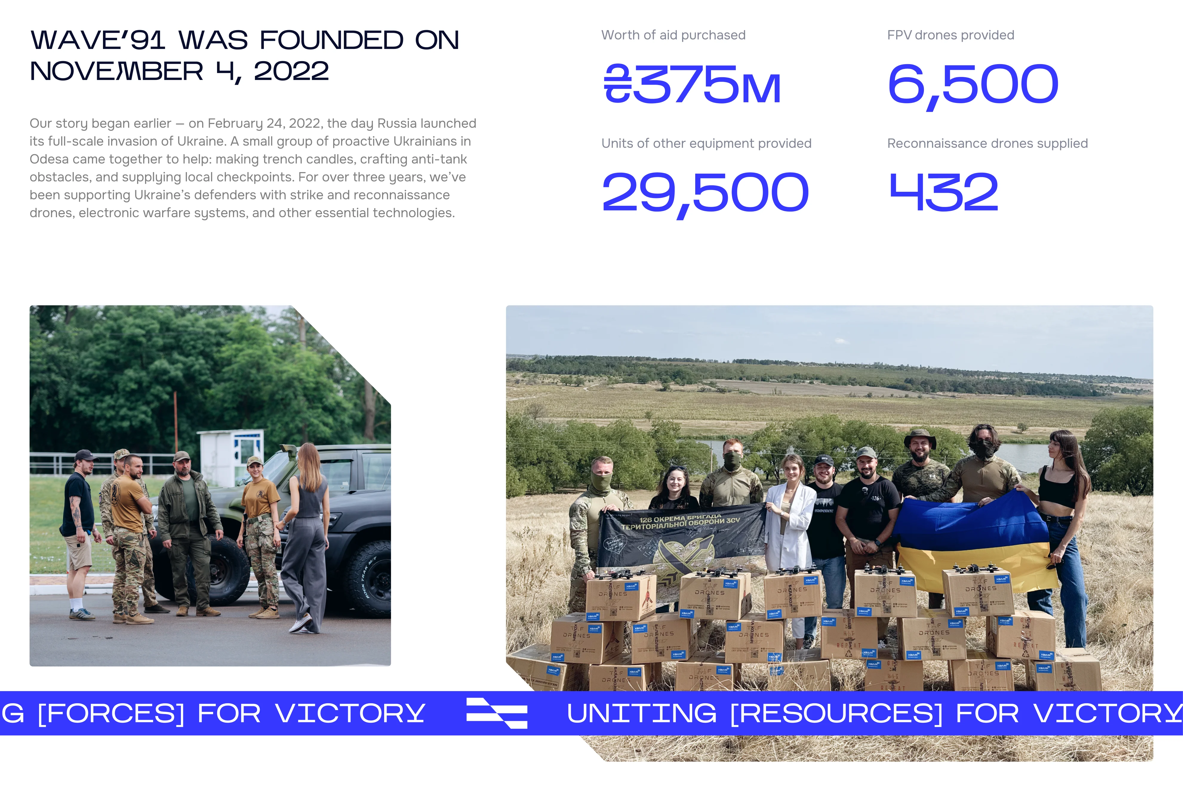
Wave'91 is a Ukrainian charity foundation supporting the country's Defence Forces with cutting-edge military technologies. Since the beginning of the full-scale invasion, the foundation has grown into a highly adaptive, tech-oriented organisation working closely with frontline units to deliver real impact.
The goal of this project was to redesign the foundation's website to better reflect their mission, improve user experience, and support fundraising efforts through clearer communication and more effective UI.
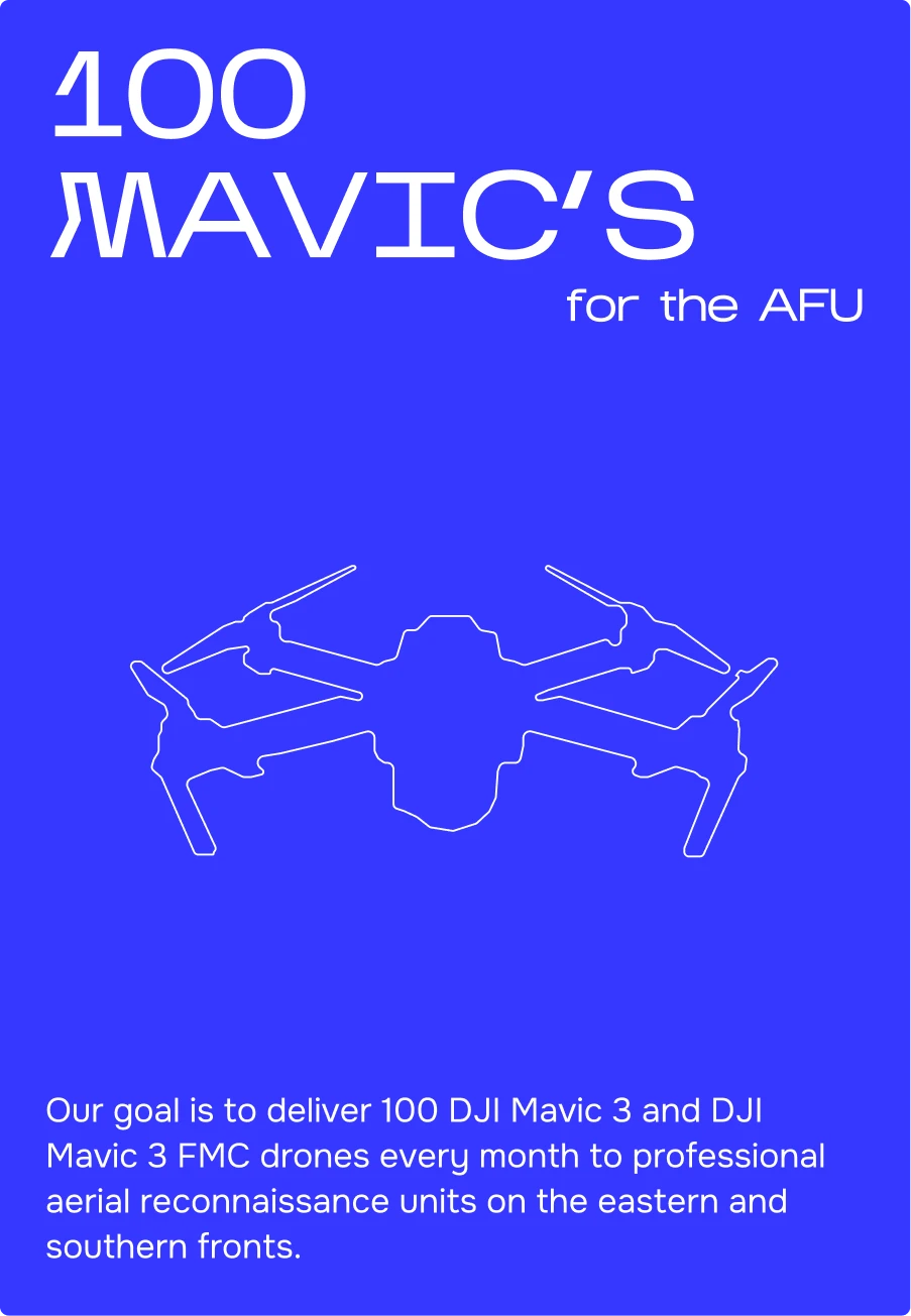
BEFORE
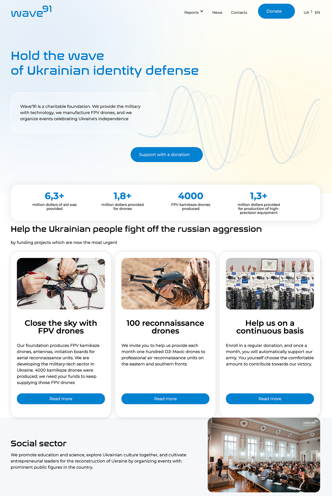

Sensitive content
This photo contains sensitive content, such as poor layout and typography, which some people might find offensive or disturbing.
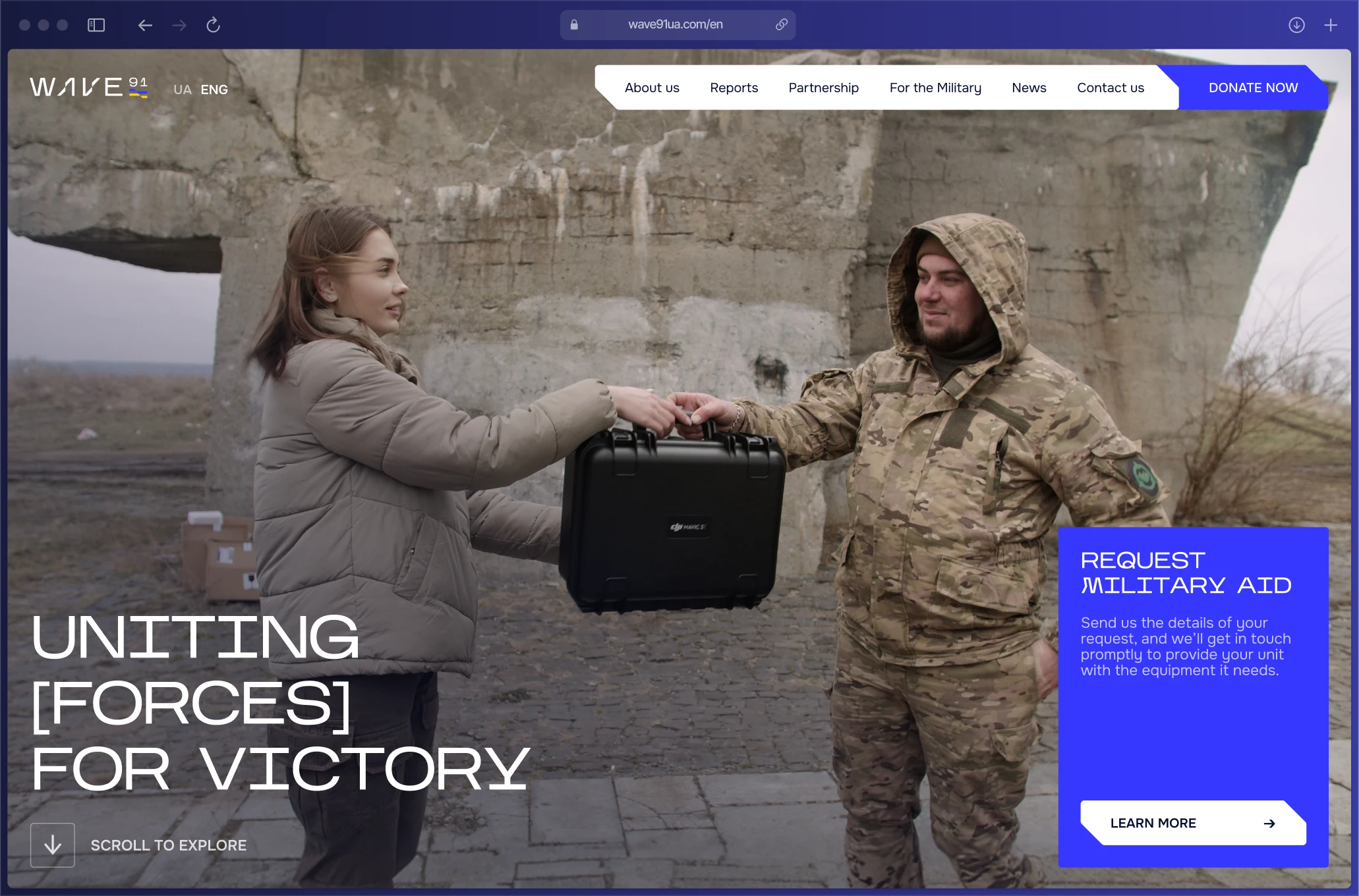
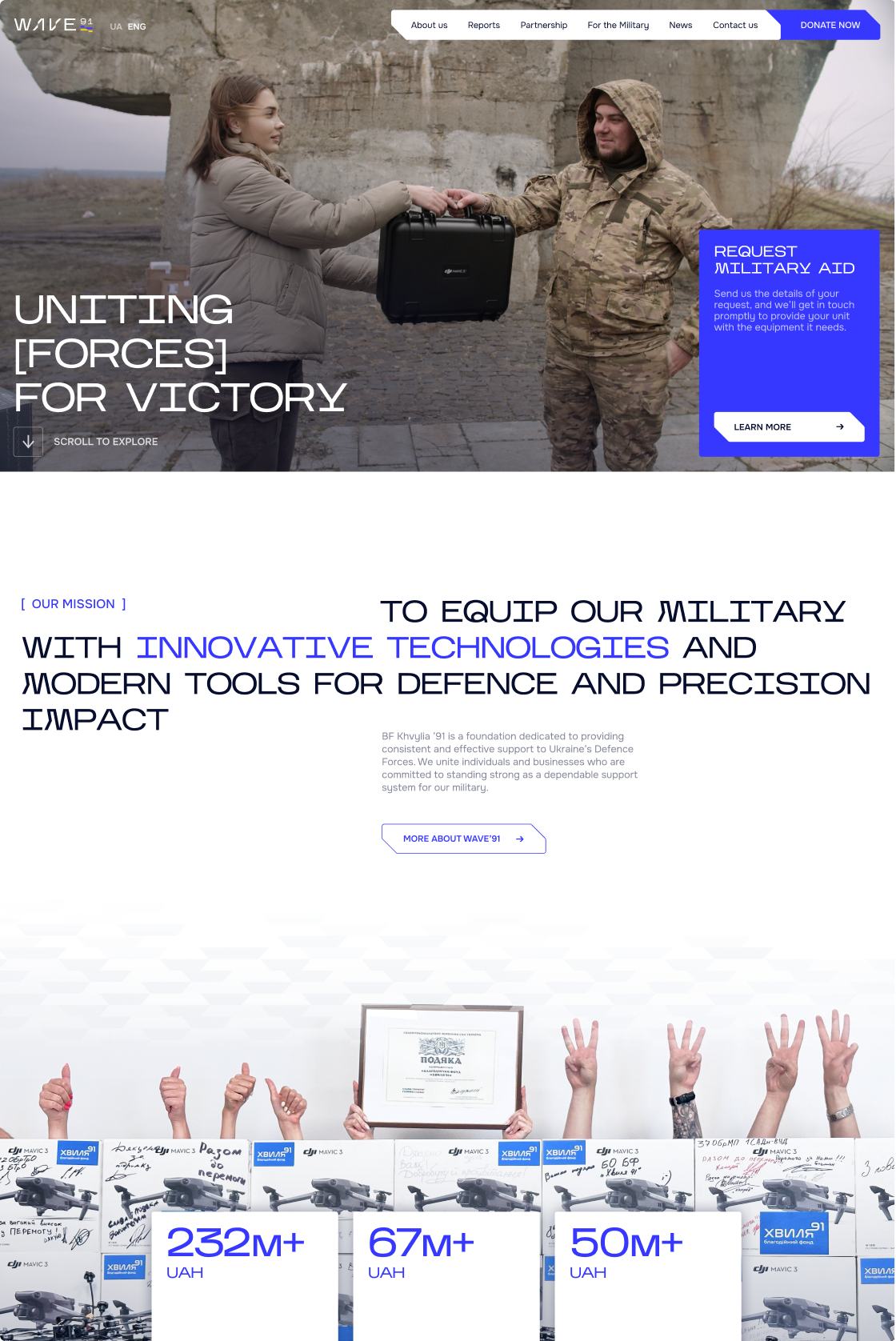
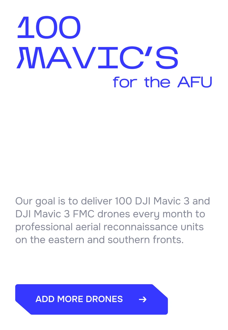
AFTER
Problem
The existing website had an unclear structure, outdated content, and poor usability.
Users found it difficult to navigate and understand the foundation's projects, which weakened trust and reduced engagement.
The website doesn't show all foundation's initiatives and fails to express it's new positioning as a military-focused charity.
Goals
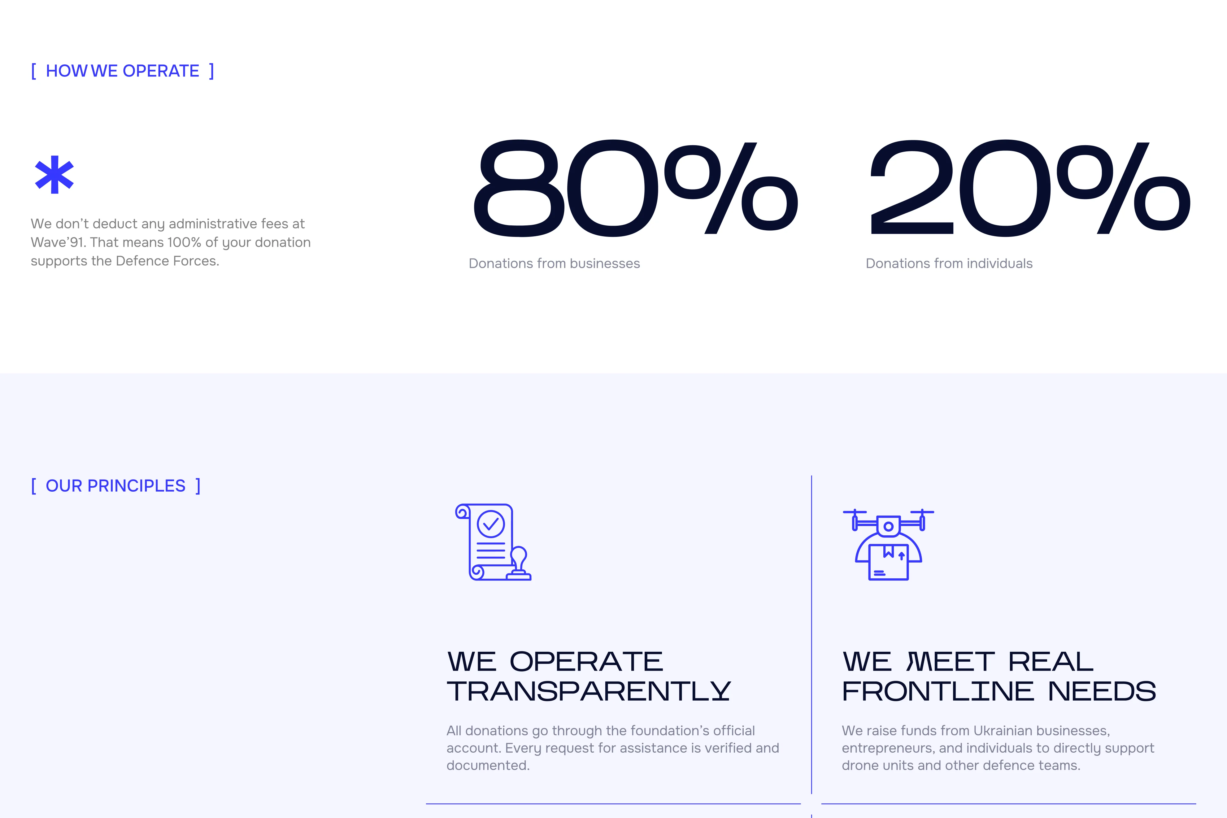
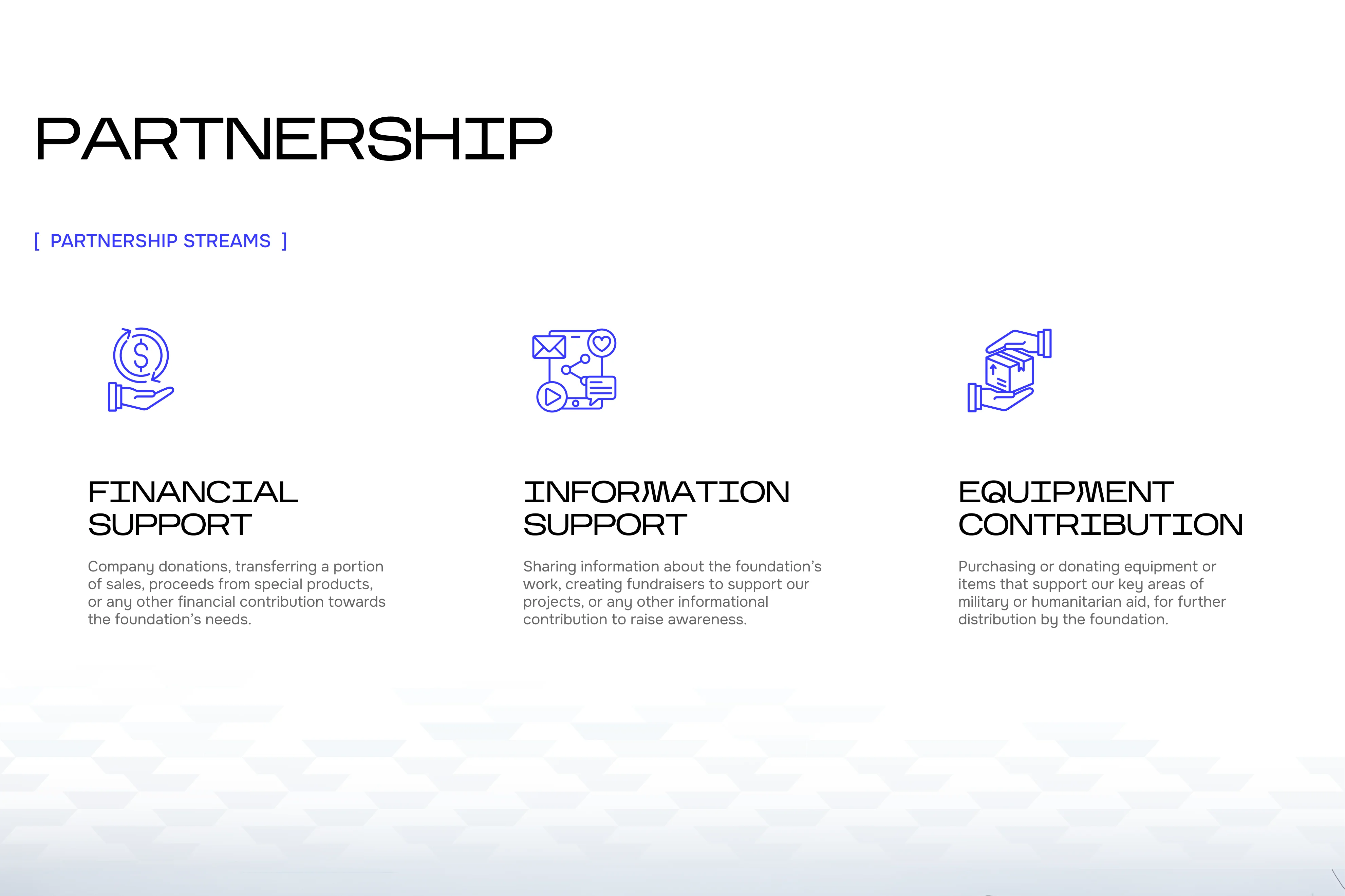
Help increase donation flow & attract new donors — especially businesses and enterprise partners.
Reorganise the site structure for intuitive navigation and friction-free donation experience.
Using refreshed branding guidelines, design an engaging interface that shows the foundation's values and impact.
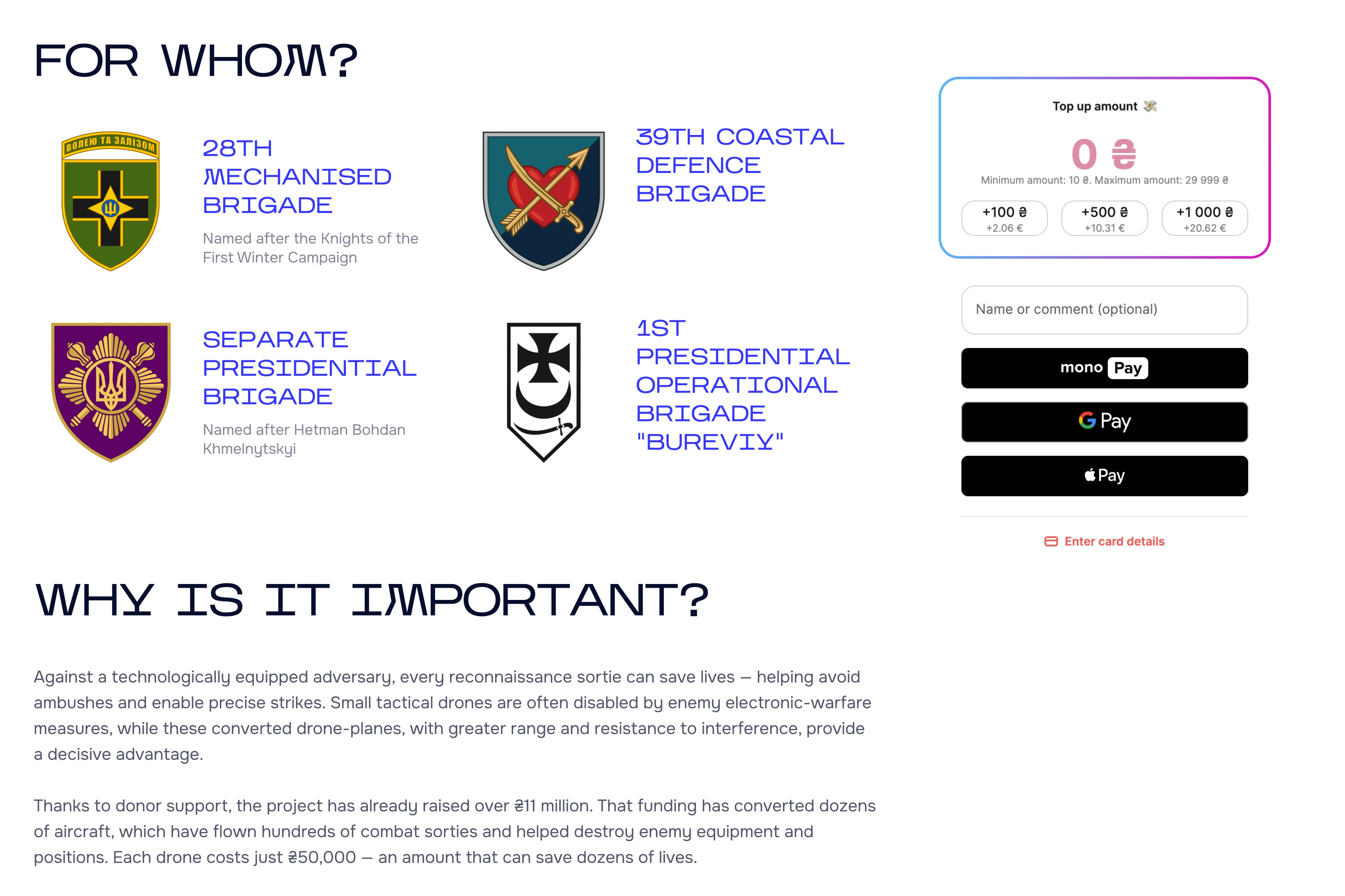
Visually convey that the foundation is effective and in direct contact with the military about real-time needs on the ground.
I initially mapped out IA and wireframes based on competitor analysis and client input. Having tested a prototype with both military and donor user groups, I later modified the architecture and content order to suit user needs better, like adding a separate page for the military and adding dedicated CTA banners for each user group.


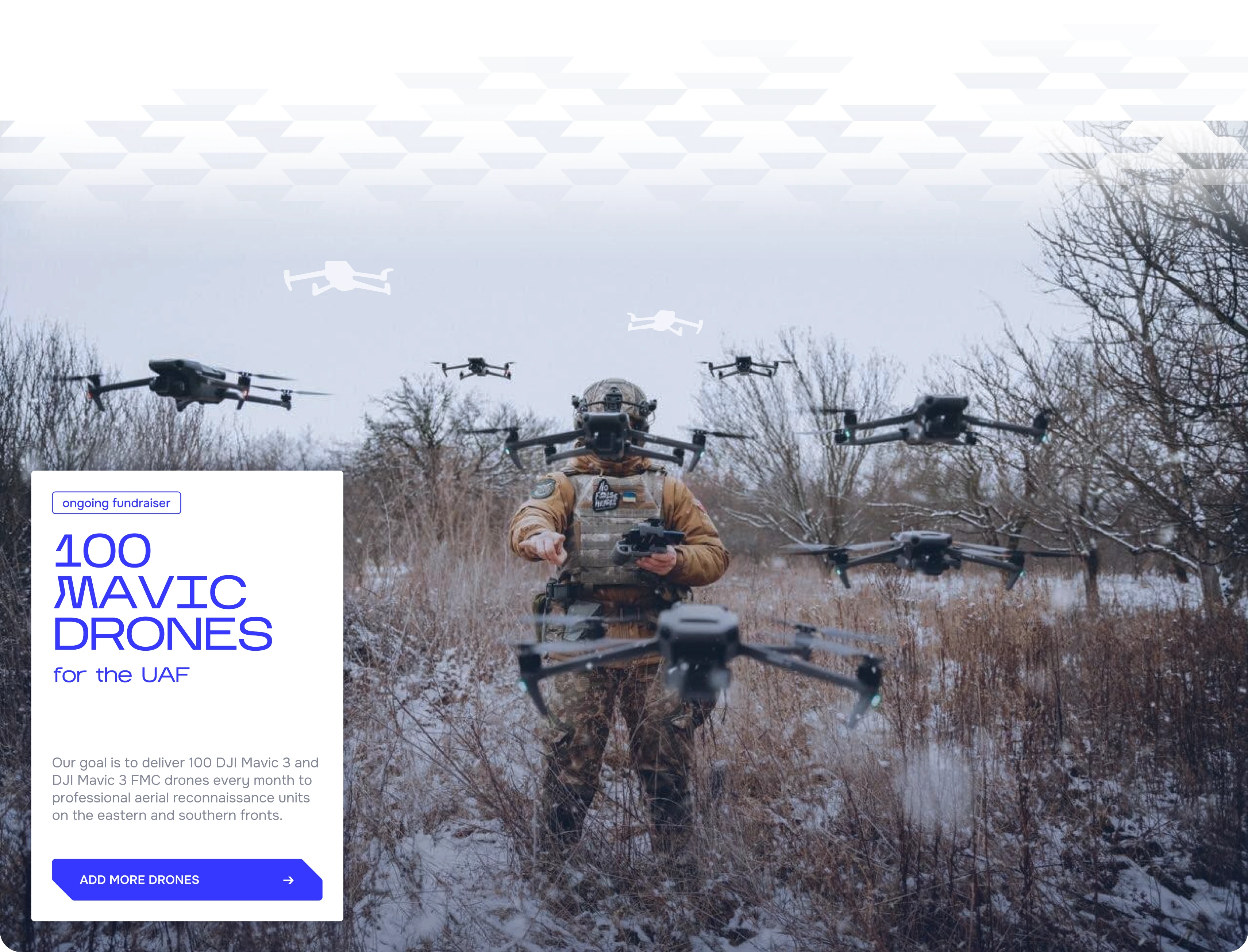
Inspired by the folding logo geometry and bold, rough aesthetics of the military style, I arrived at the key stylistic decisions: chamfered corners, juxtaposed composition, large typography, and bold colours.
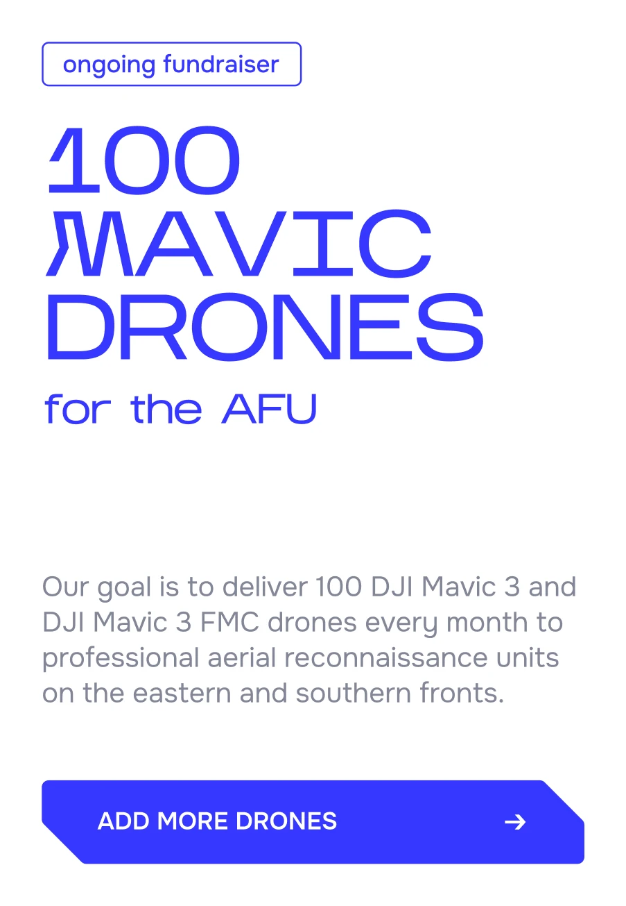
CARD DESIGN ITERATIONS
FINAL VERSION
BUTTON DESIGN


COLOUR PALETTE

[ TYPOGRAPHY ]
I used Onest for body copy. Designed for digital use, it remains legible and consistent at small sizes. It's clean, understated design intentionally contrasts with the bold, confident character of the Kharkiv typeface, creating a clear hierarchy and balanced typographic system.

wave-inspired pattern
transitions between blocks
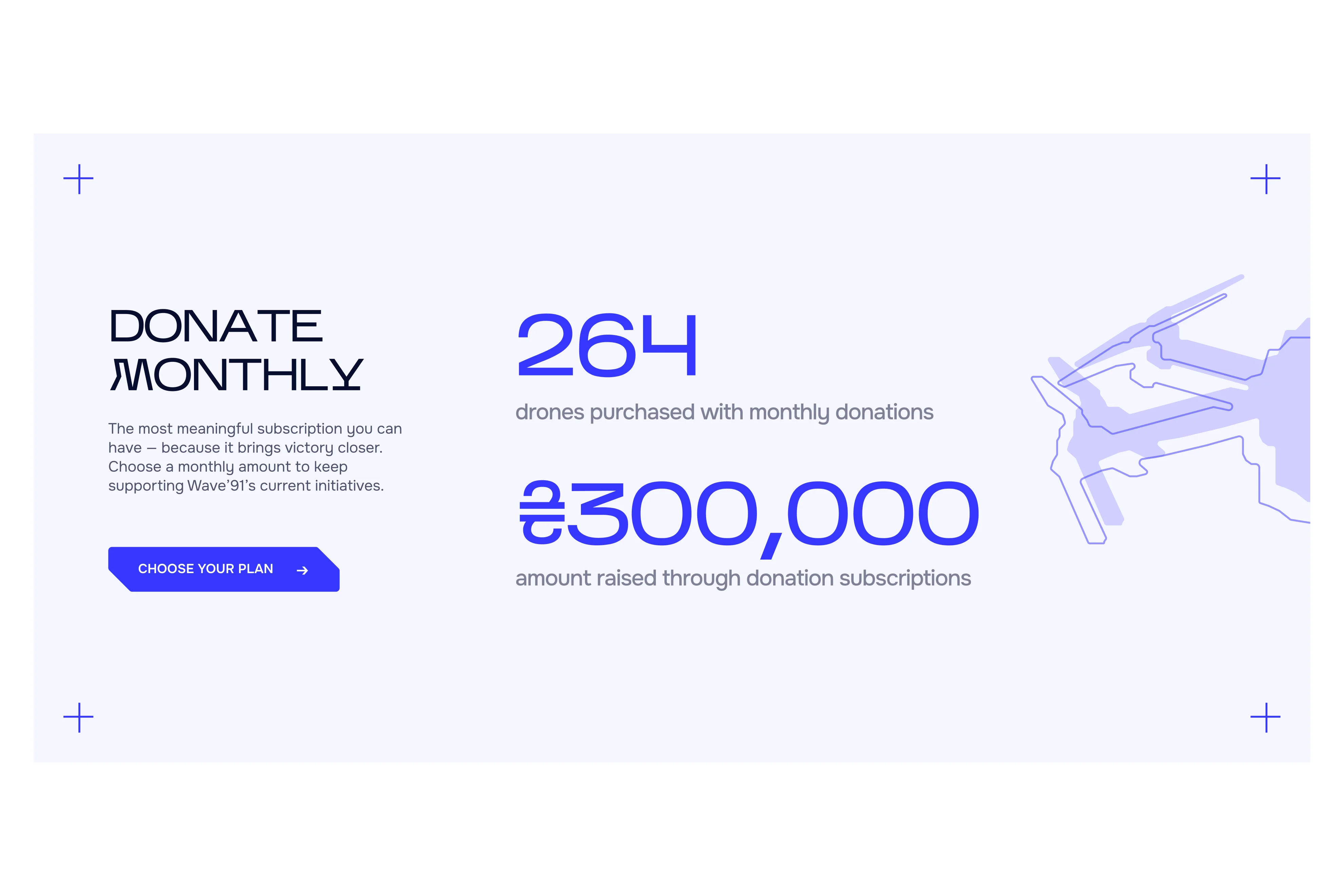
Testing with 10 users highlighted opportunities to improve clarity, make key content easier to find, and better surface subscription options for more sustainable fundraising.
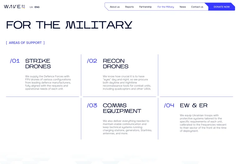
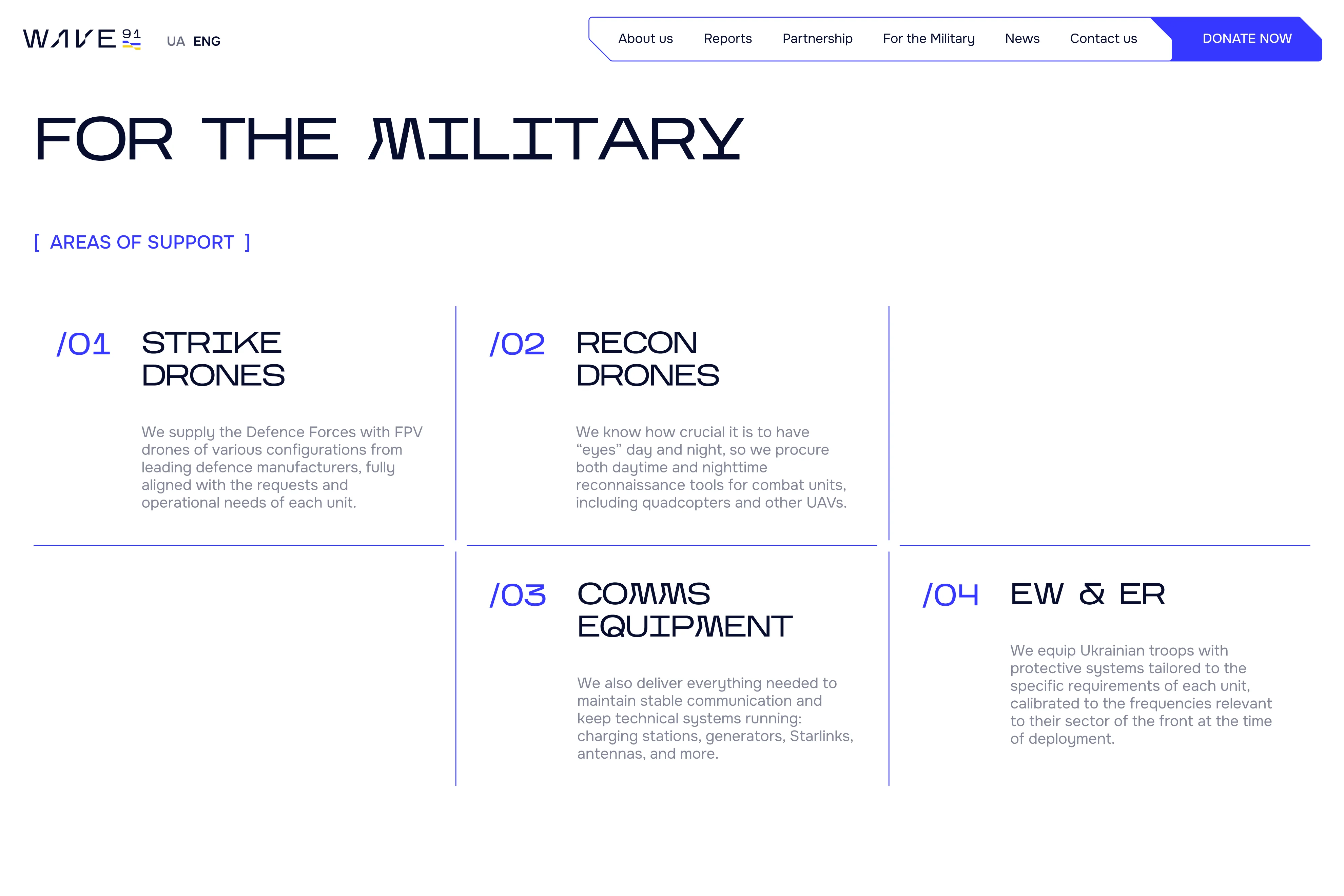
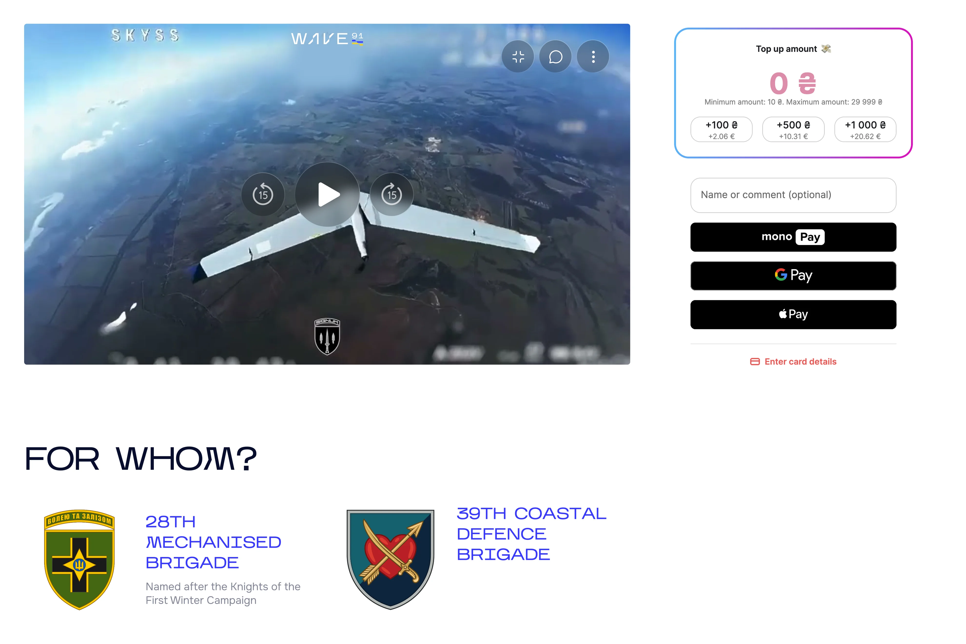
/01 FOR THE MILITARY
INSIGHT
Military users defaulted to contact page and did not search for relevant info across the site.
SOLUTION
Gathered all relevant information on a dedicated military page; added a clear banner on main page to direct users there.
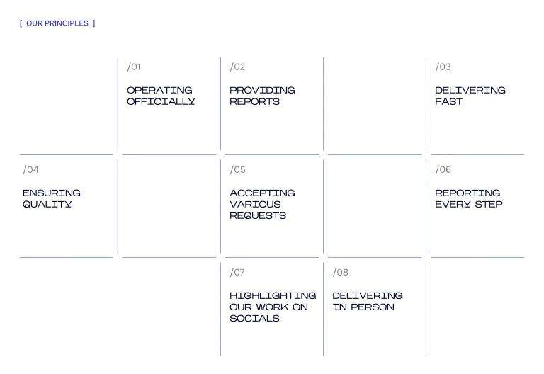
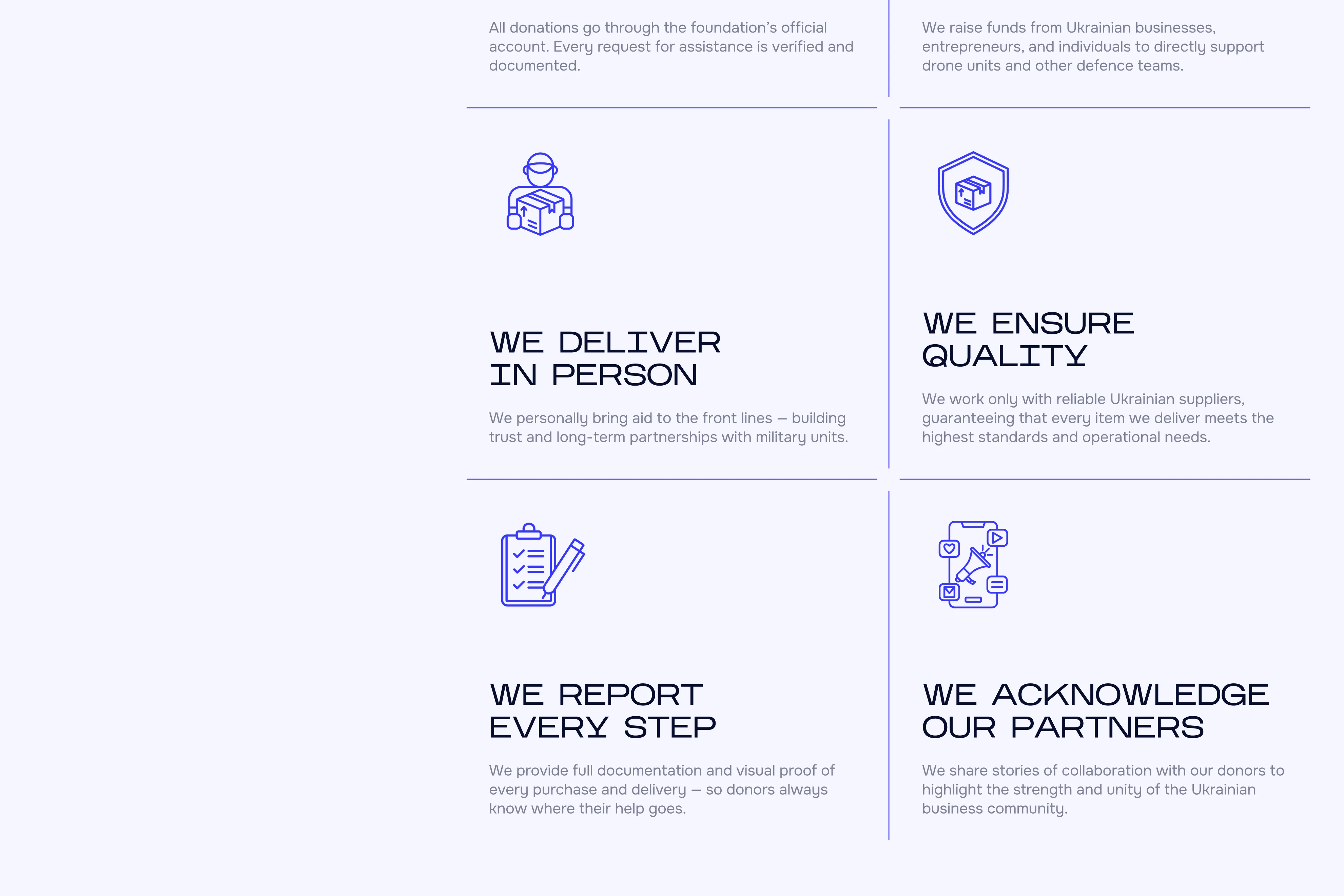
/02 PRINCIPLES LAYOUT
INSIGHT
Users perceived the principles as a calendar and attempted to interact with it to reveal details.
SOLUTION
Redesigned the layout as a more familiar pattern, added icons to clarify meaning at a glance, and removed hover-based interactions.
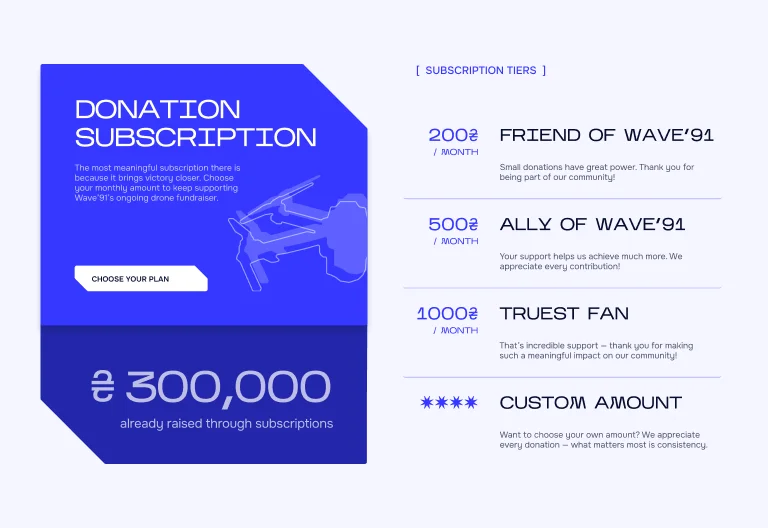
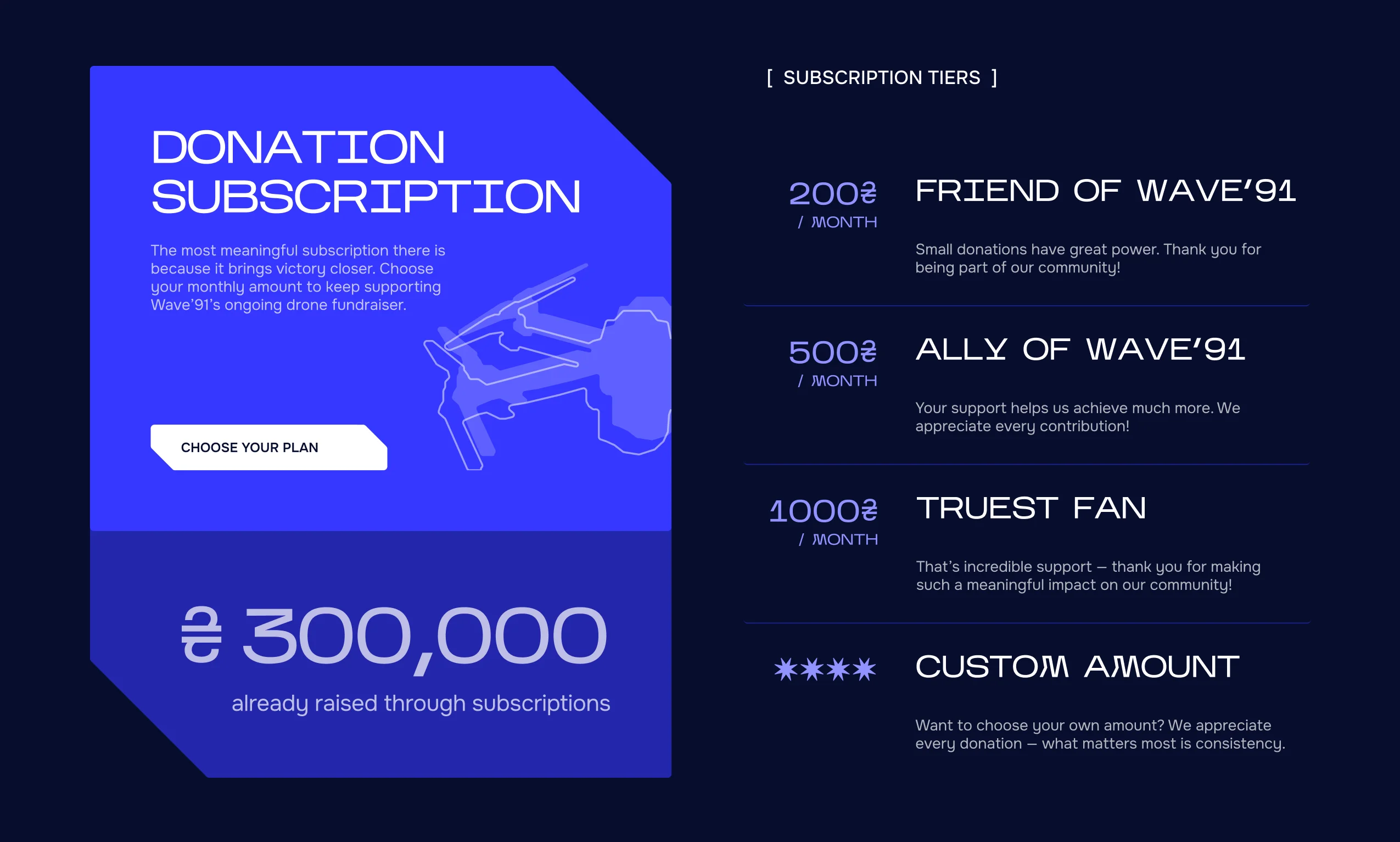
/03 SUBSCRIPTION
INSIGHT
Users failed to scroll far enough on home and donation pages to discover subscription options.
SOLUTION
Placed subscription options before all other forms of donation, moved it up on home page, and added an extra banner on contact page.
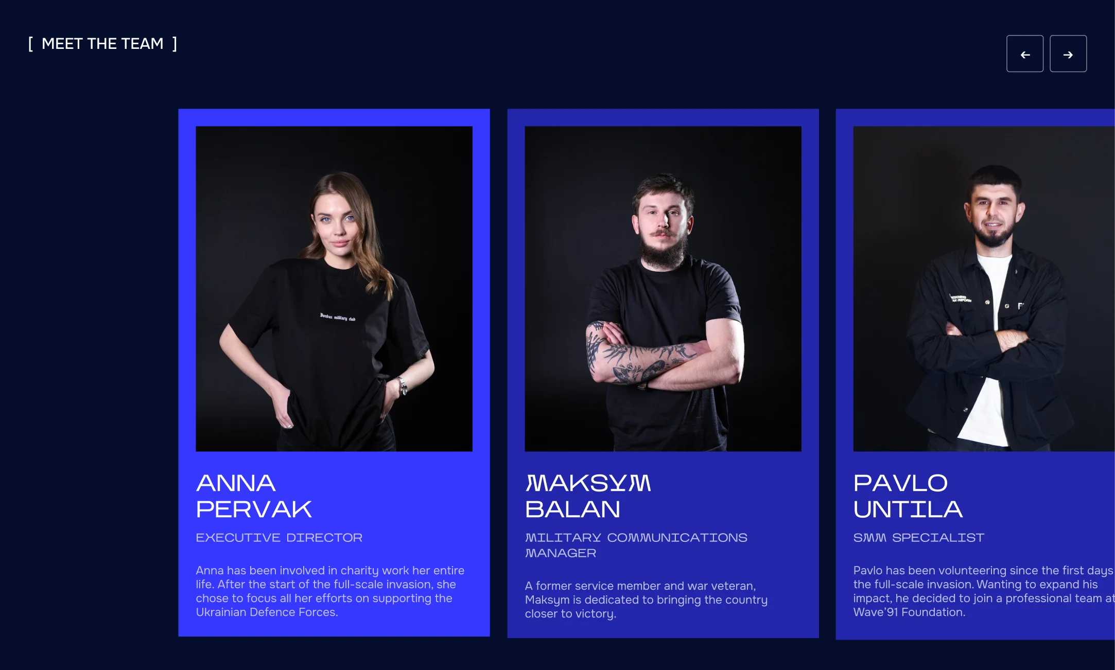
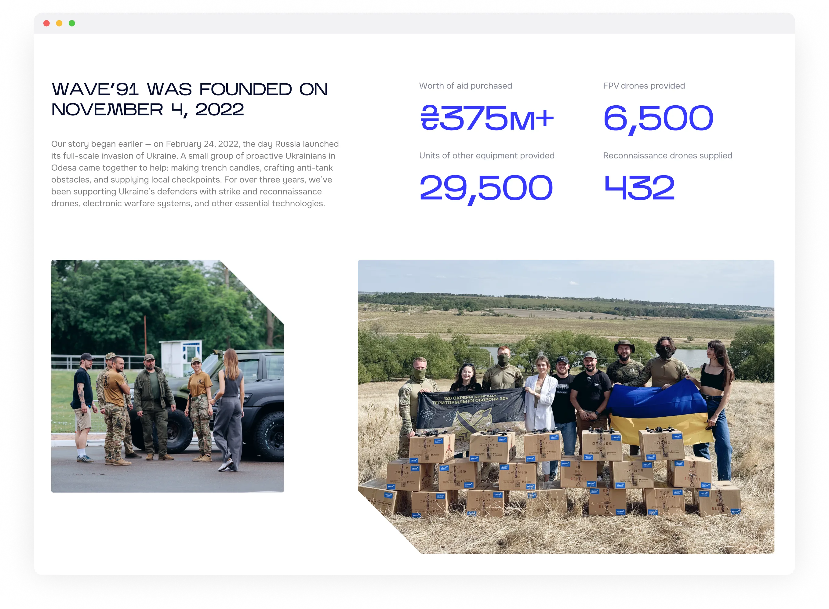
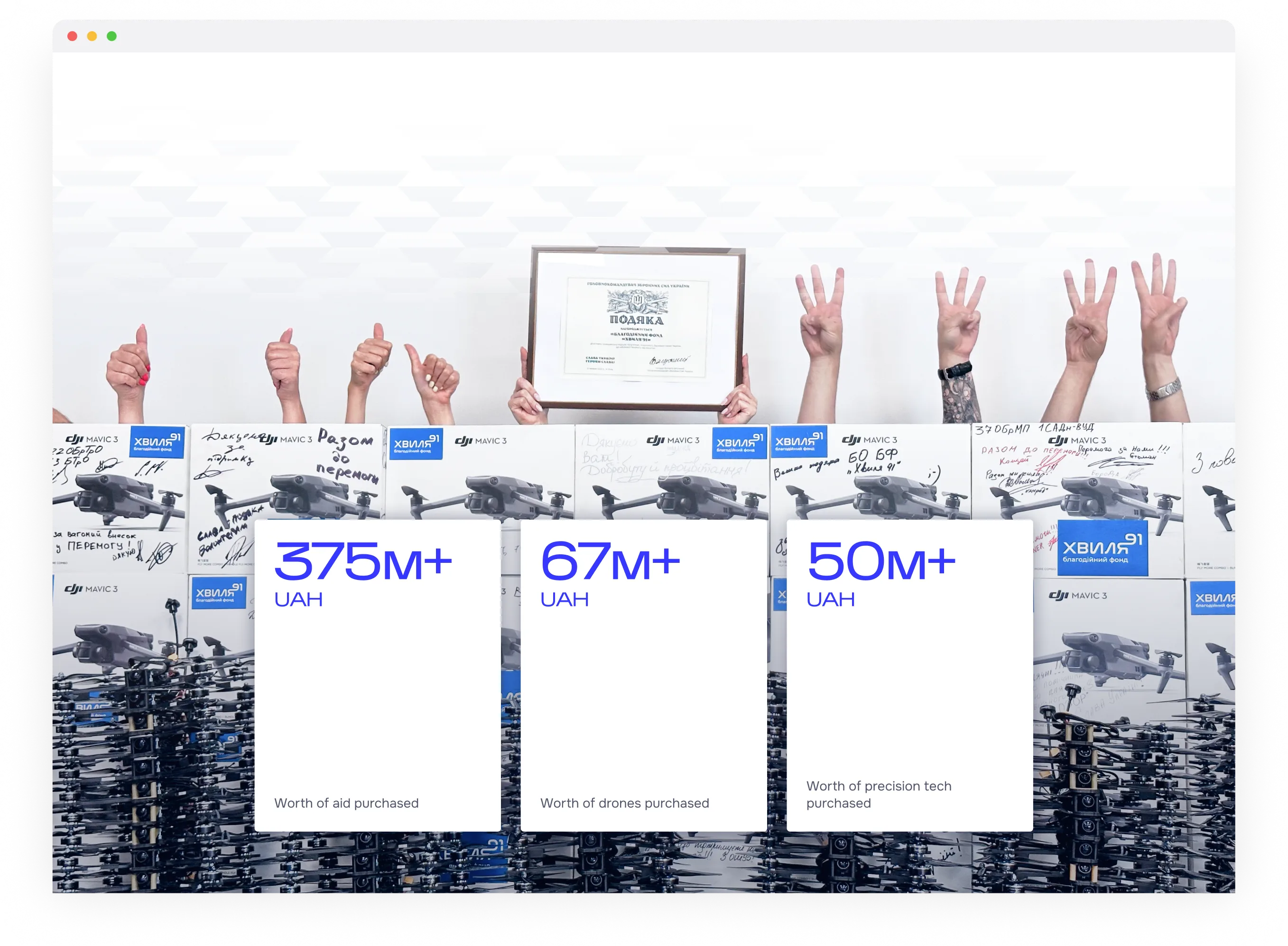
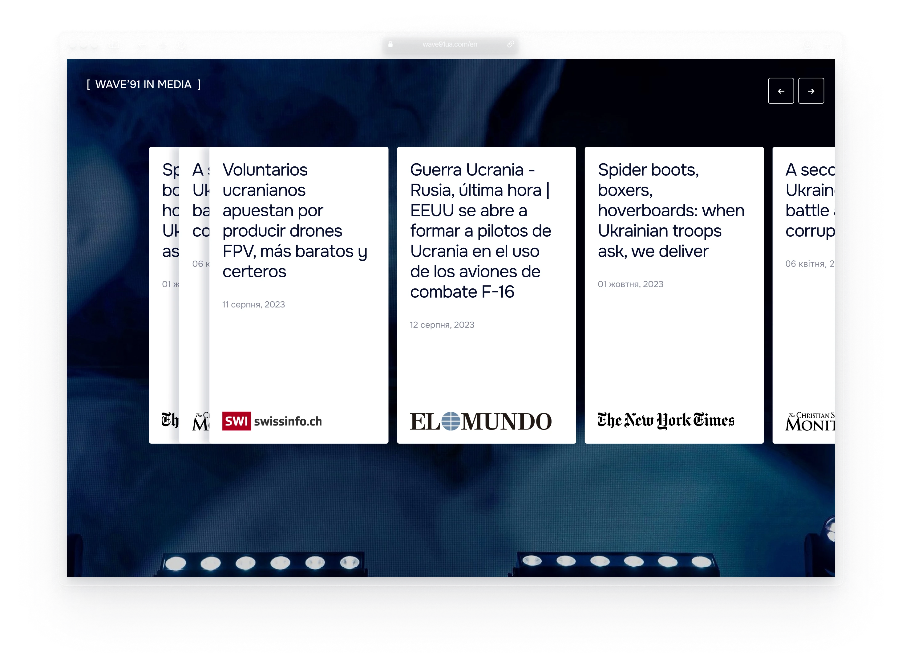
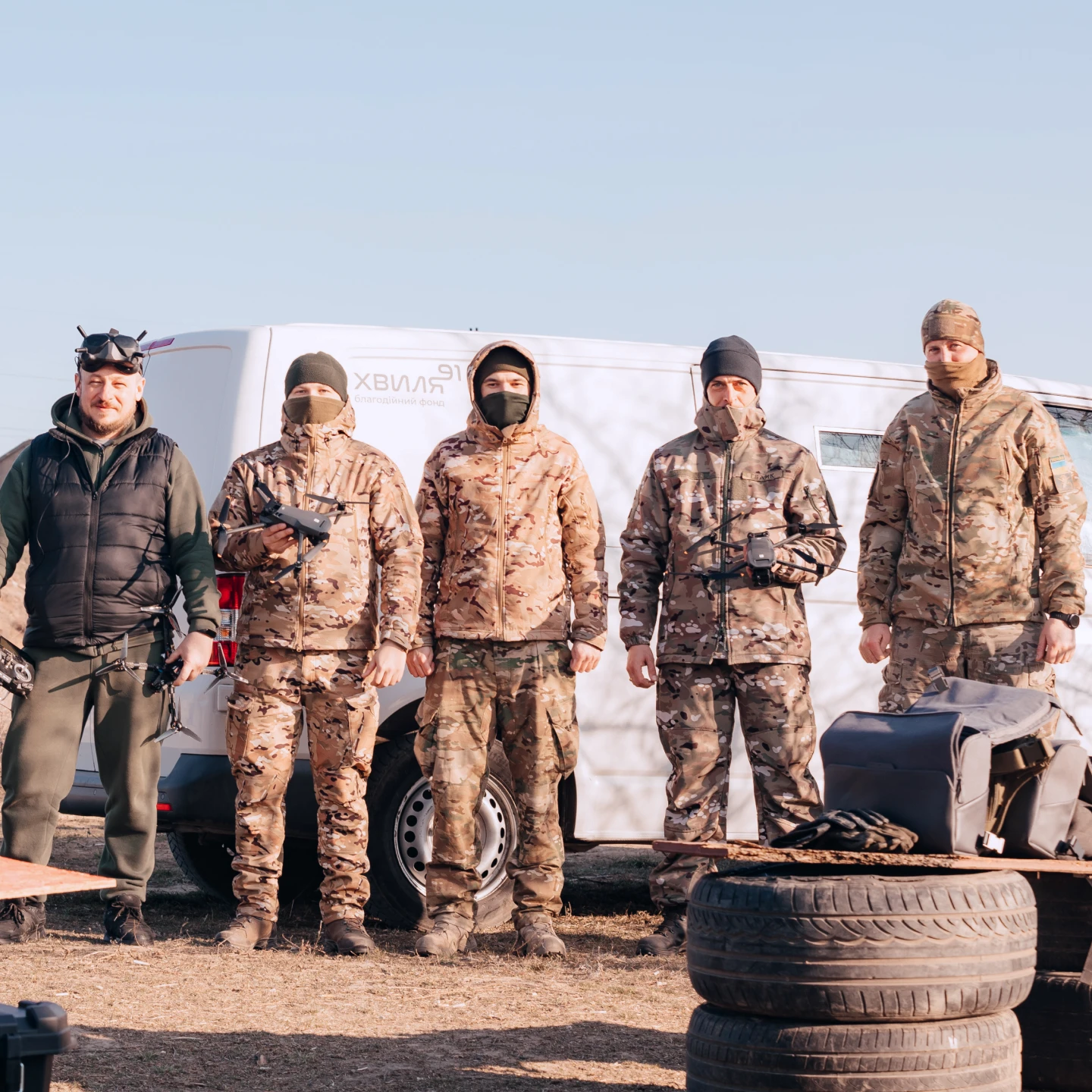
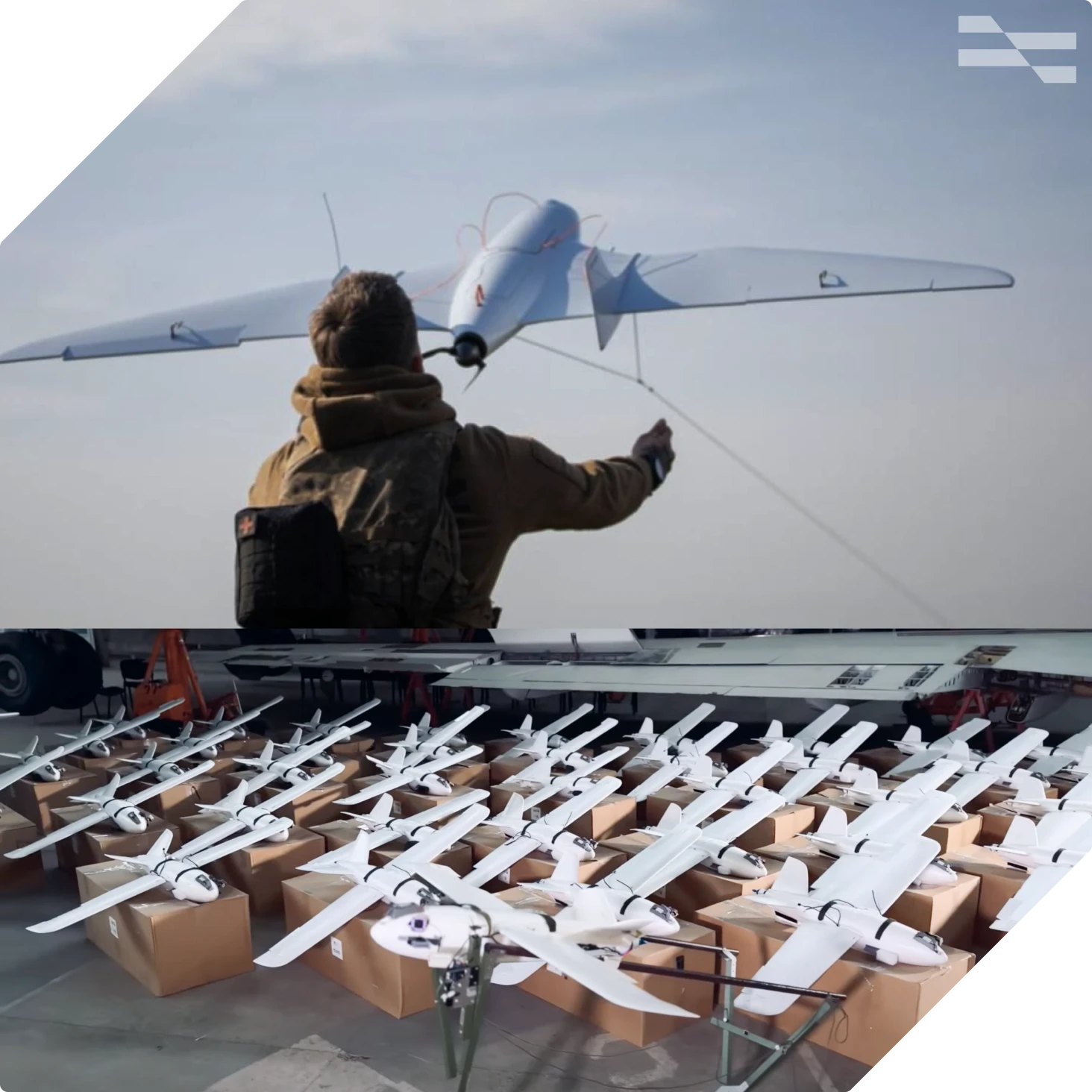
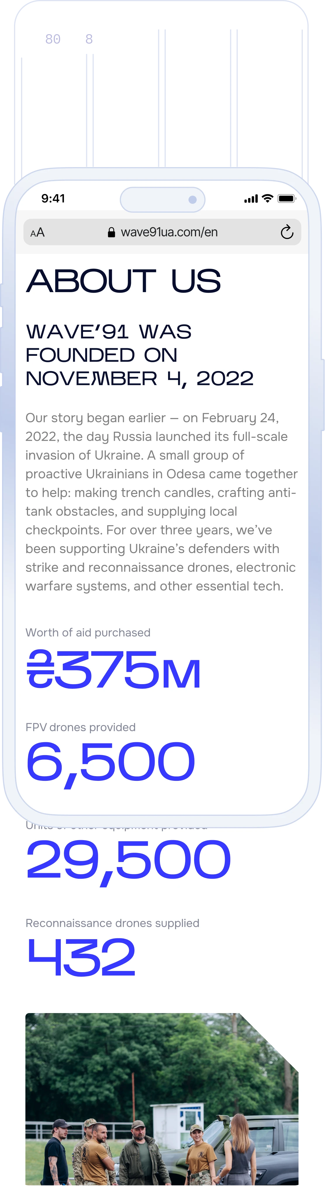
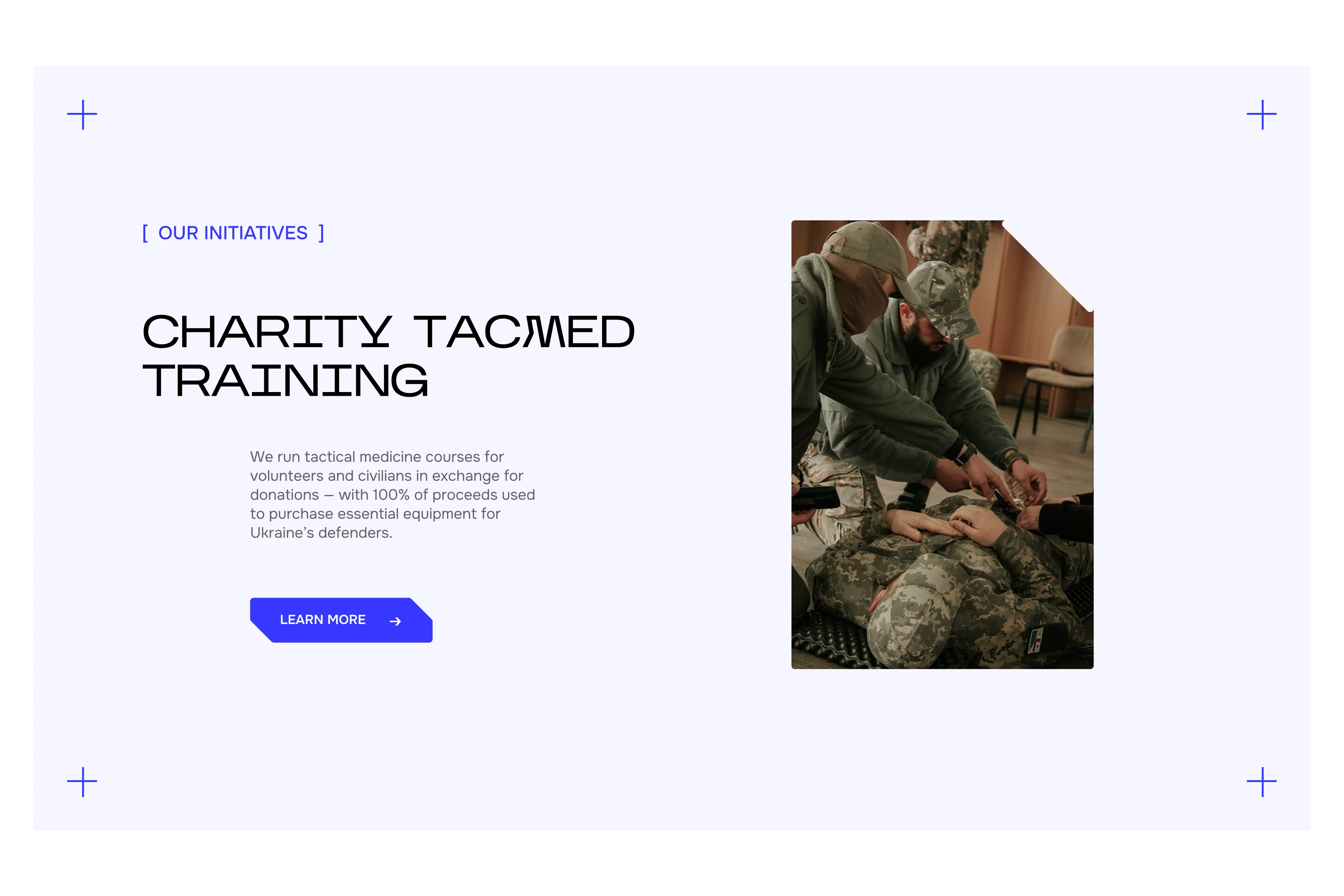
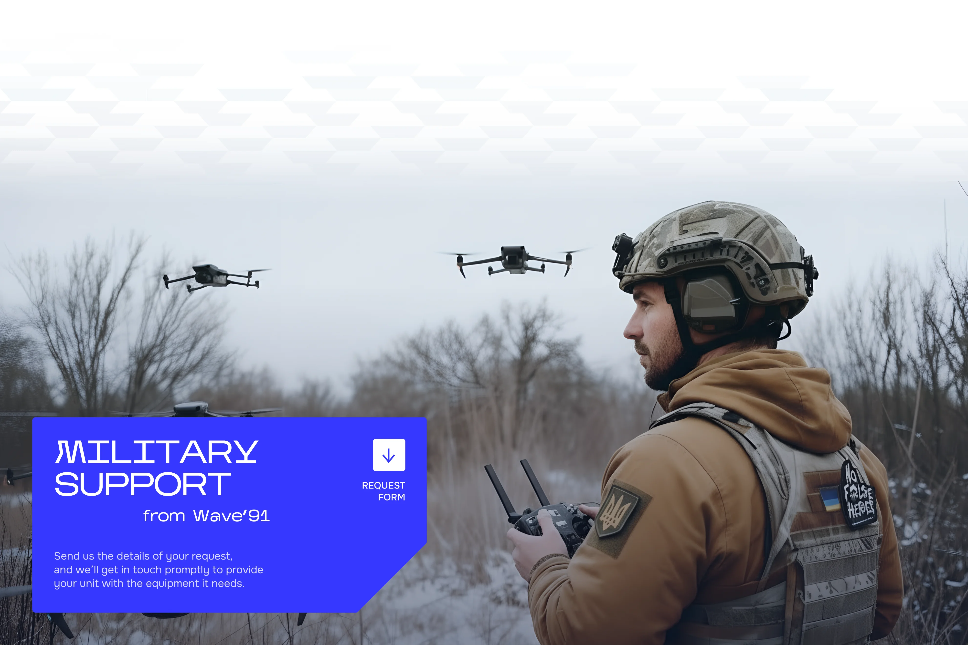
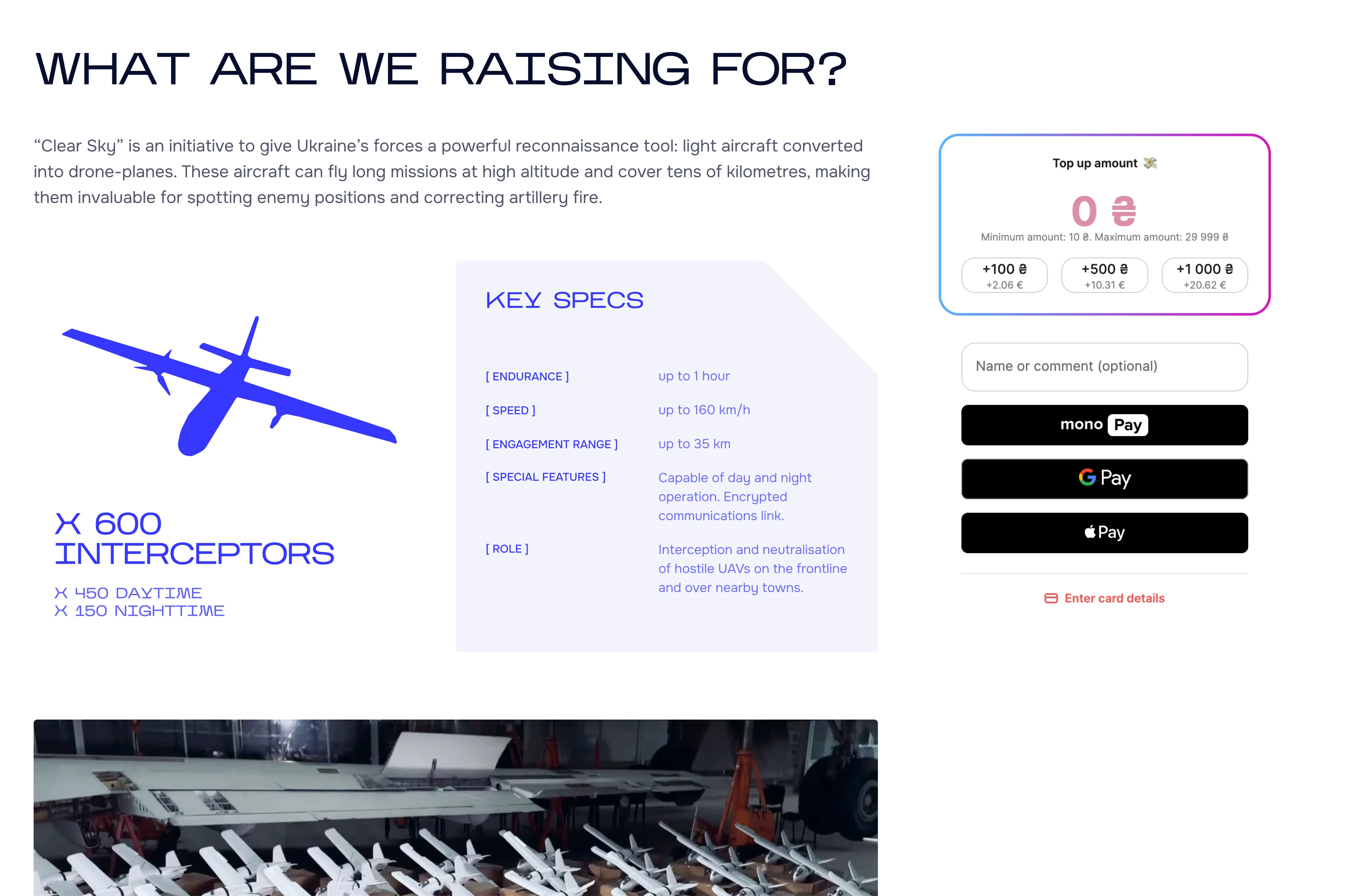
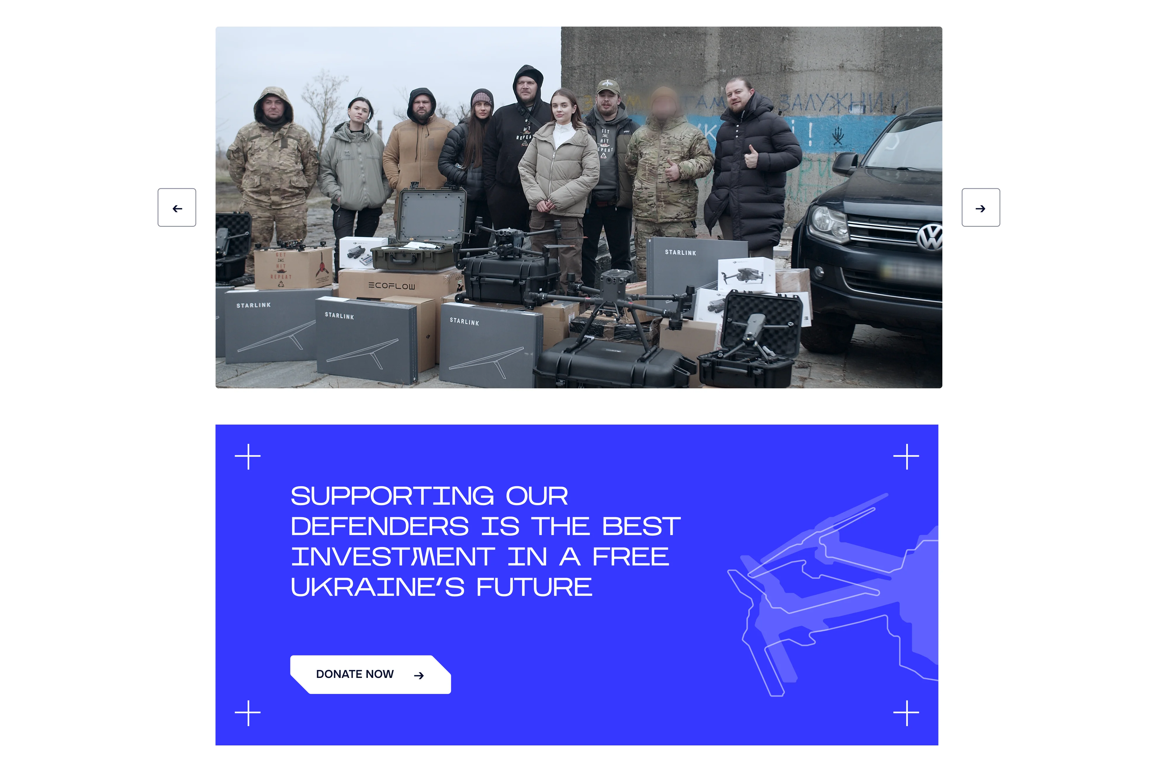
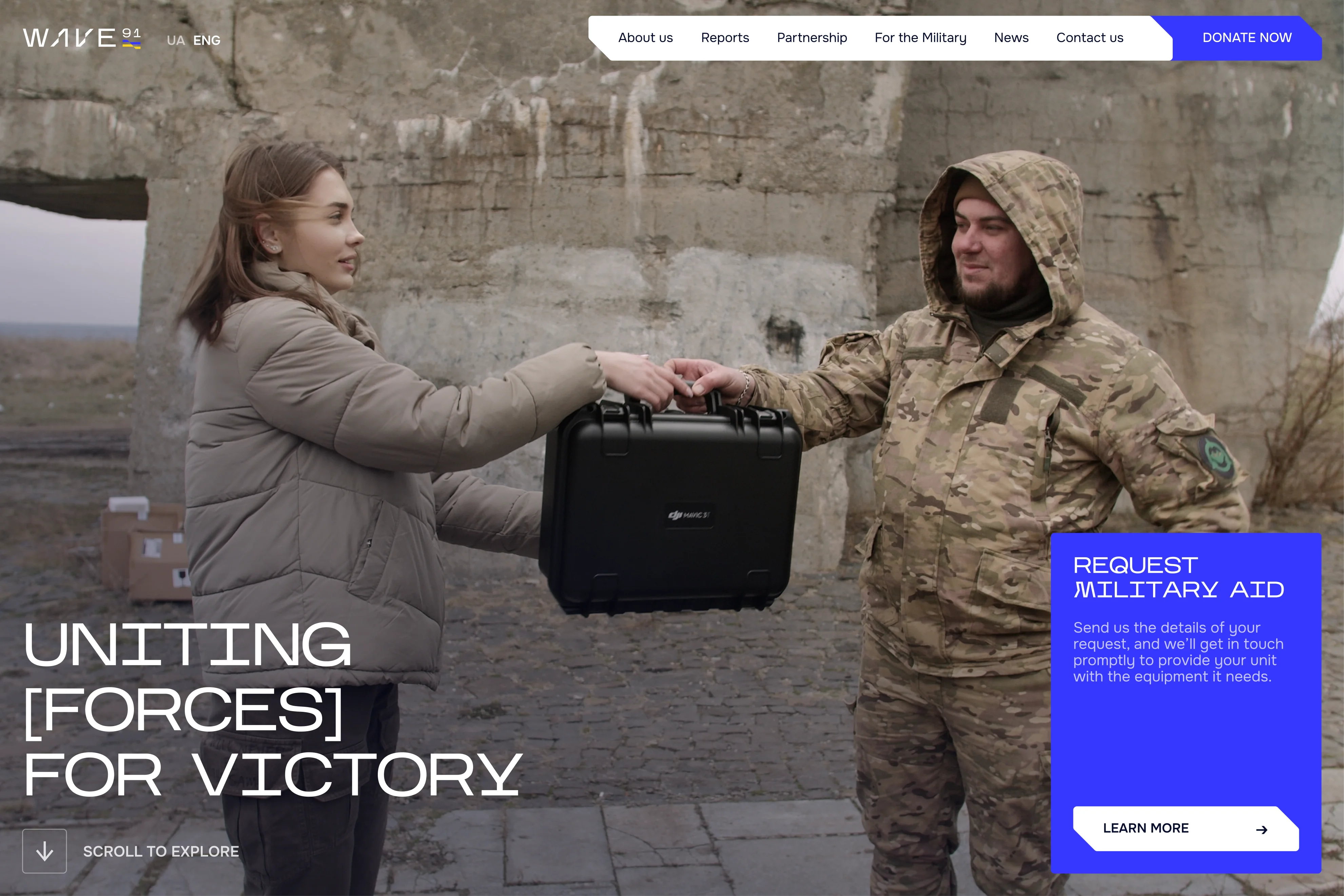
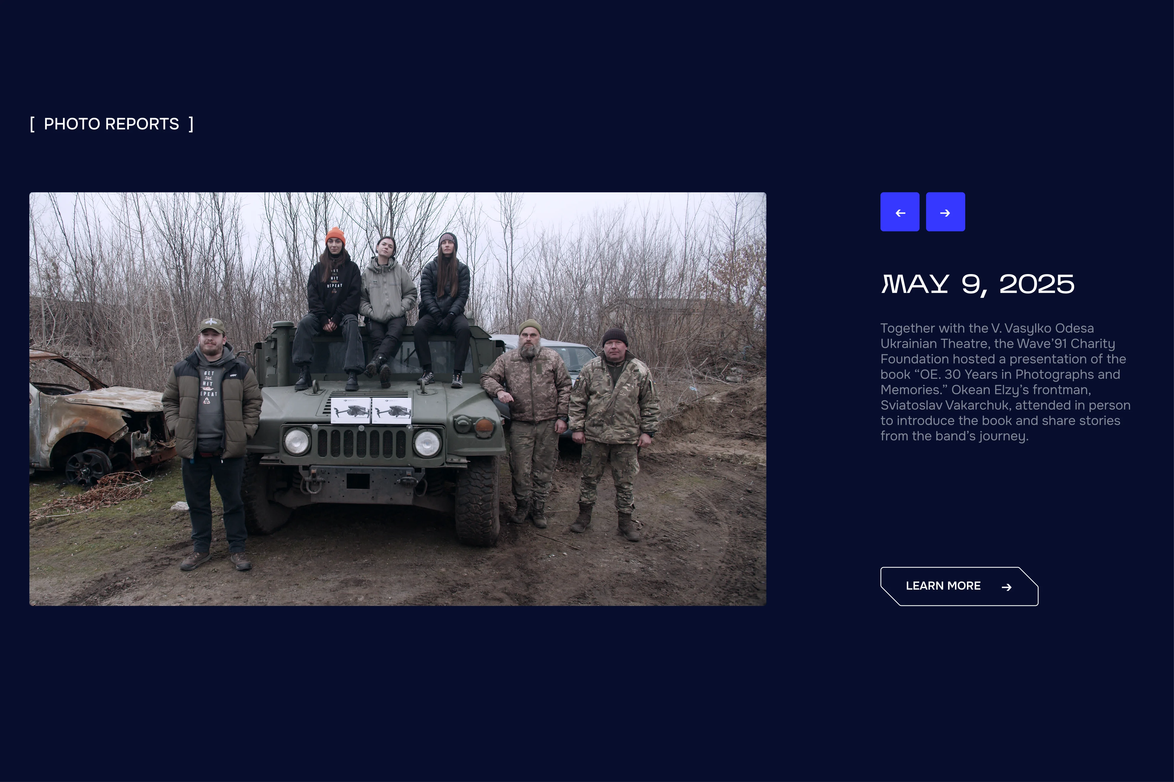
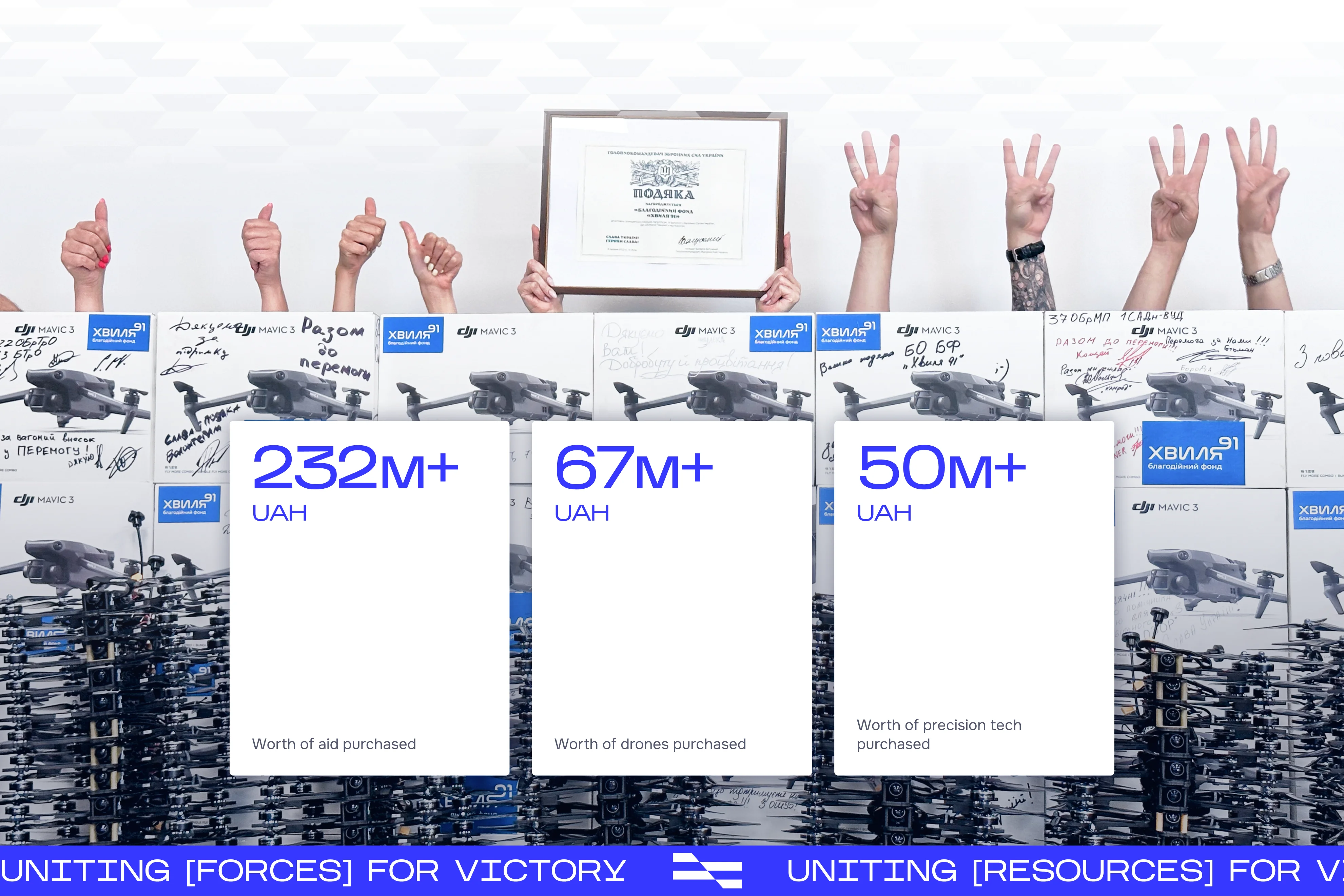
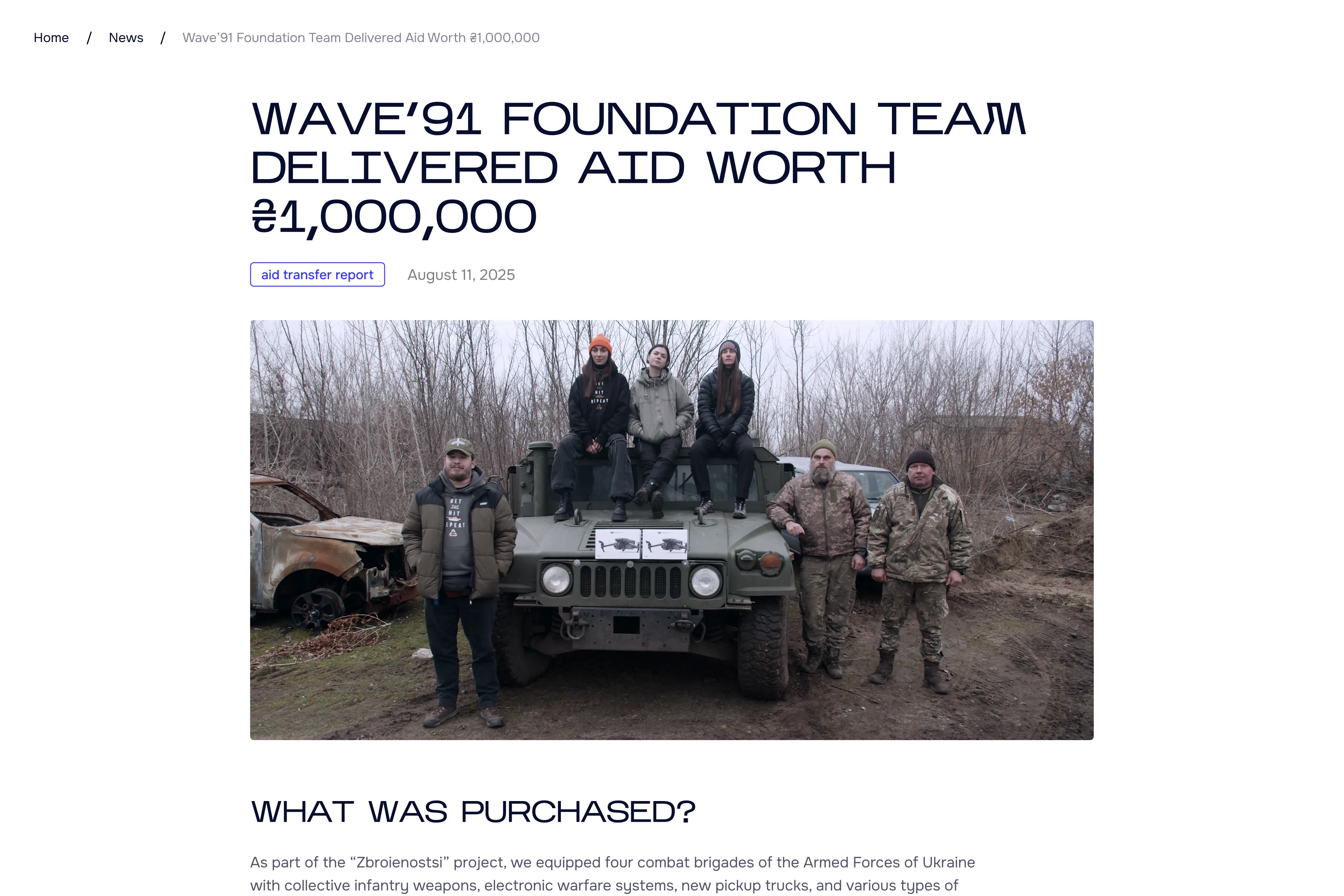
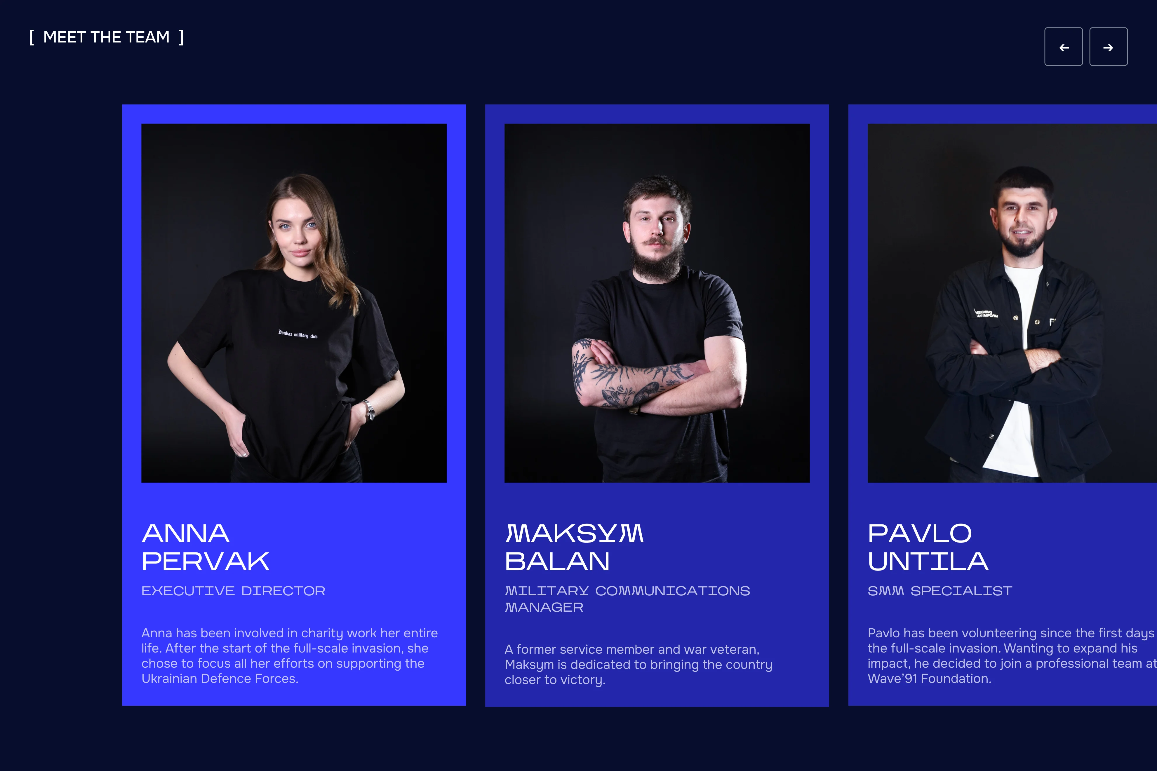
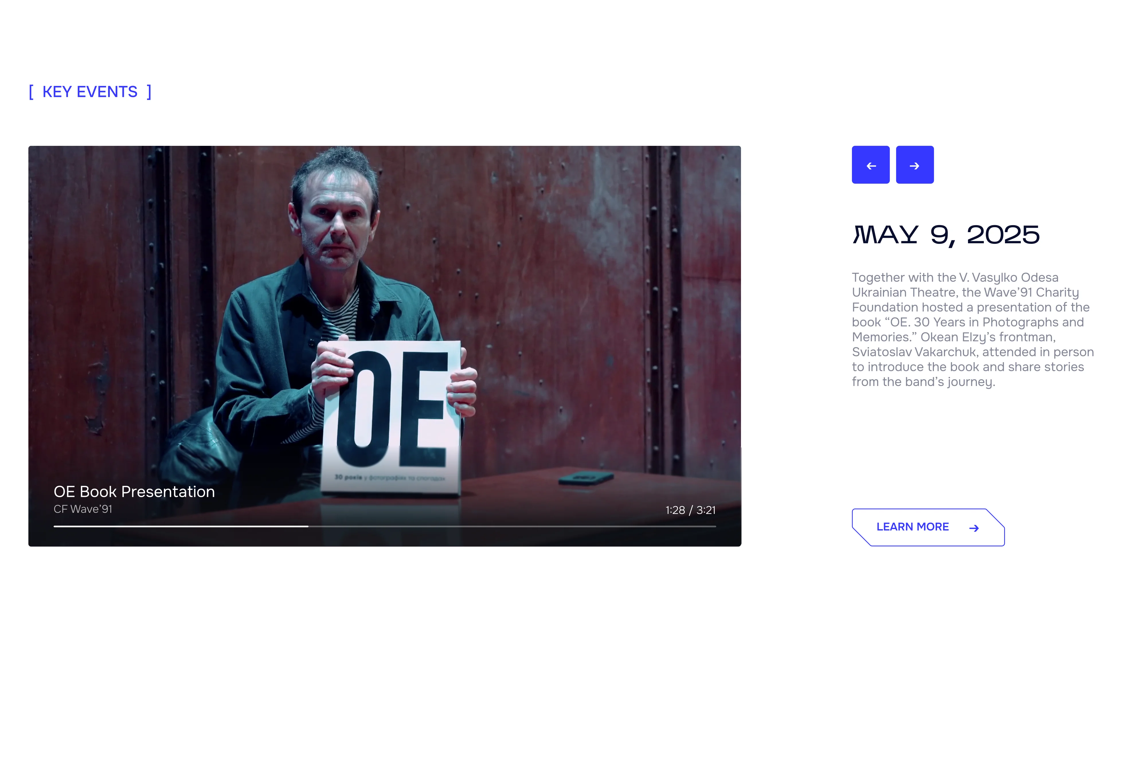
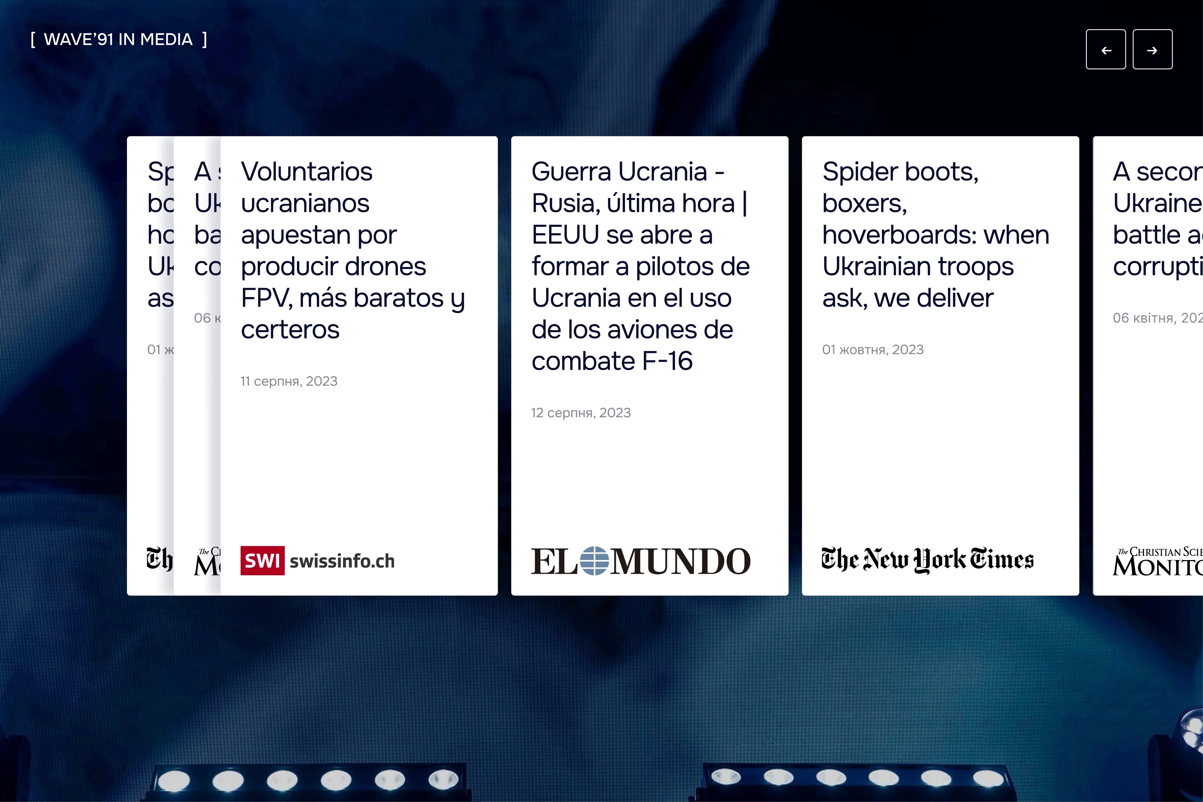
Building trust with new donors means showing real impact, not just stating it. Images of the team delivering aid and bold, confident figures communicate the foundation's credibility more effectively than words alone.
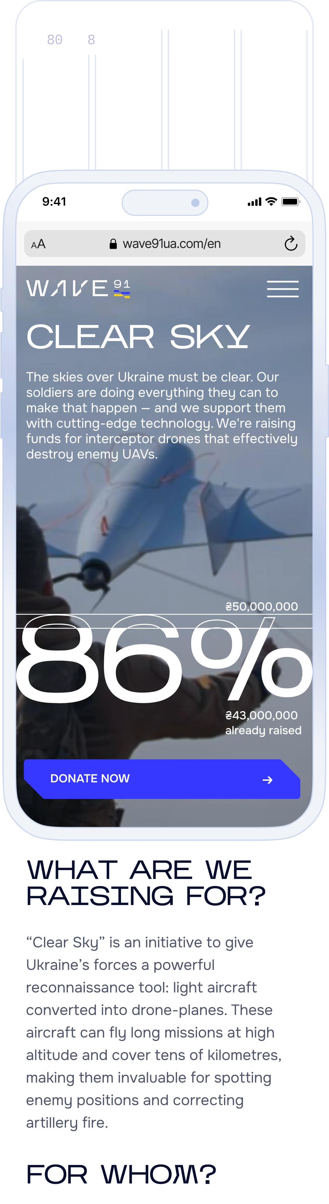
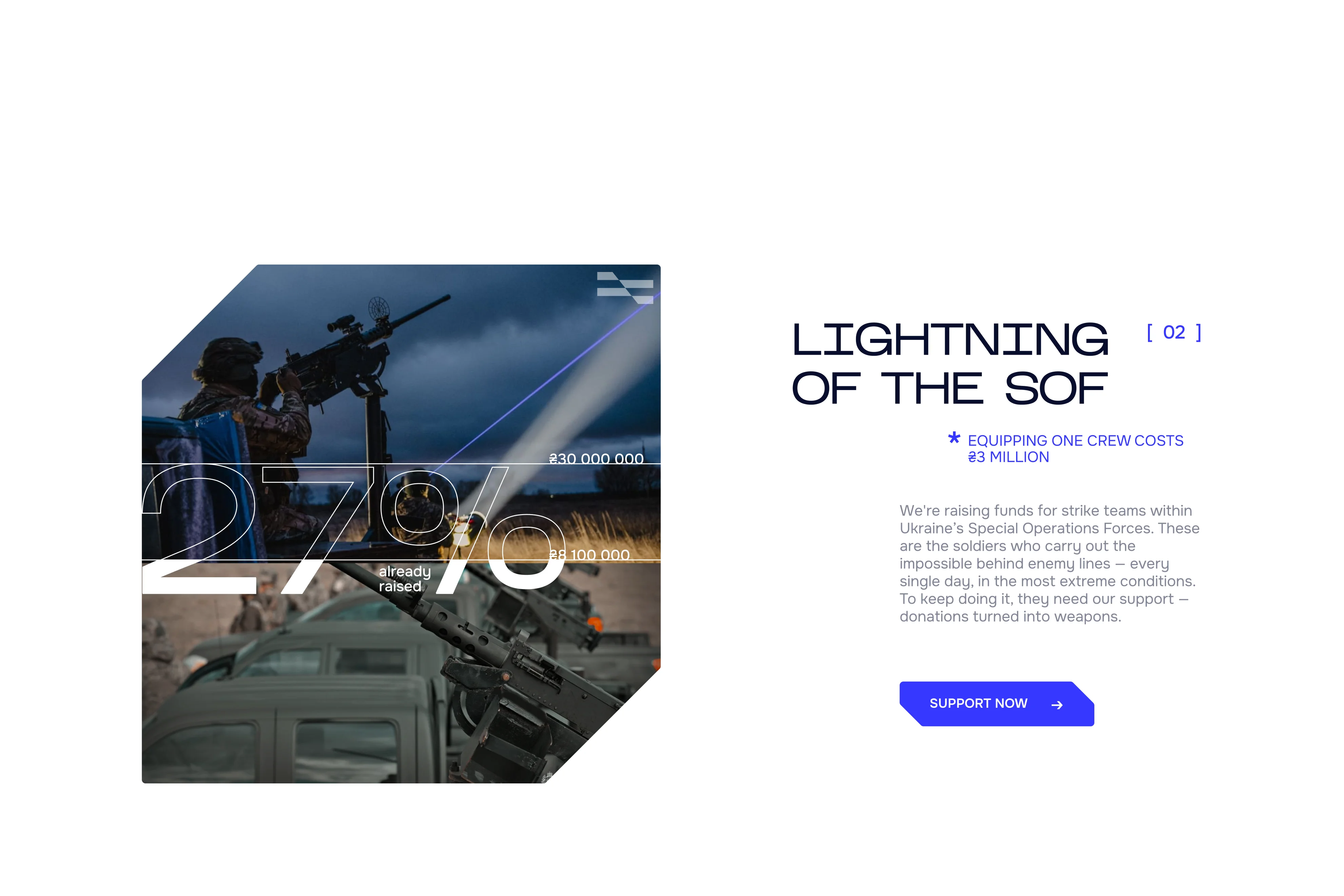
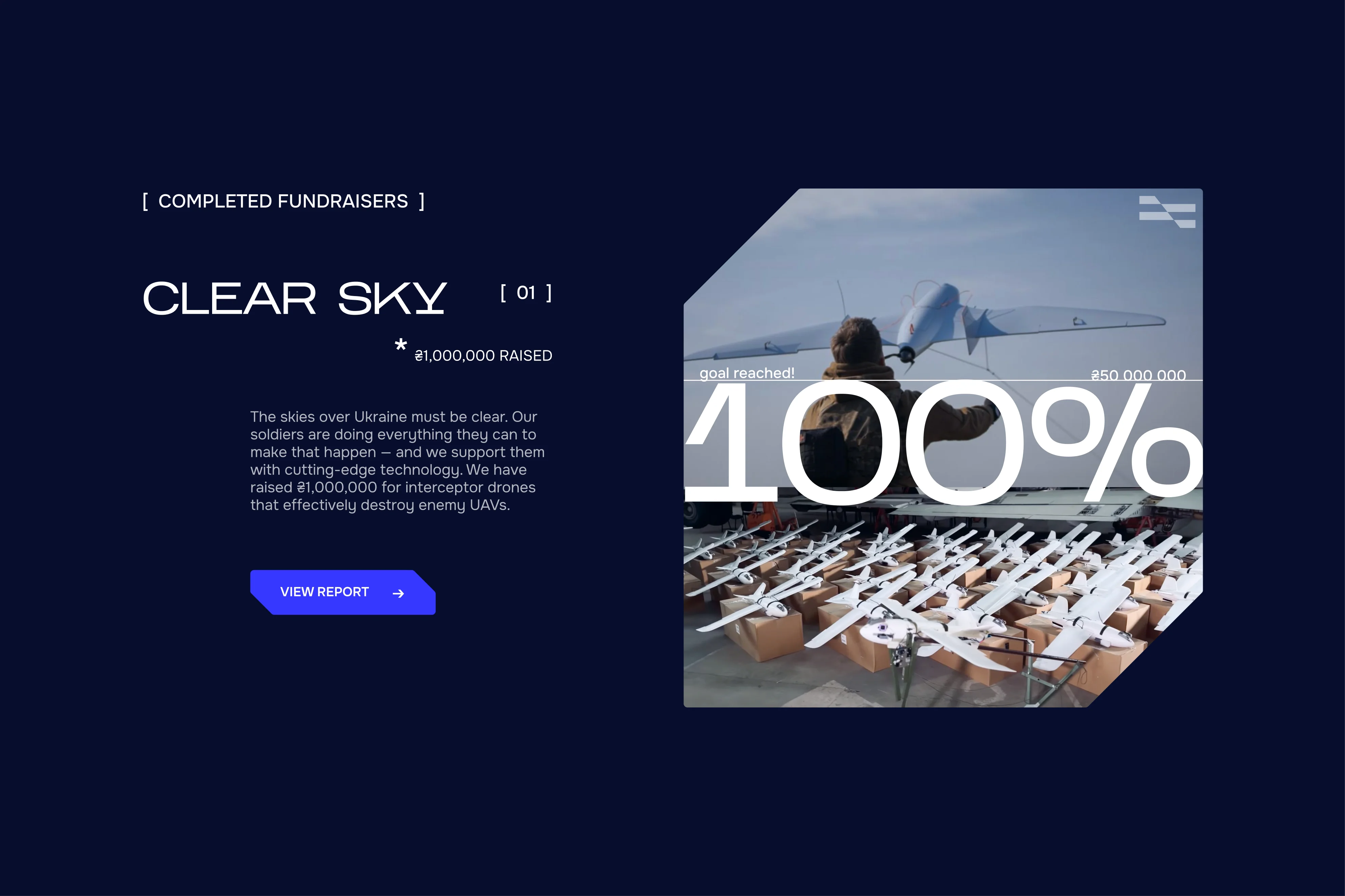
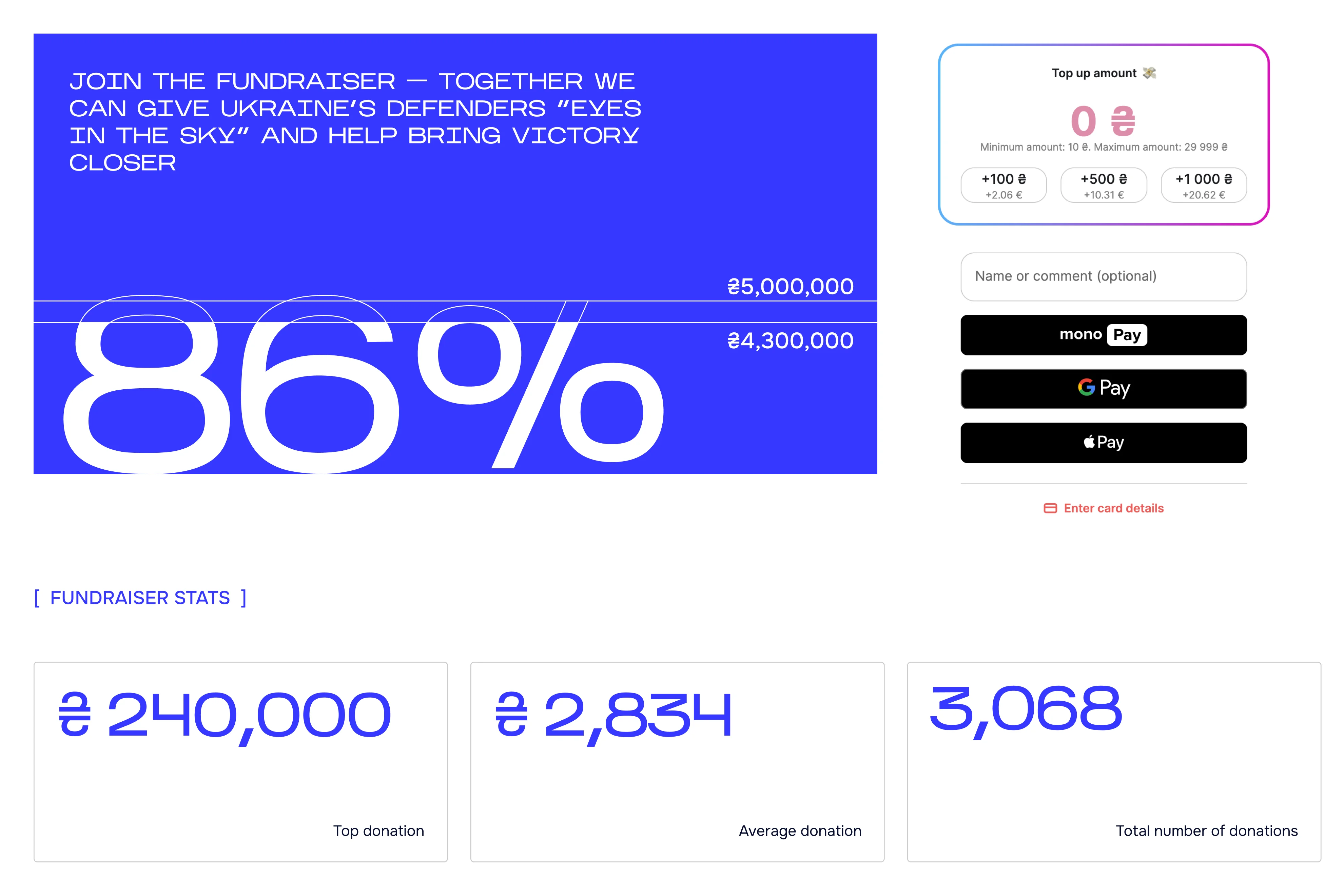
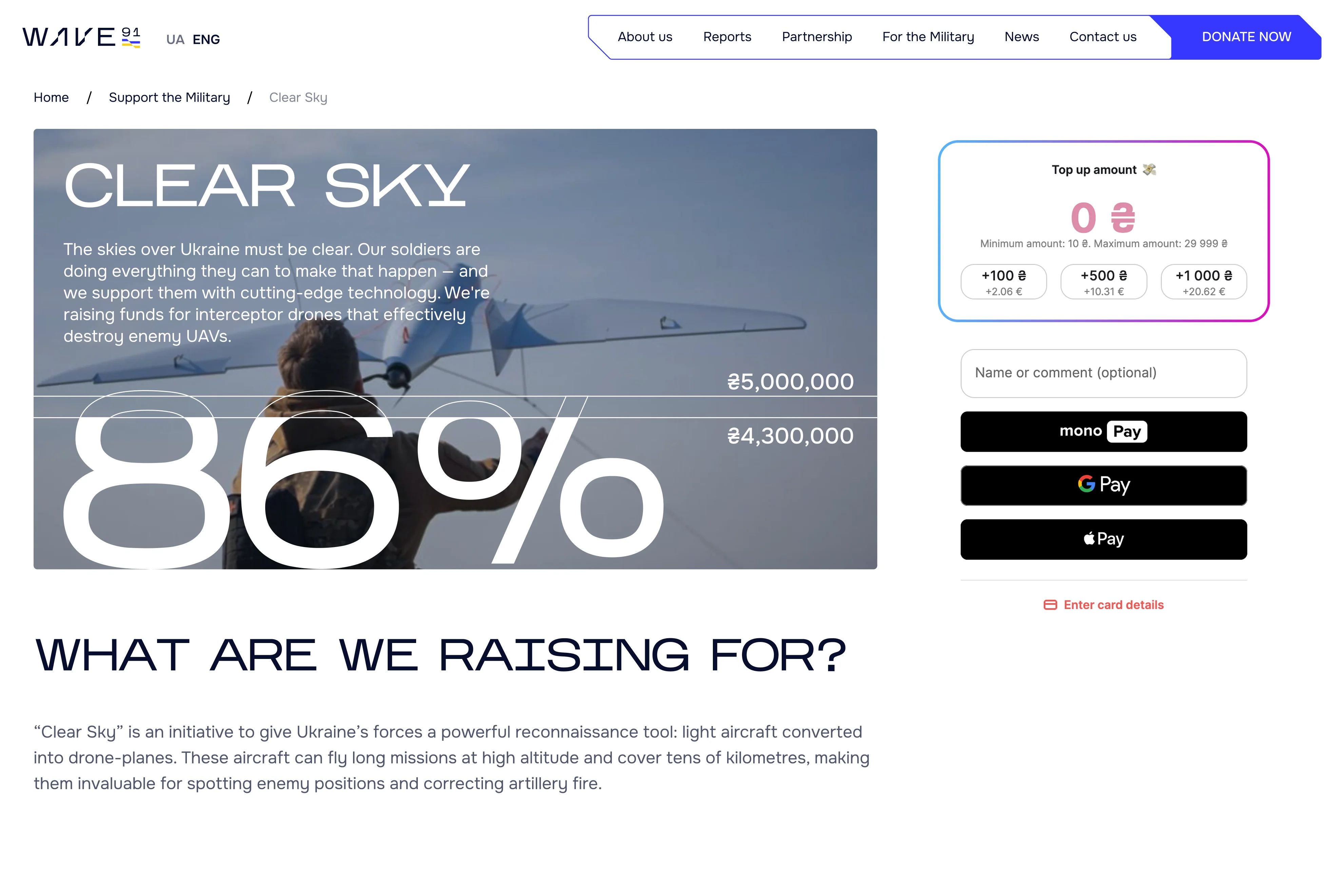
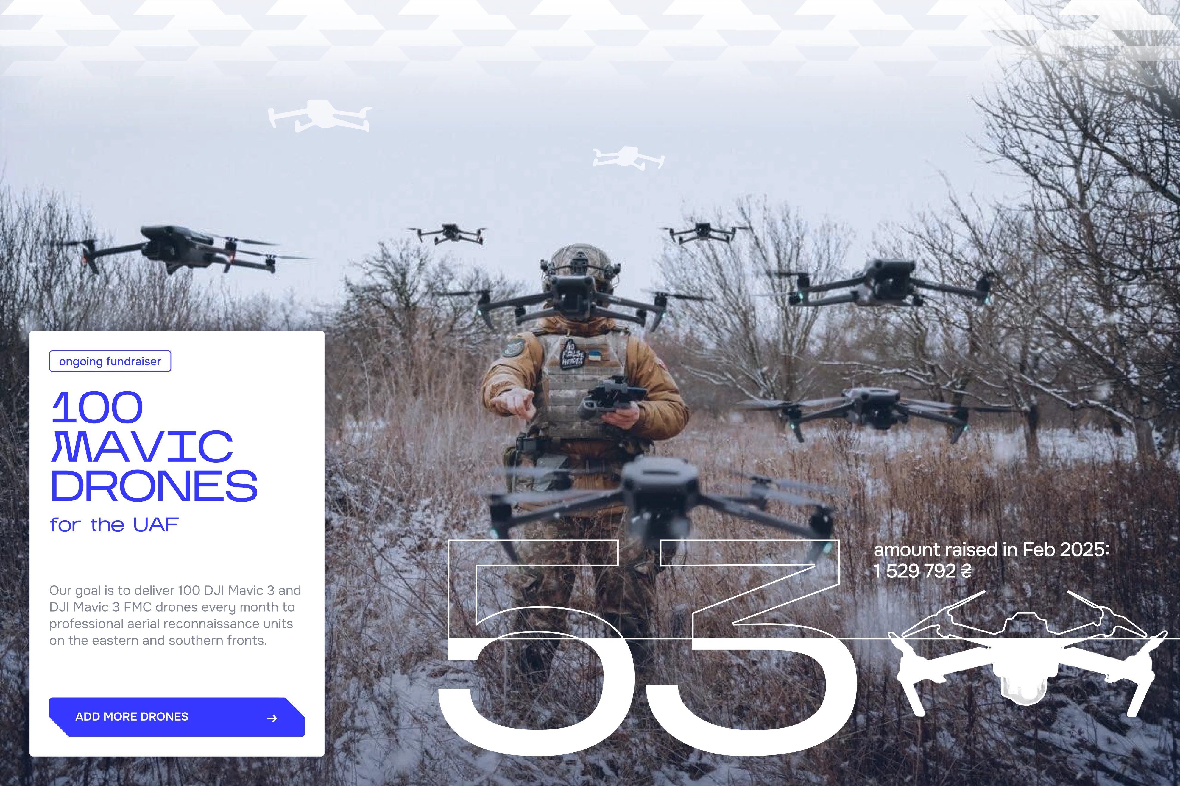
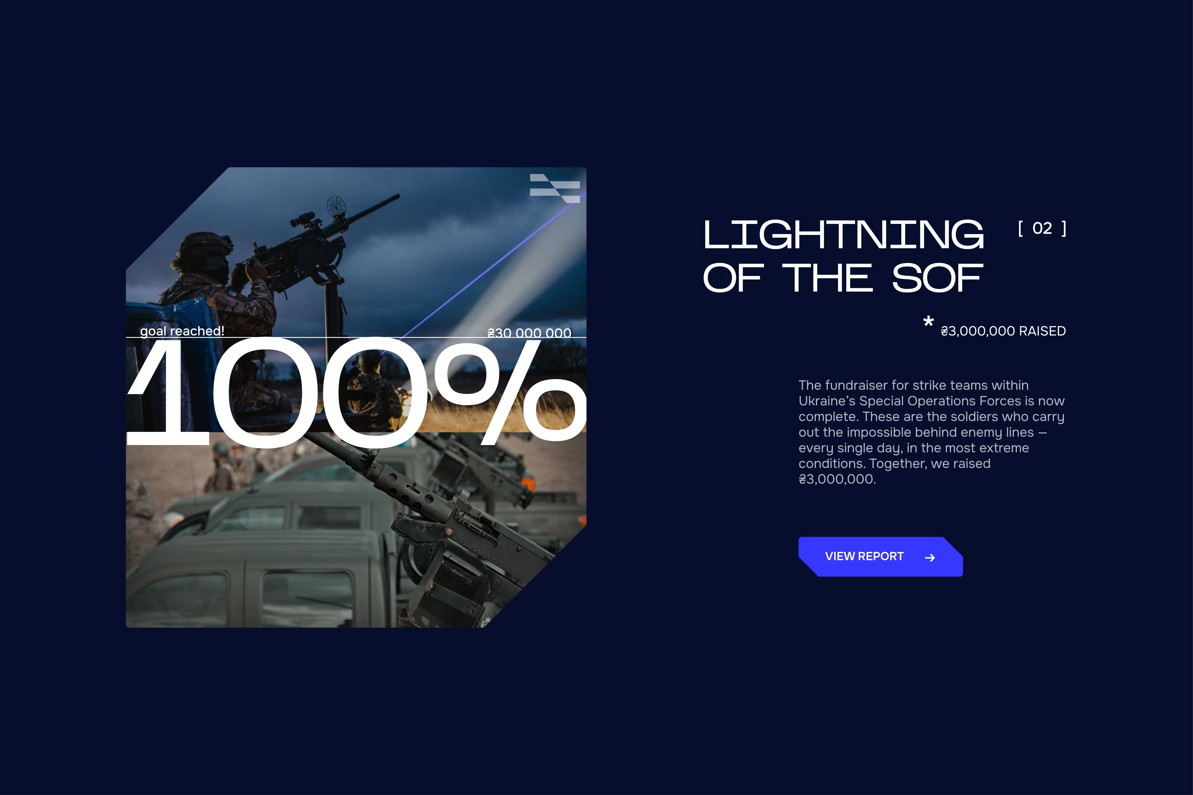
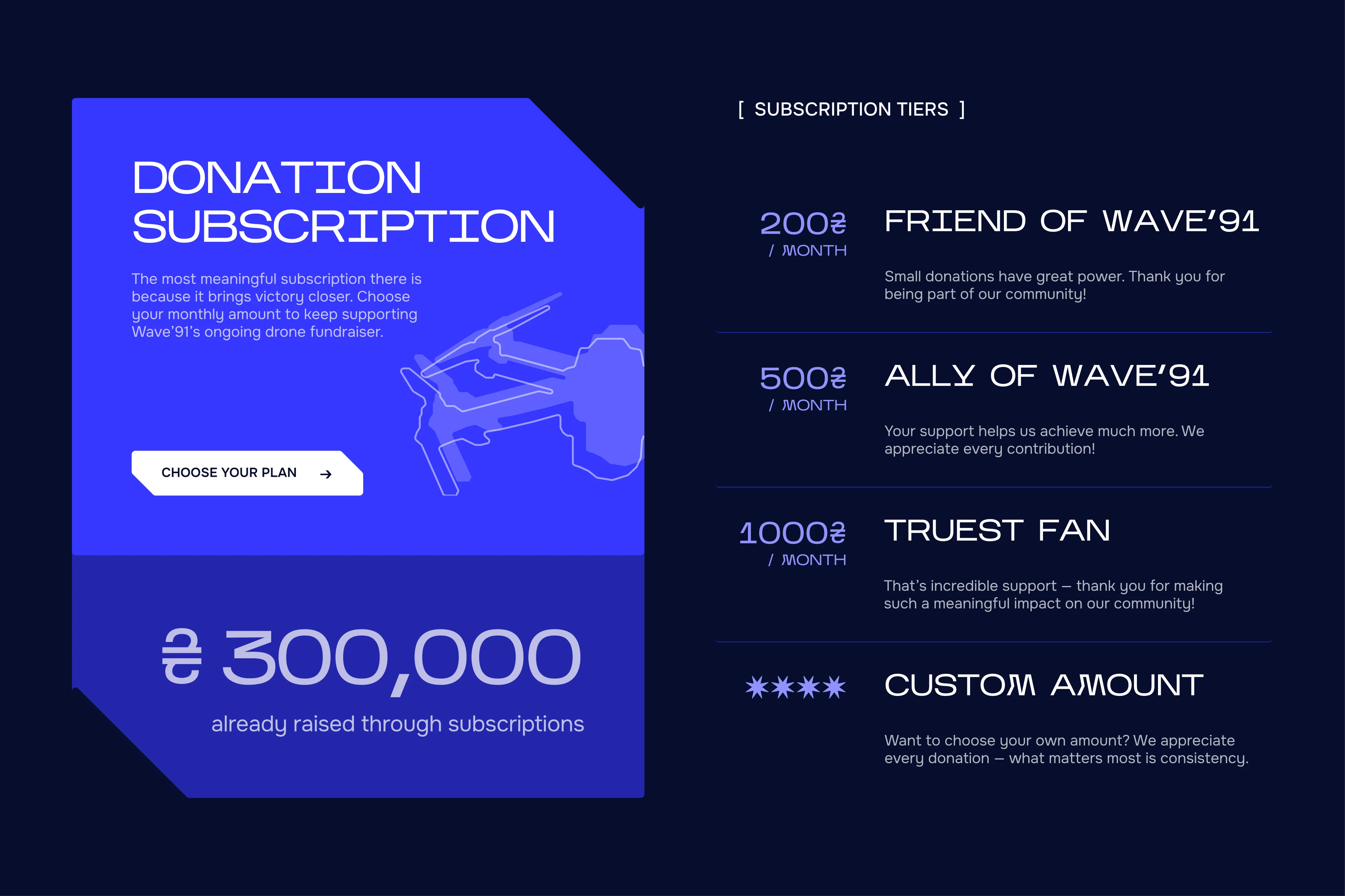
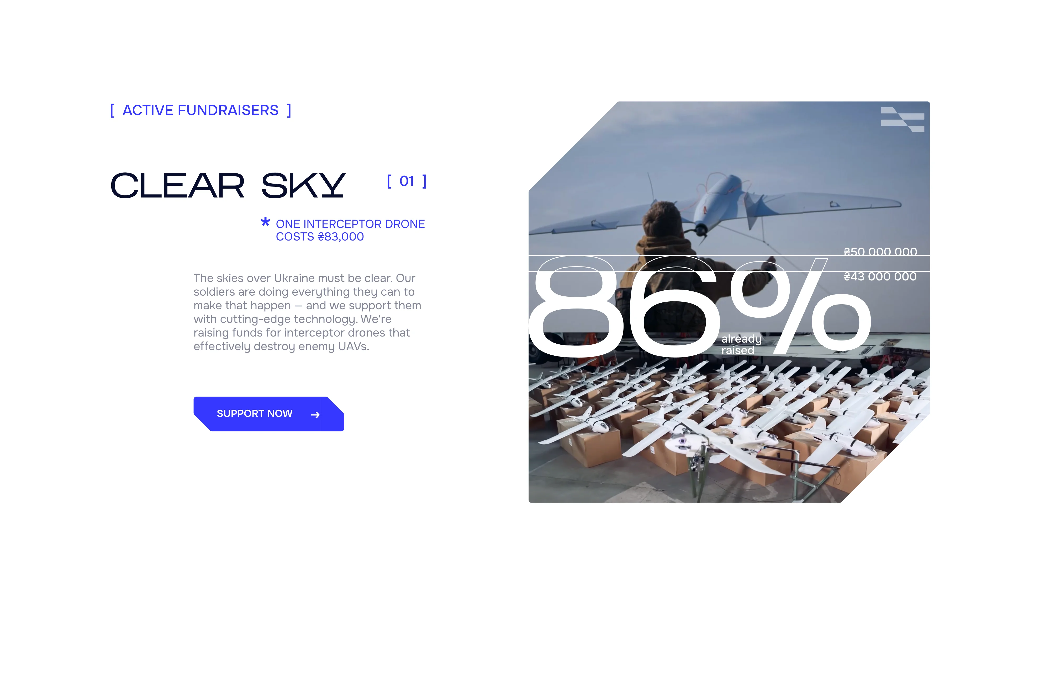
To encourage momentum, I designed fundraiser cards that visually fill as donations grow, inviting users to chip in and help complete it, making their contribution feel tangible and immediately impactful.
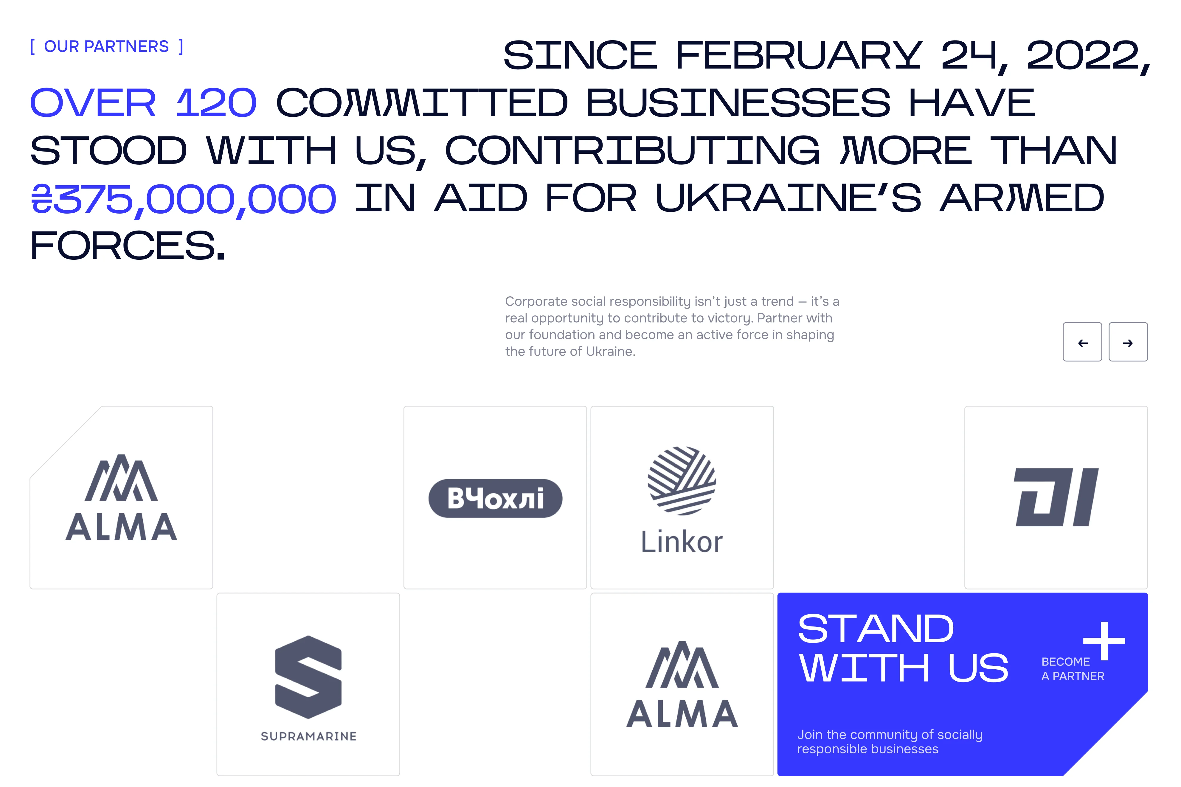
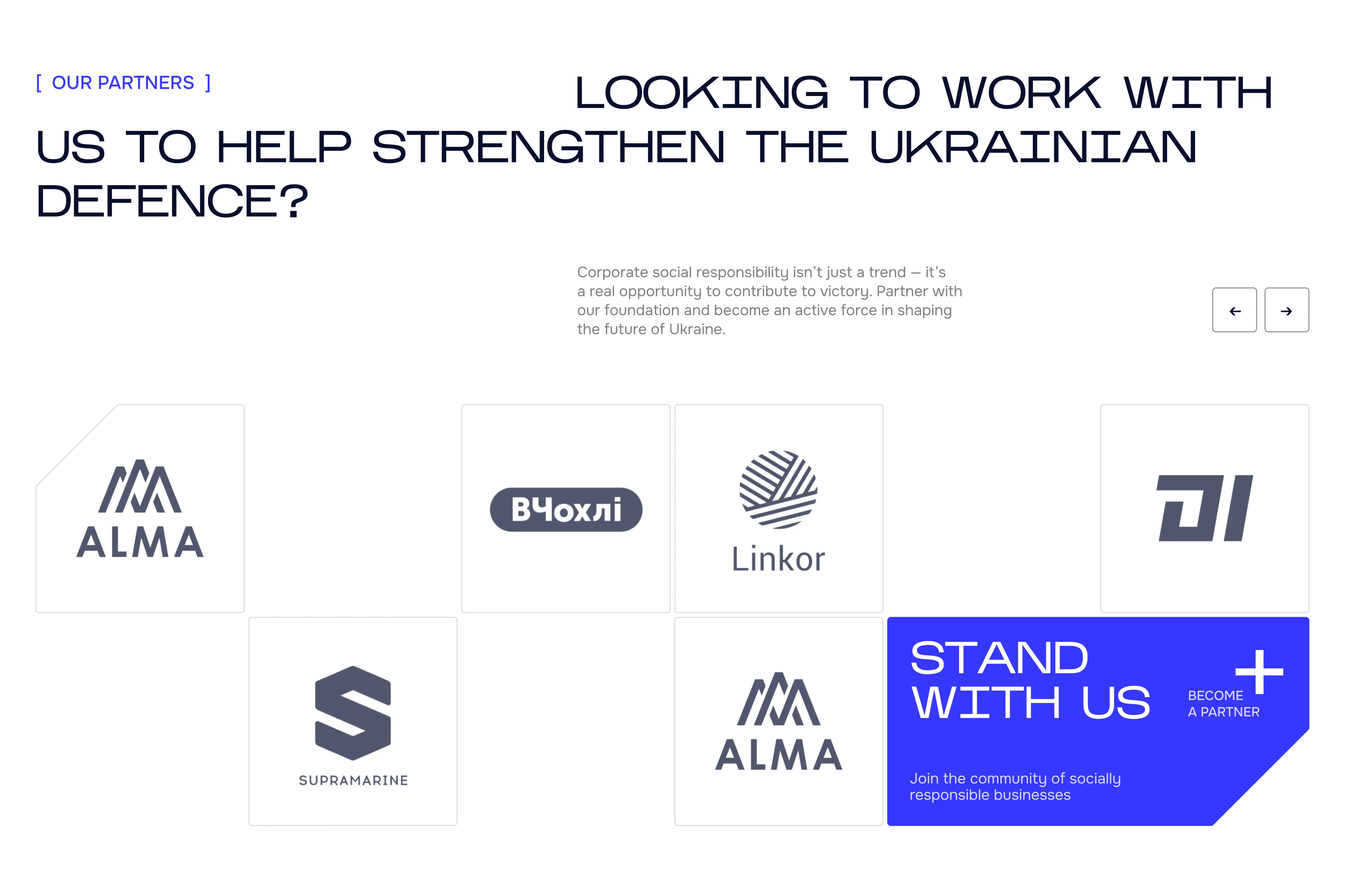
The CTA invites businesses to place their logo alongside others and help bring Ukraine's victory closer. The wording reinforces a sense of unity and collective responsibility, making partnership feel meaningful rather than transactional.

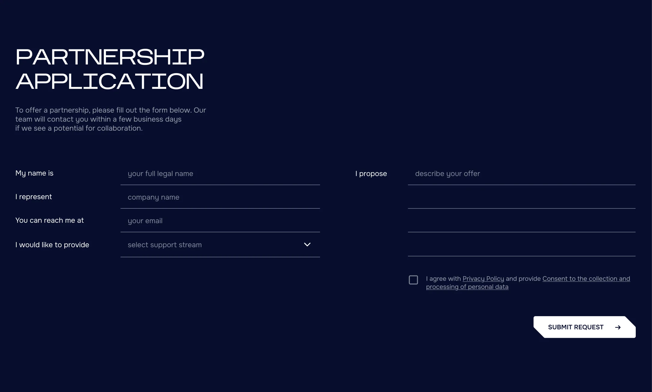
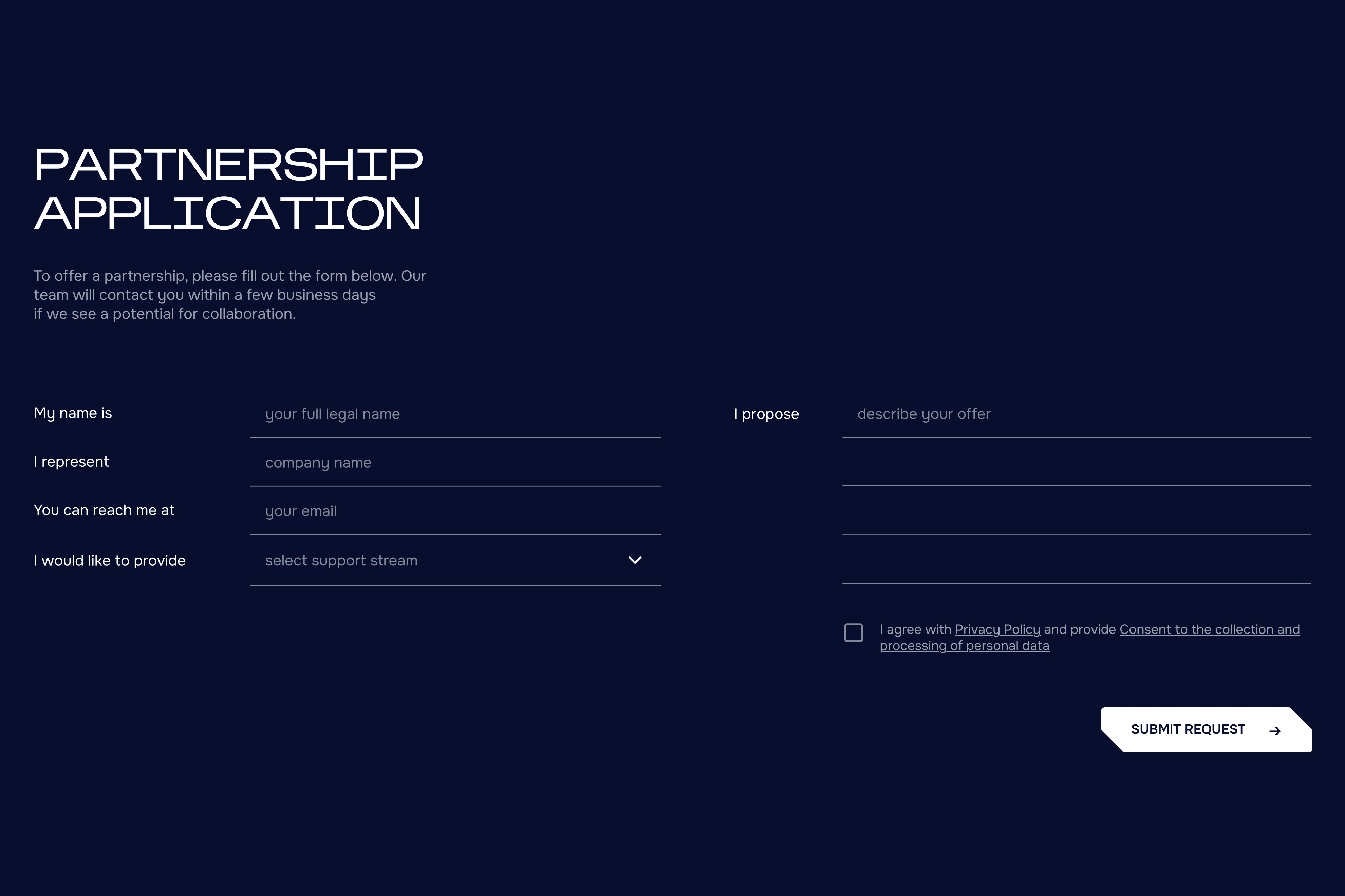
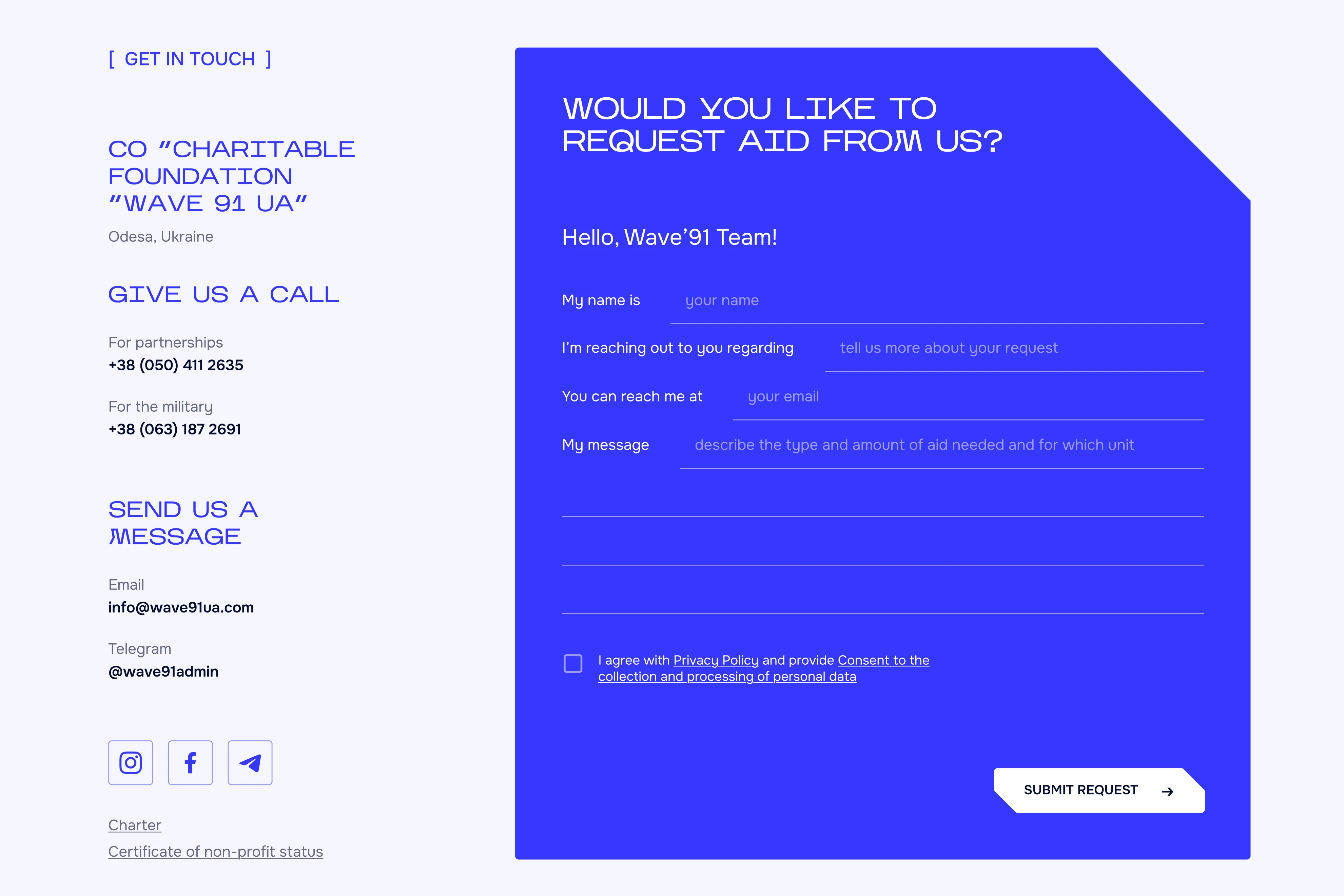
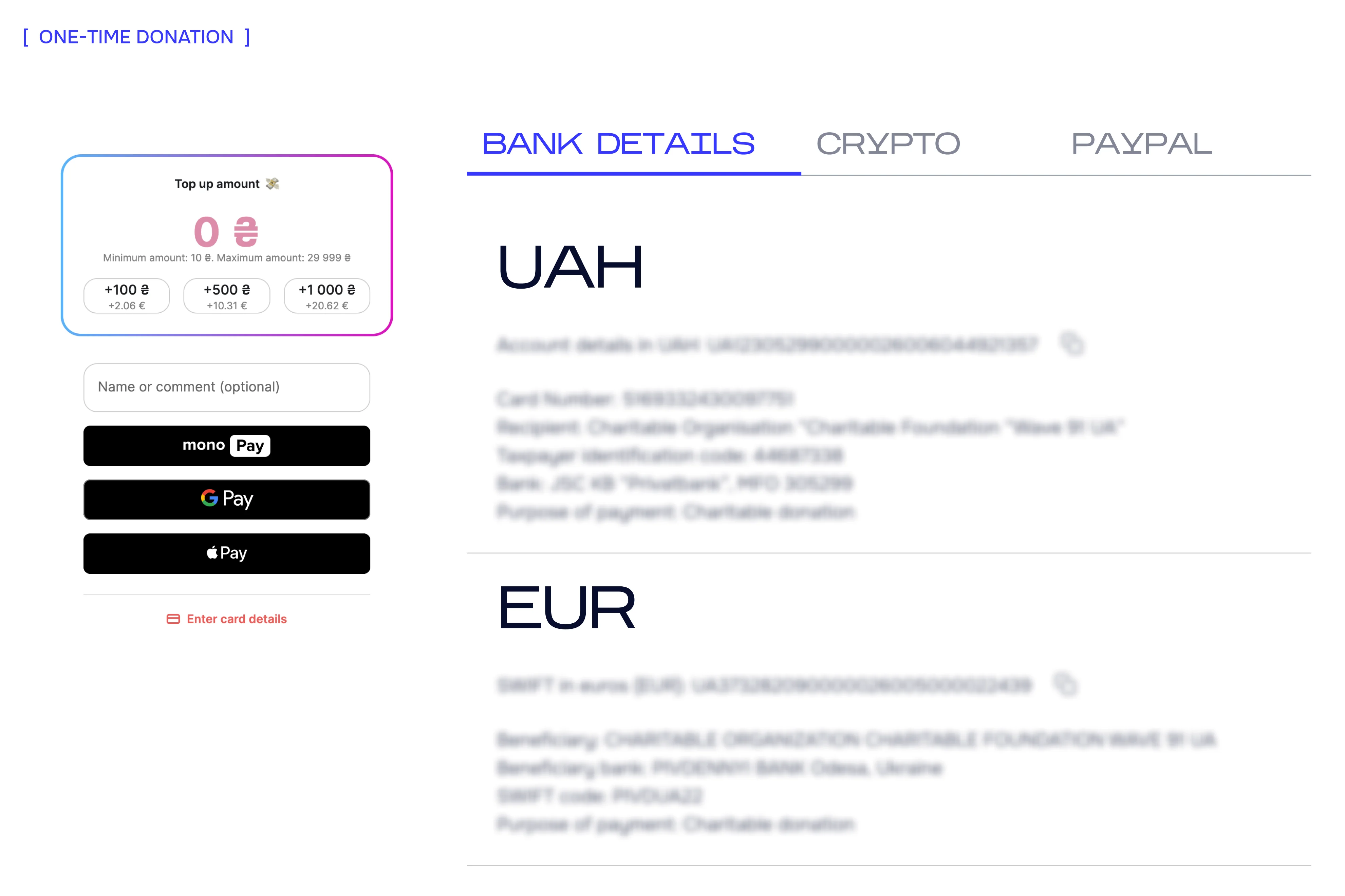
contact form
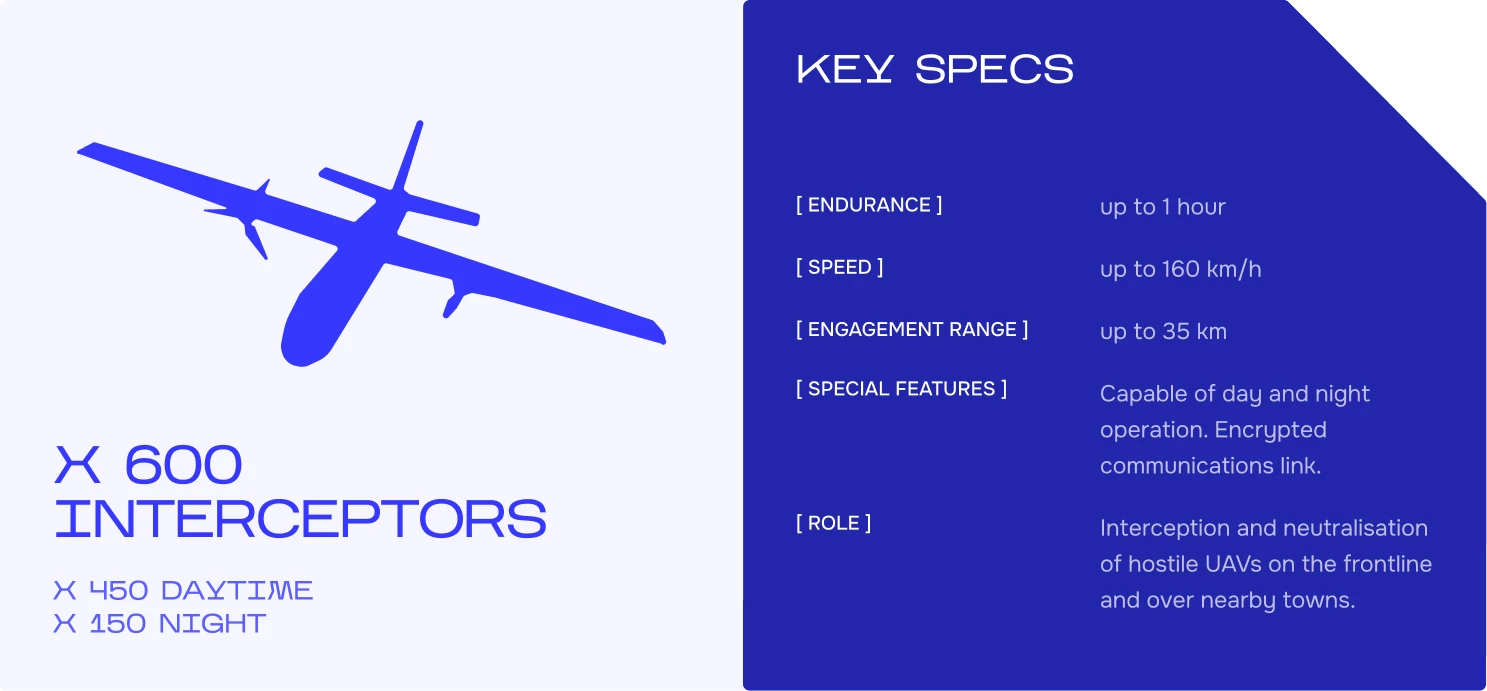
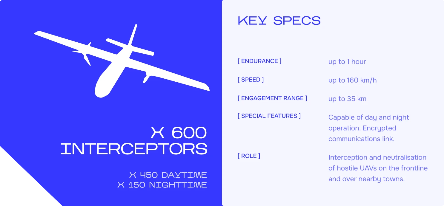
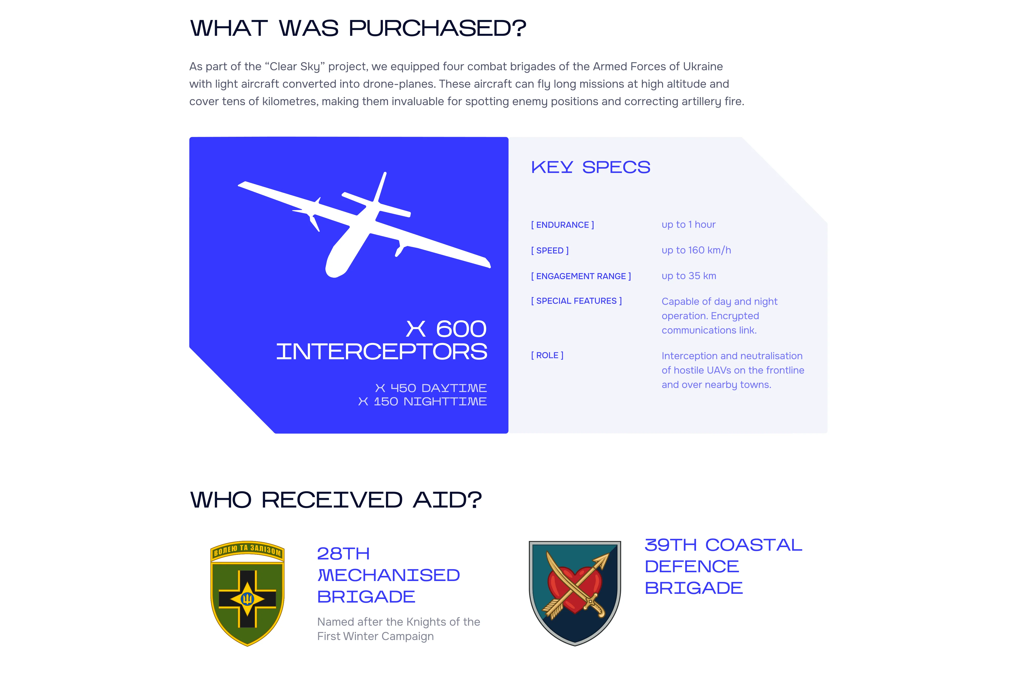
spec cards
Results
The client approved the final design direction and described it as "a distinctive and compelling design that best captures the spirit and core mission of the foundation."
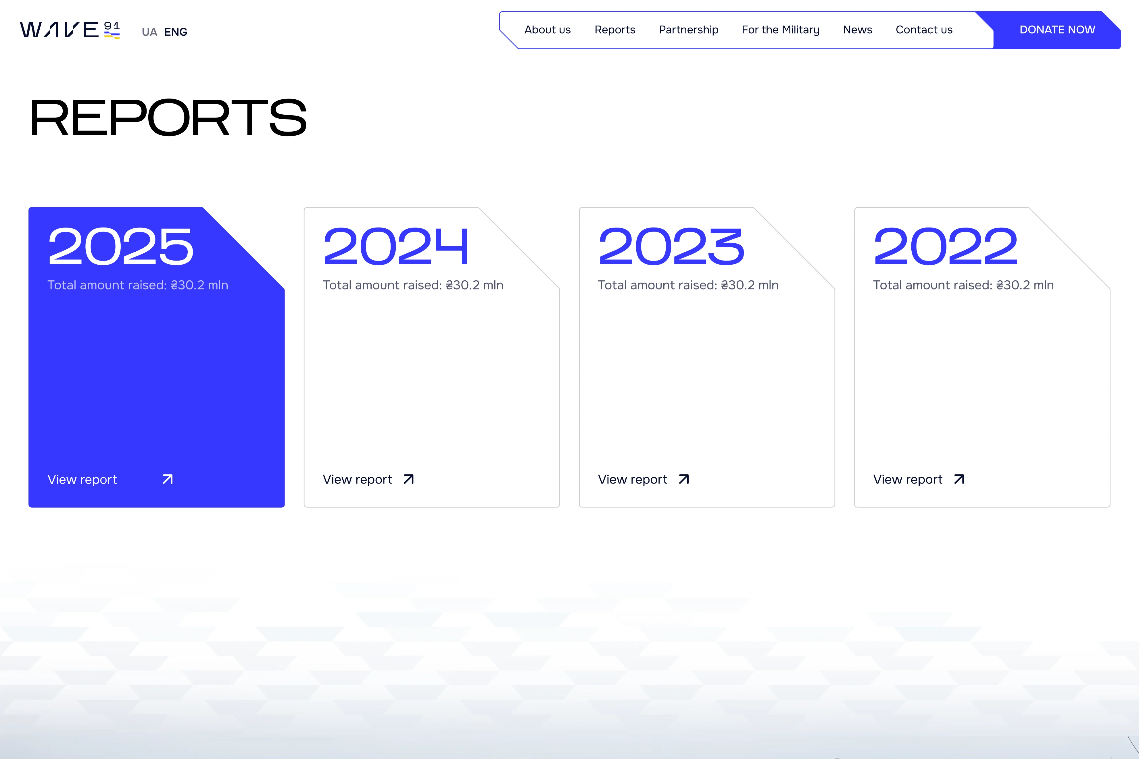
The website included 11 pages in two languages, along with a mobile version, and required close collaboration across design, client feedback, and development. The project is now in production, with launch planned for April 2026.


KEEP EXPLORING

Redesign for a home appliance store. Improved UI, navigation, and product discoverability.
VIEW CASE