HOME APPLIANCES E-COMMERCE
SITE REDESIGN
Tehnohata is a well-established home appliance retailer with over 20 years of experience. Known for its personalised approach, the brand serves both individual customers and interior designers sourcing products for their clients.
This project focused on redesigning the existing website to streamline the purchasing journey and improve usability. The user interface also required a visual refresh, as the original design felt outdated.
BEFORE

Sensitive content
This photo contains sensitive content, such as poor layout and typography, which some people might find offensive or disturbing.
AFTER

Sensitive content
This photo contains sensitive content, such as poor layout and typography, which some people might find offensive or disturbing.
Problem
The existing website has outdated UI and poor usability. Users struggle to find products they need quickly.
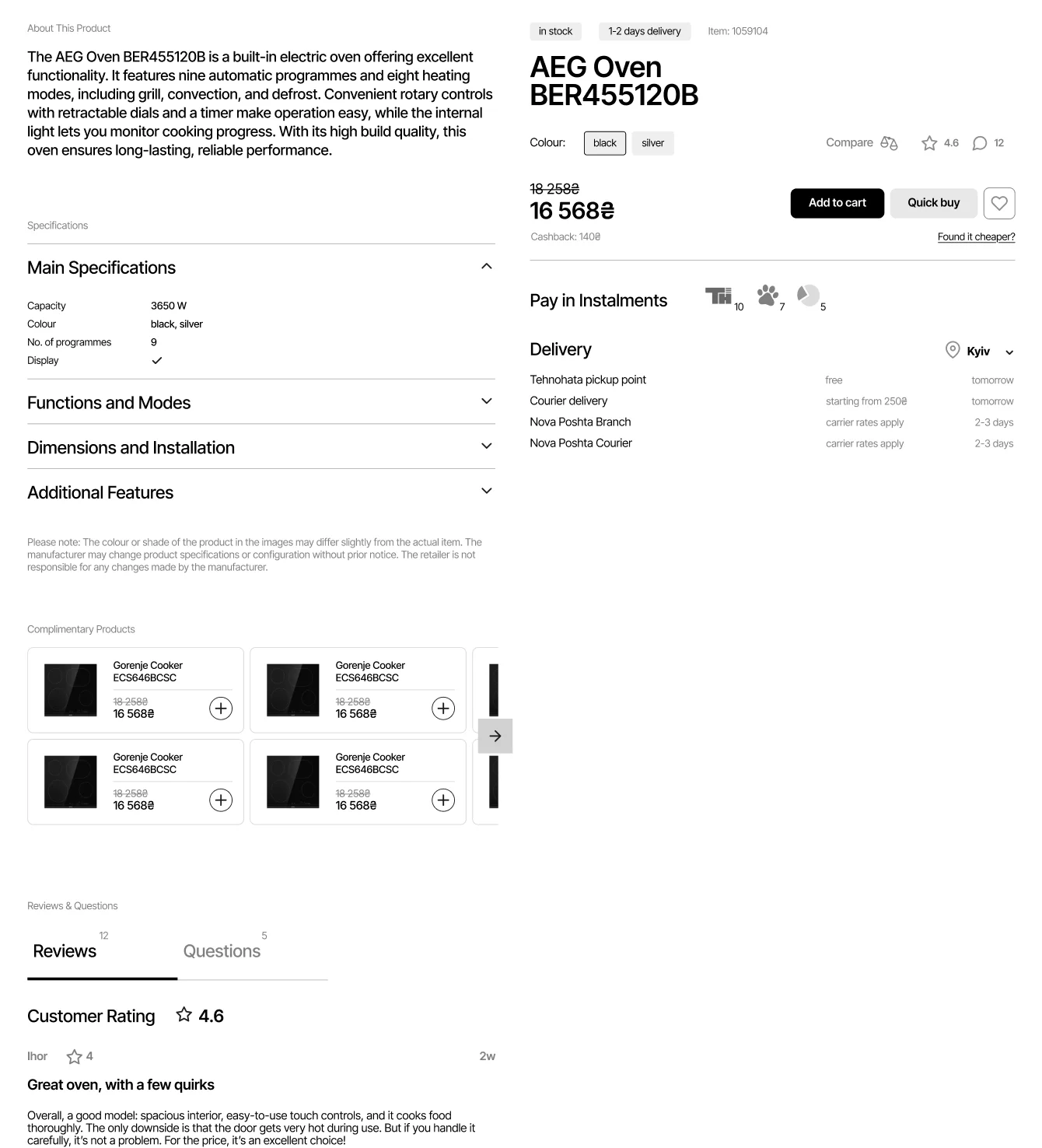
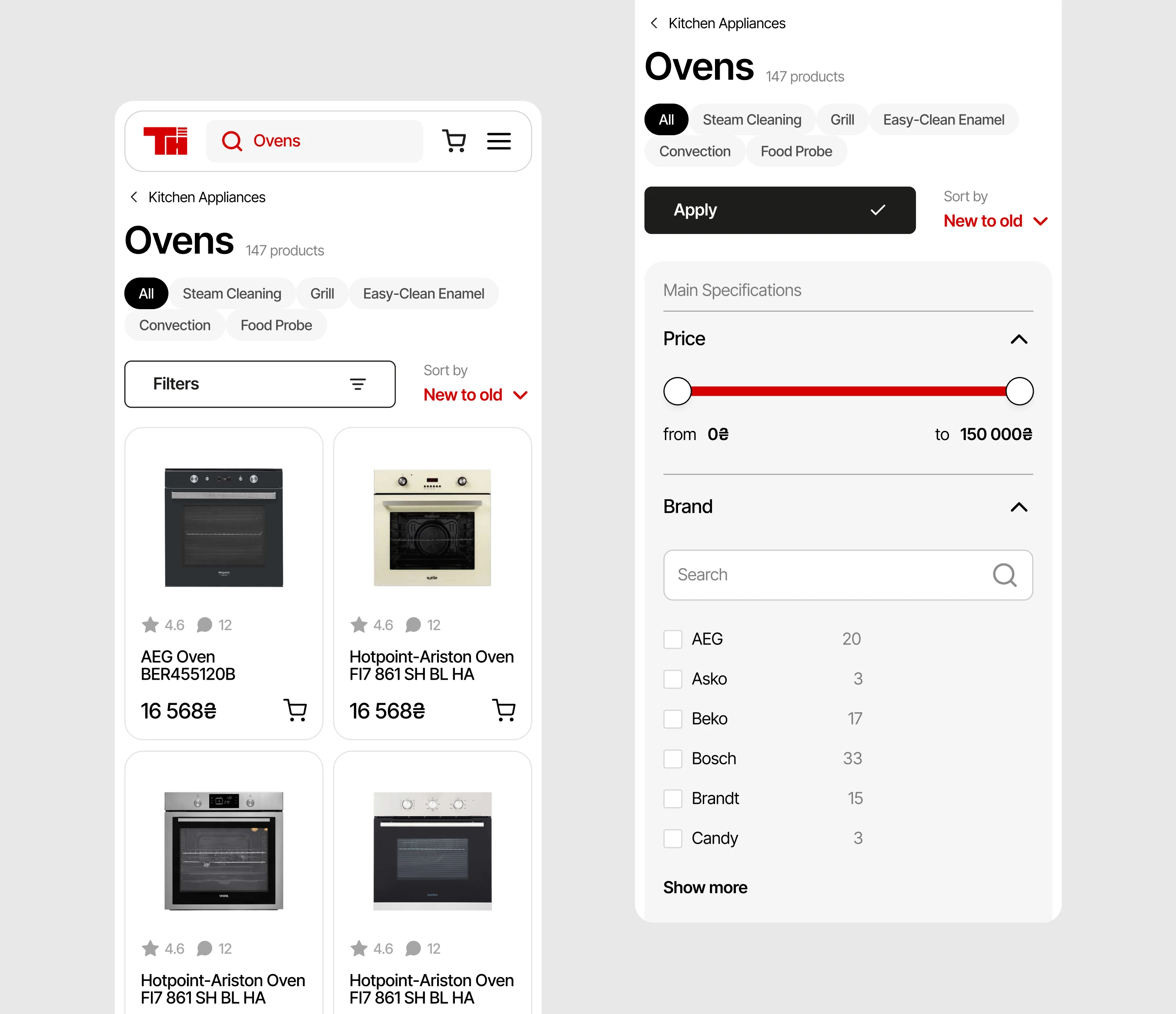
The product cards miss relevant info and clearly visible CTA.
Product page looks cluttered and has poor content structure.
The site fails to convey the store's key advantages.
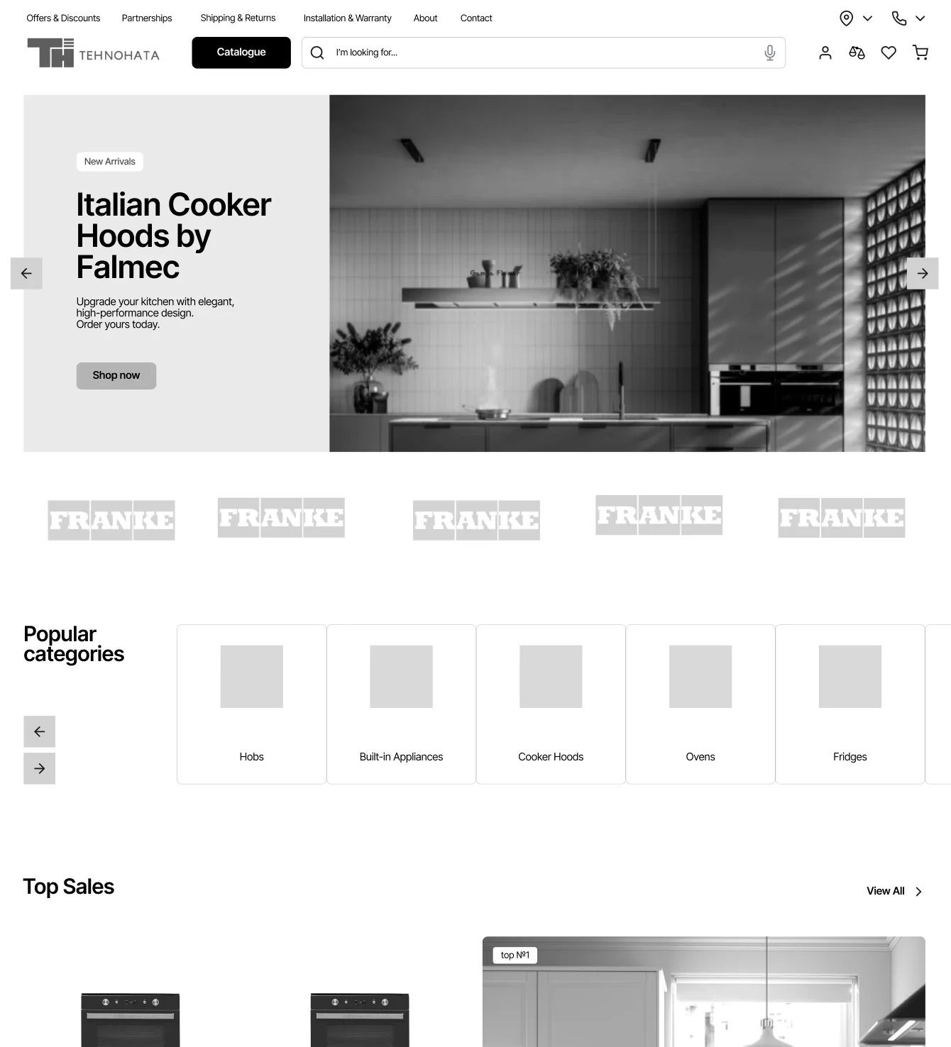
Product filters are not intuitive.
Goals
Improve overall UI, product discoverability, and navigation to create a more intuitive shopping experience.
Redesign product cards and product page to include all relevant information while staying visually clean and appealing.
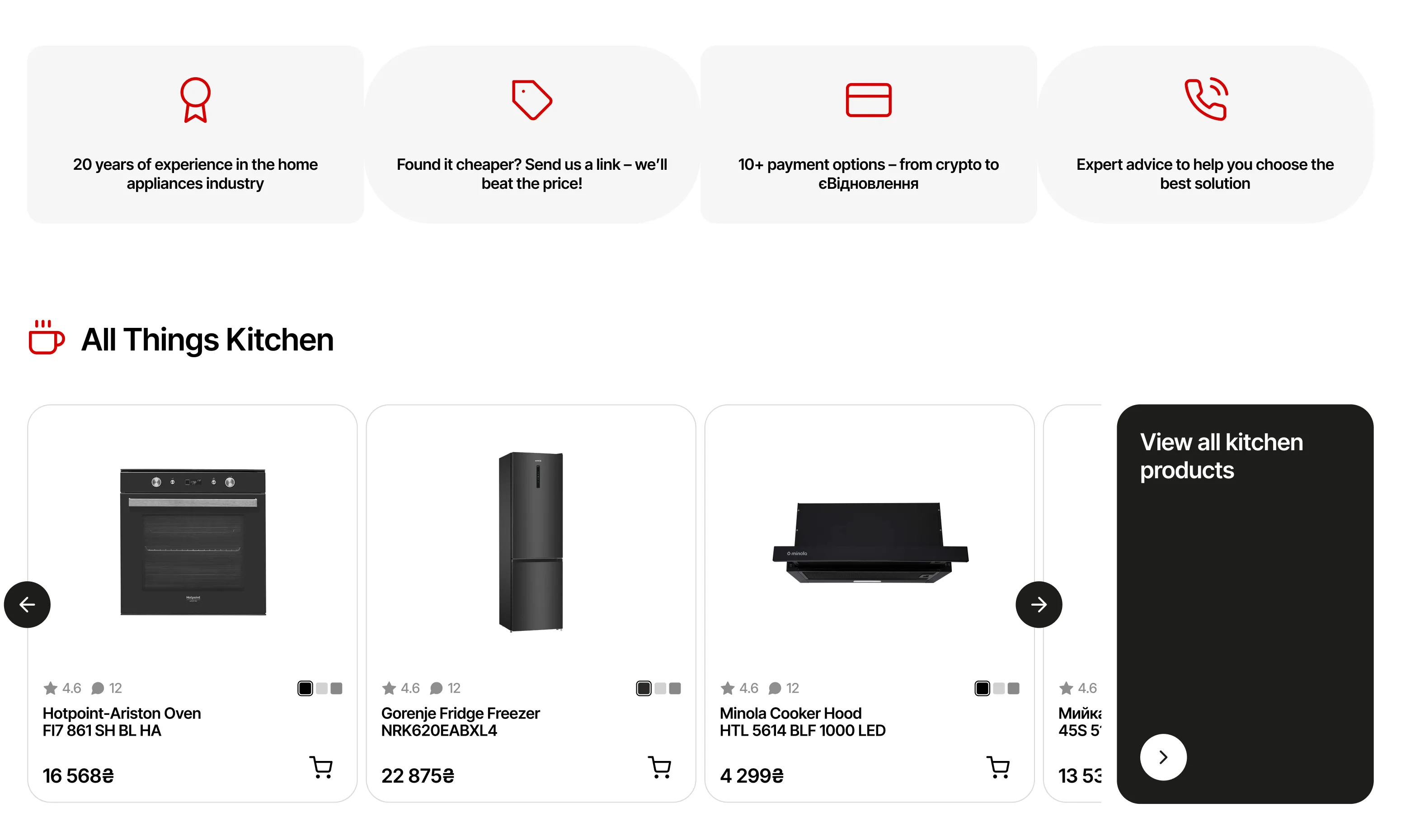
Present store's key advantages earlier in the journey to increase user trust and confidence.
Deliver a modern, responsive design that supports the brand's credibility, expertise, and tailored approach to each client.
I began by analysing competitor websites to understand how they structure user flows and present products. This helped identify both best practices and areas for improvement.
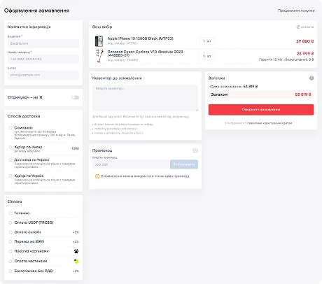
Not enough padding → hard to scan
Poor spacing in specs → hard to read
All info on the right → too many CTA's
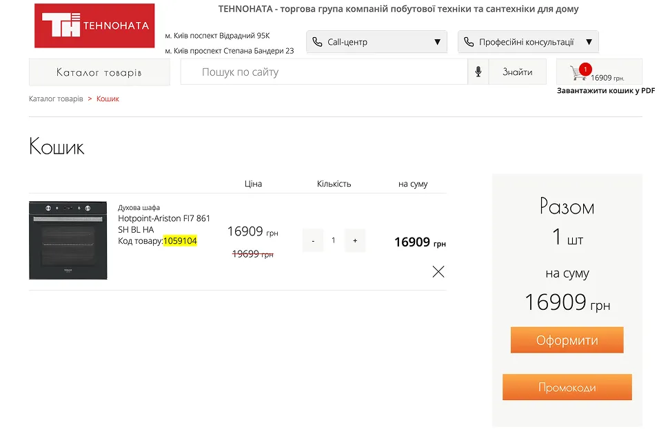
Short checkout form → faster to fill
Multi-step form → more drop off points
Visual clutter → CTA isn't clear
Key info & CTA fixed → quick access
Good spacing, less info → easy to scan
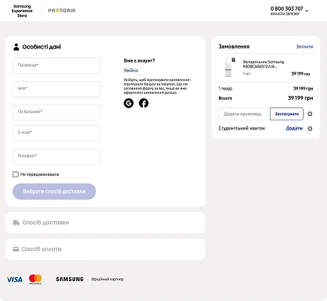
No "Place Order" CTA until form filled out → user can't see the end goal
Chaotic form layout → can miss sections
KEY TAKEAWAYS
/01
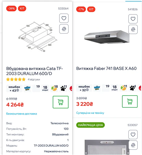
Product card needs to be clean, easy to scan, and not overloaded; additional specs presented on hover.
/02
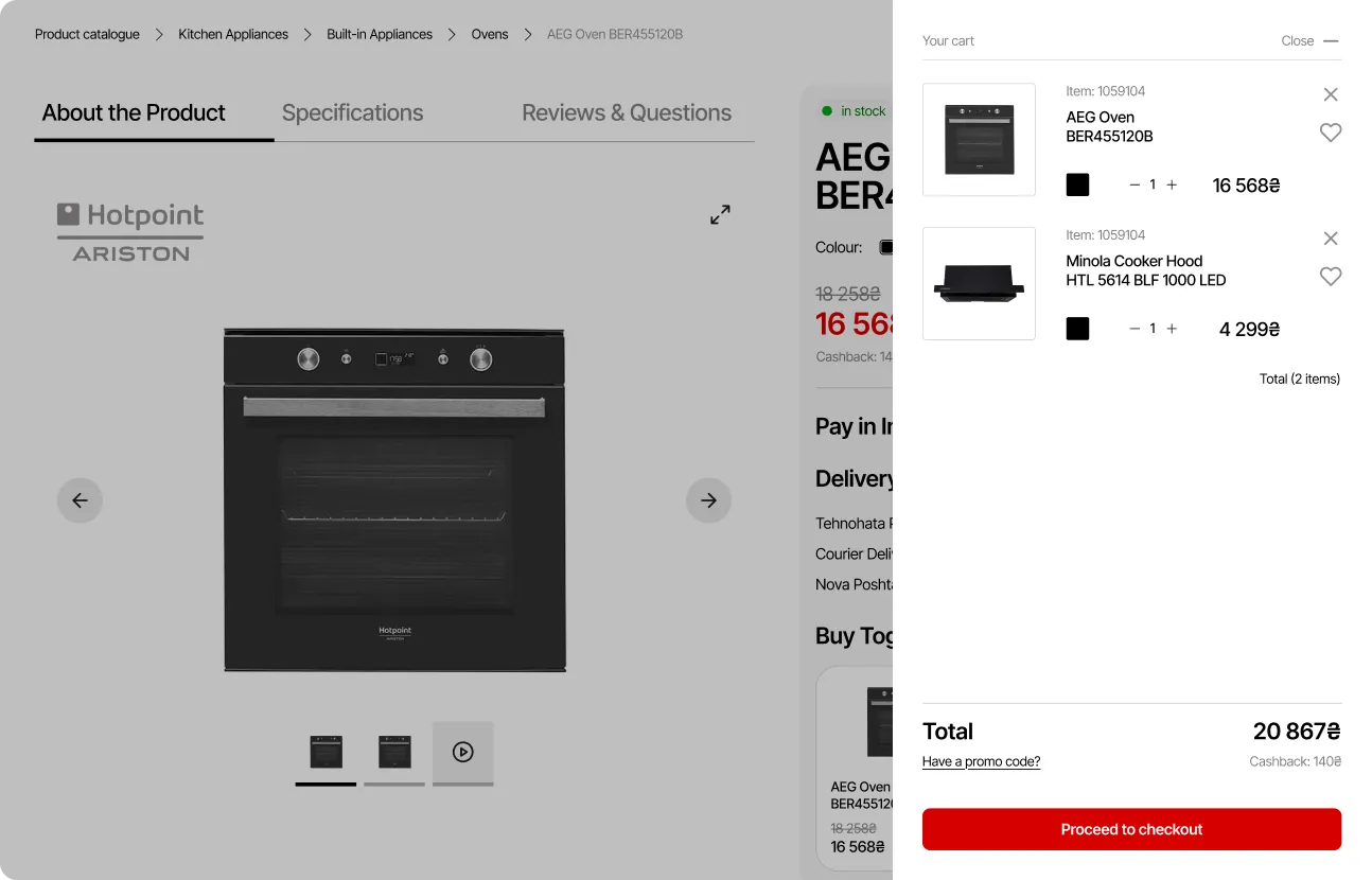
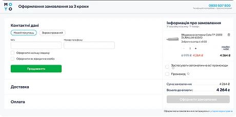
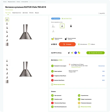
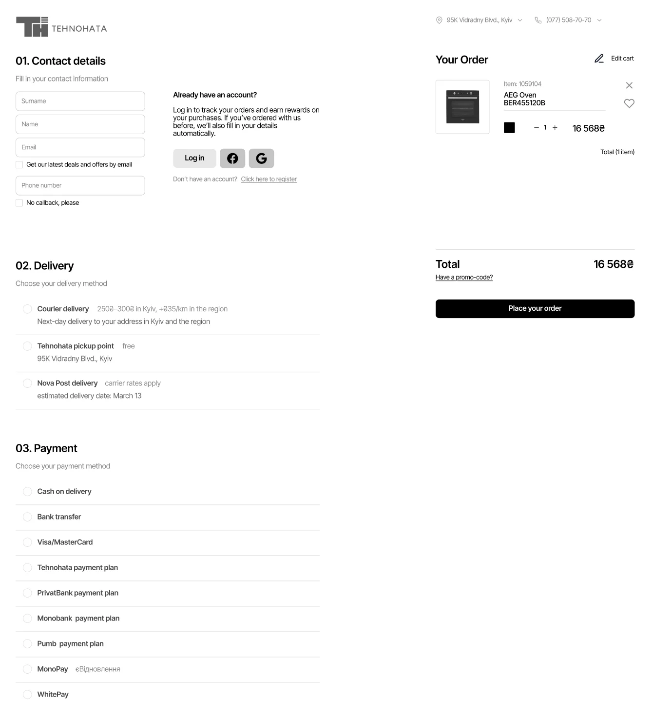
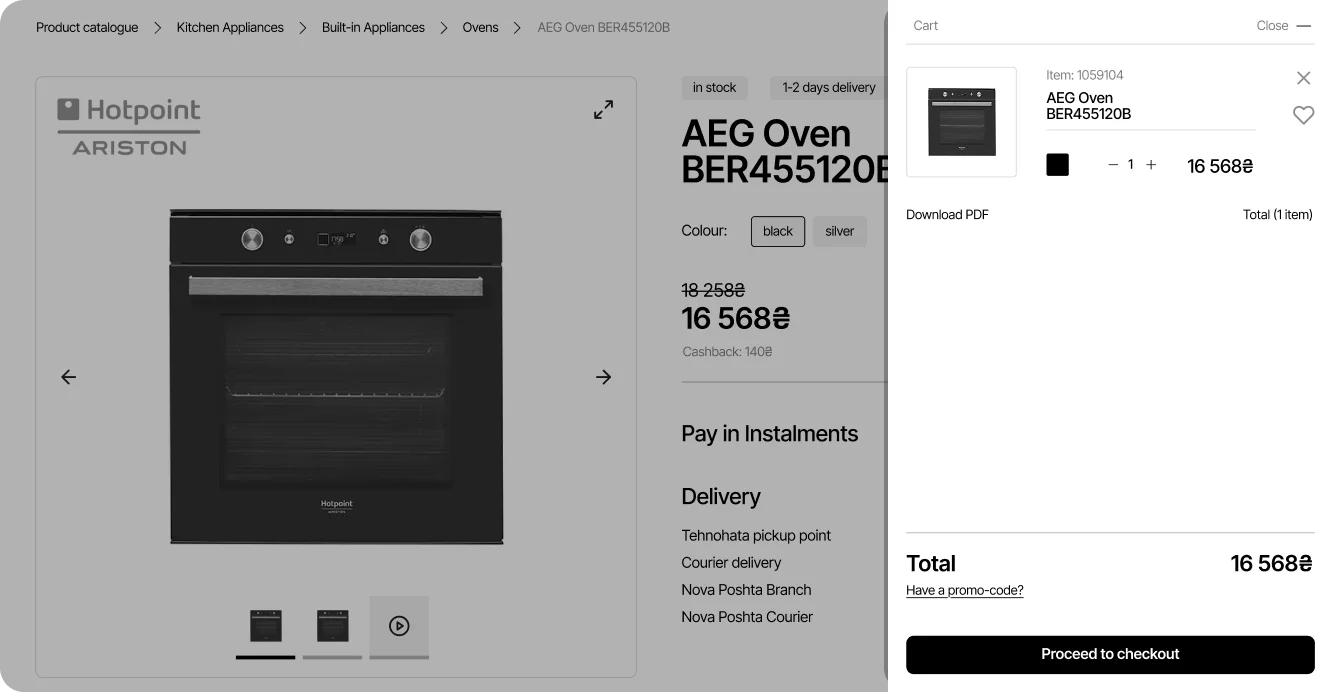
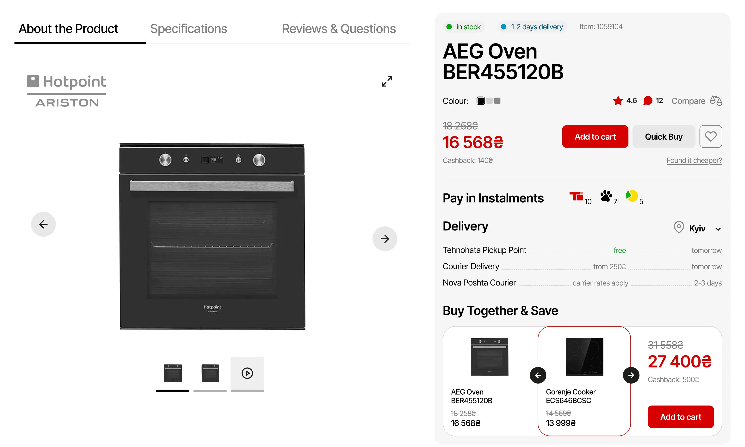
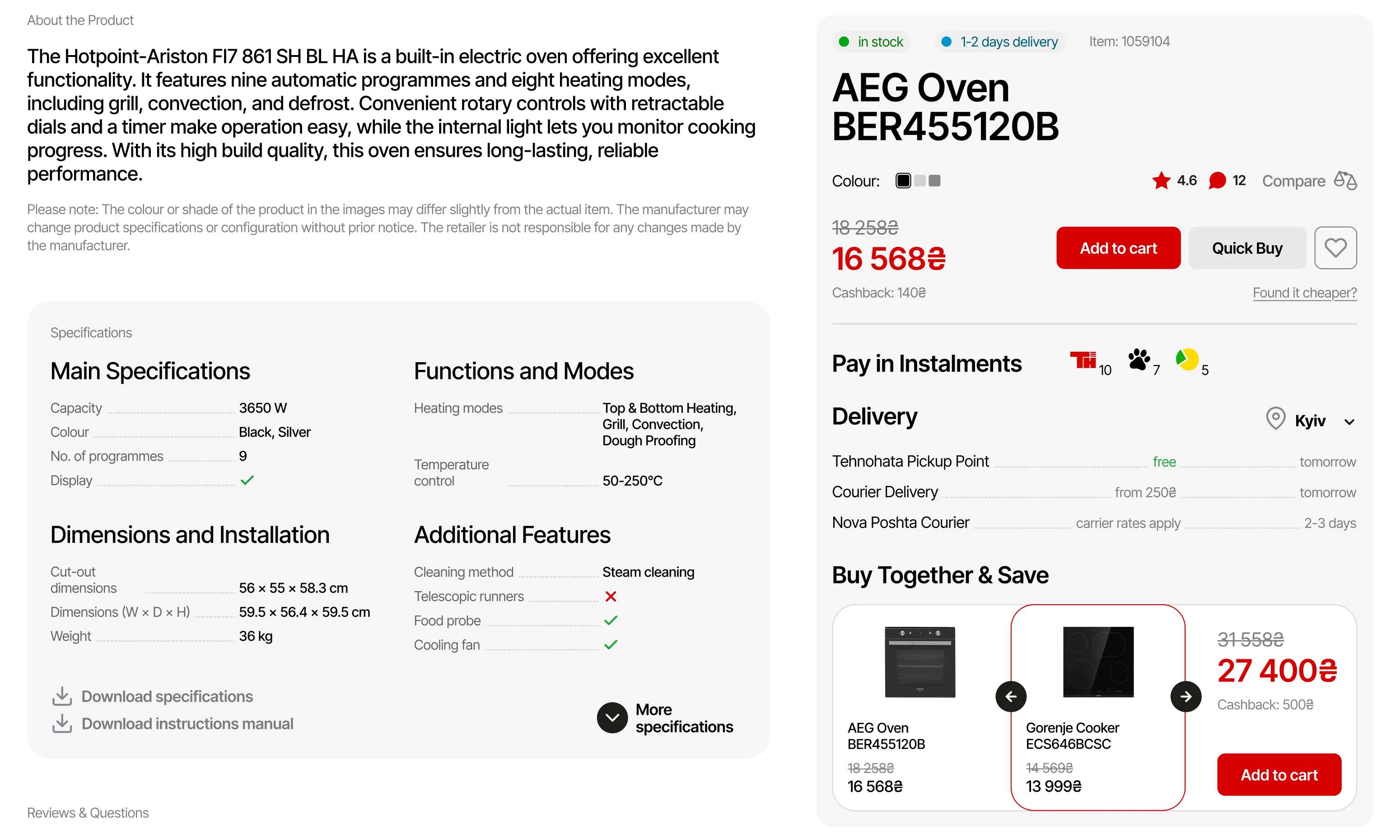
Product page needs to have key info like price, name, and CTA fixed and accessible while scrolling.
/03
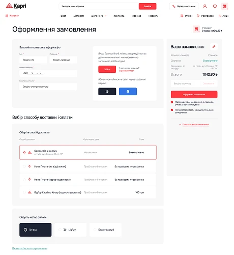
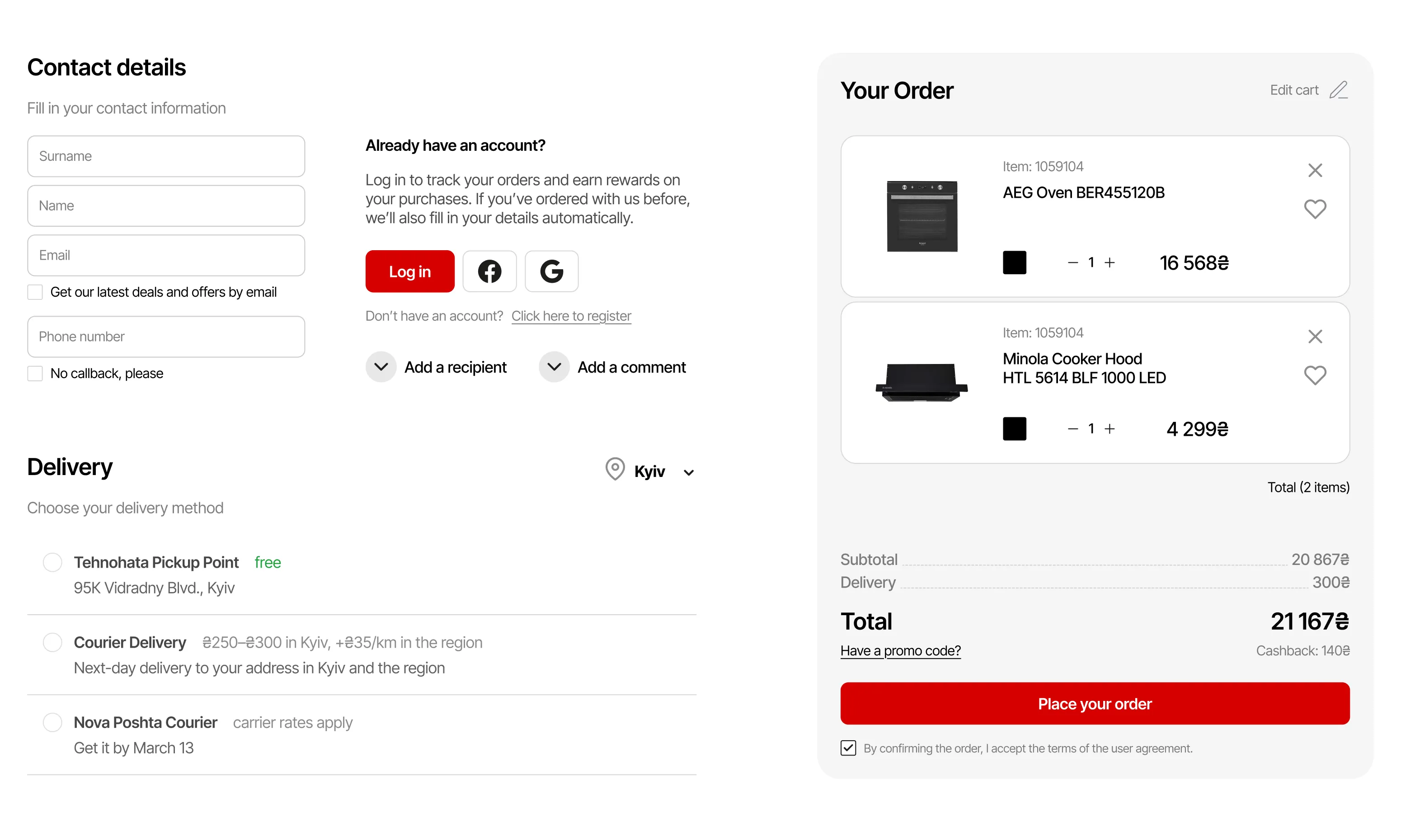
Simple checkout forms should show all steps at once — it reduces clicks & feels easier to complete.
Anna is a working mother from Kyiv who values practicality and reliability when choosing home appliances. She wants technology to simplify her life, but is cautious about where she buys it from.
I want reliable, long-lasting appliances from reputable brands.
I'm interested in promotions and discounts, as renovation gets pretty expensive.
I need products that fit my chosen interior style.
I then mapped out the key journey of purchasing an oven to structure the experience around a realistic, goal-driven scenario. This flow is a simplified version of the original for illustrative purposes.

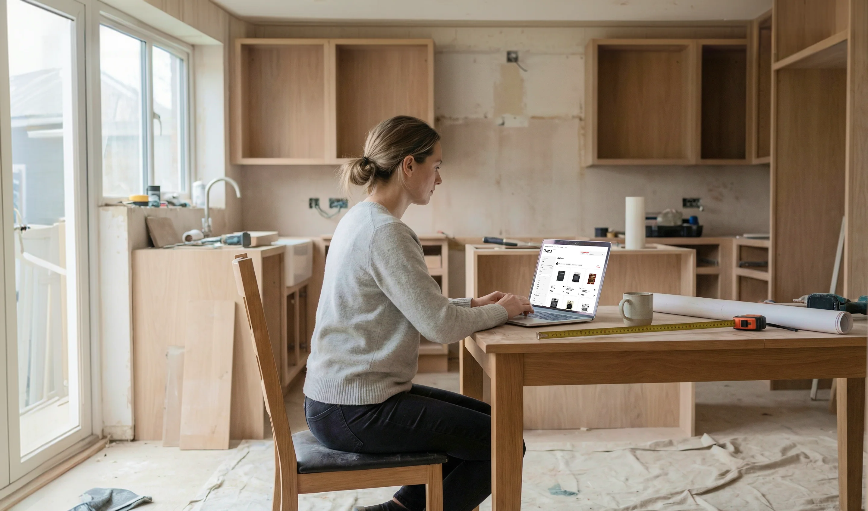
I designed a high-fidelity interactive prototype to simulate a realistic shopping experience, ready for testing. During this phase, I also reworked the product categorisation to improve usability and product discovery.
I tested the prototype with five users through short interviews and usability tasks. Based on their feedback, I identified areas for improvement and iterated on the design. Below are a few selected insights from the many I analysed.
BEFORE
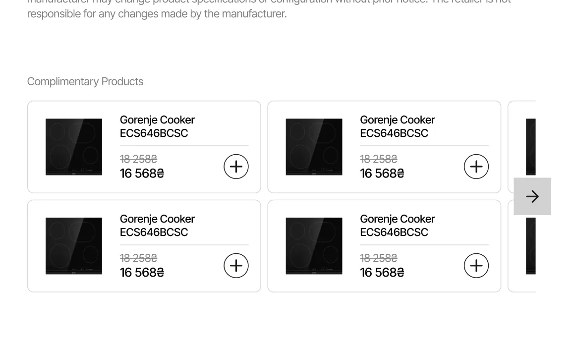
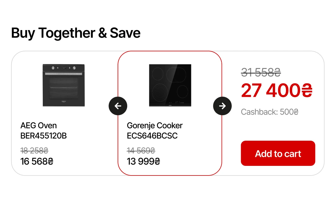
/01 PRODUCT BUNDLES
INSIGHT
Users preferred tangible discounts over complimentary products.
SOLUTION
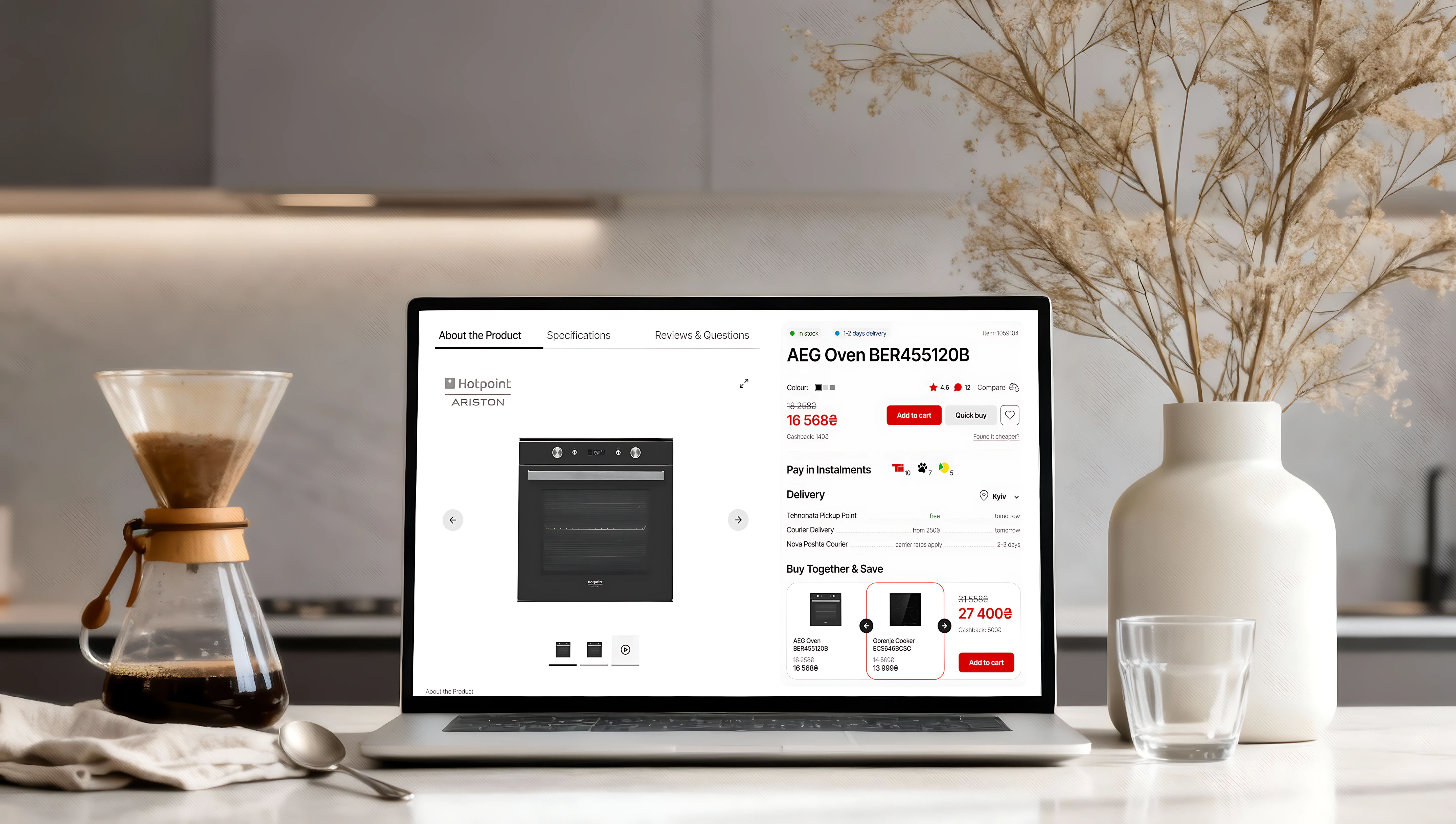
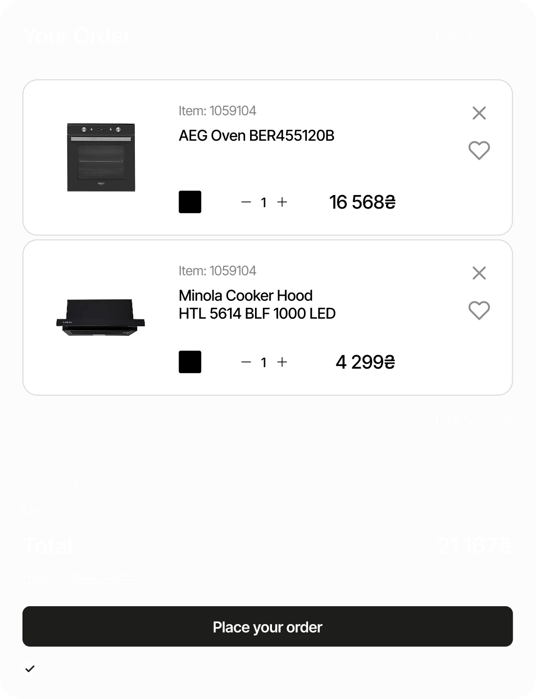
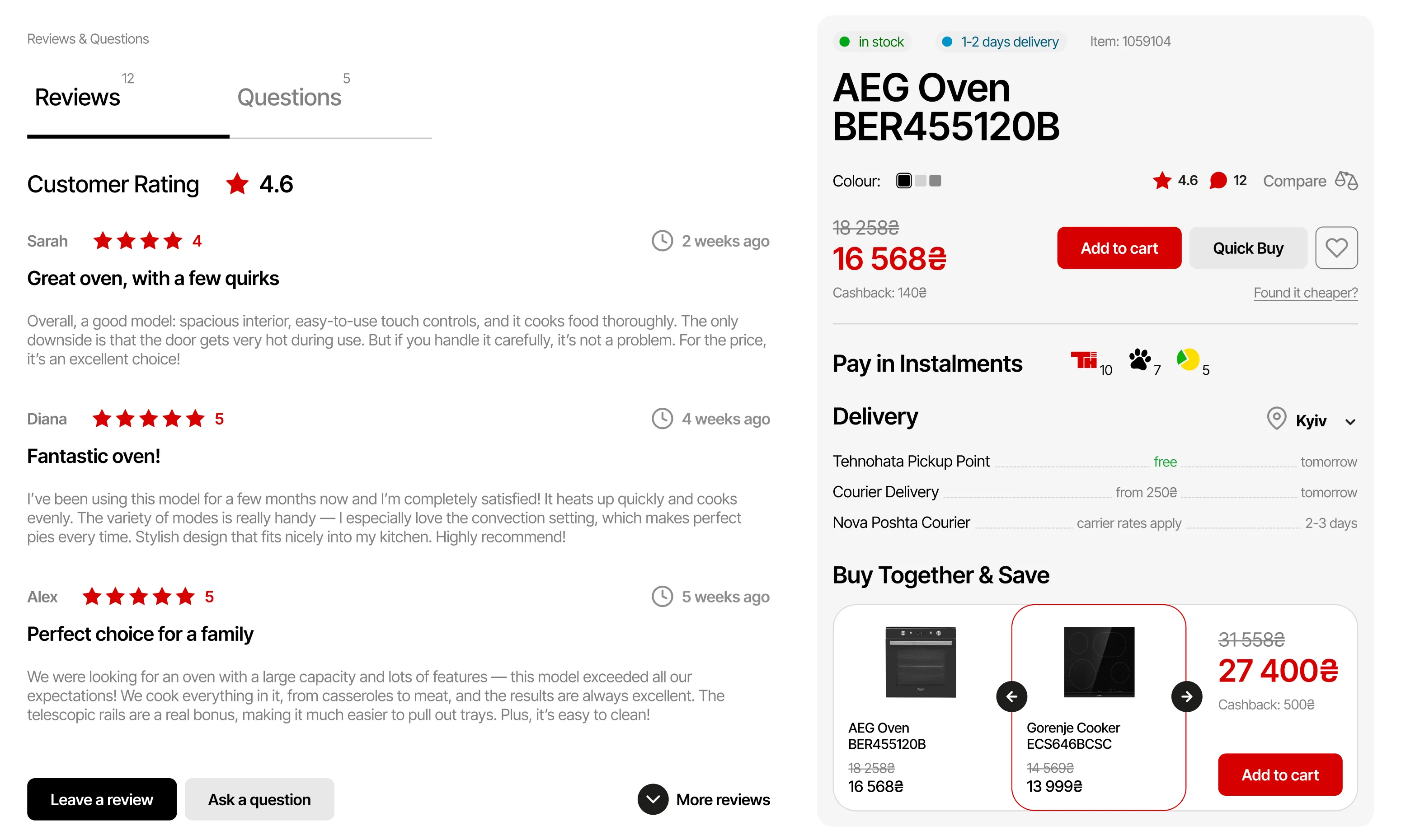
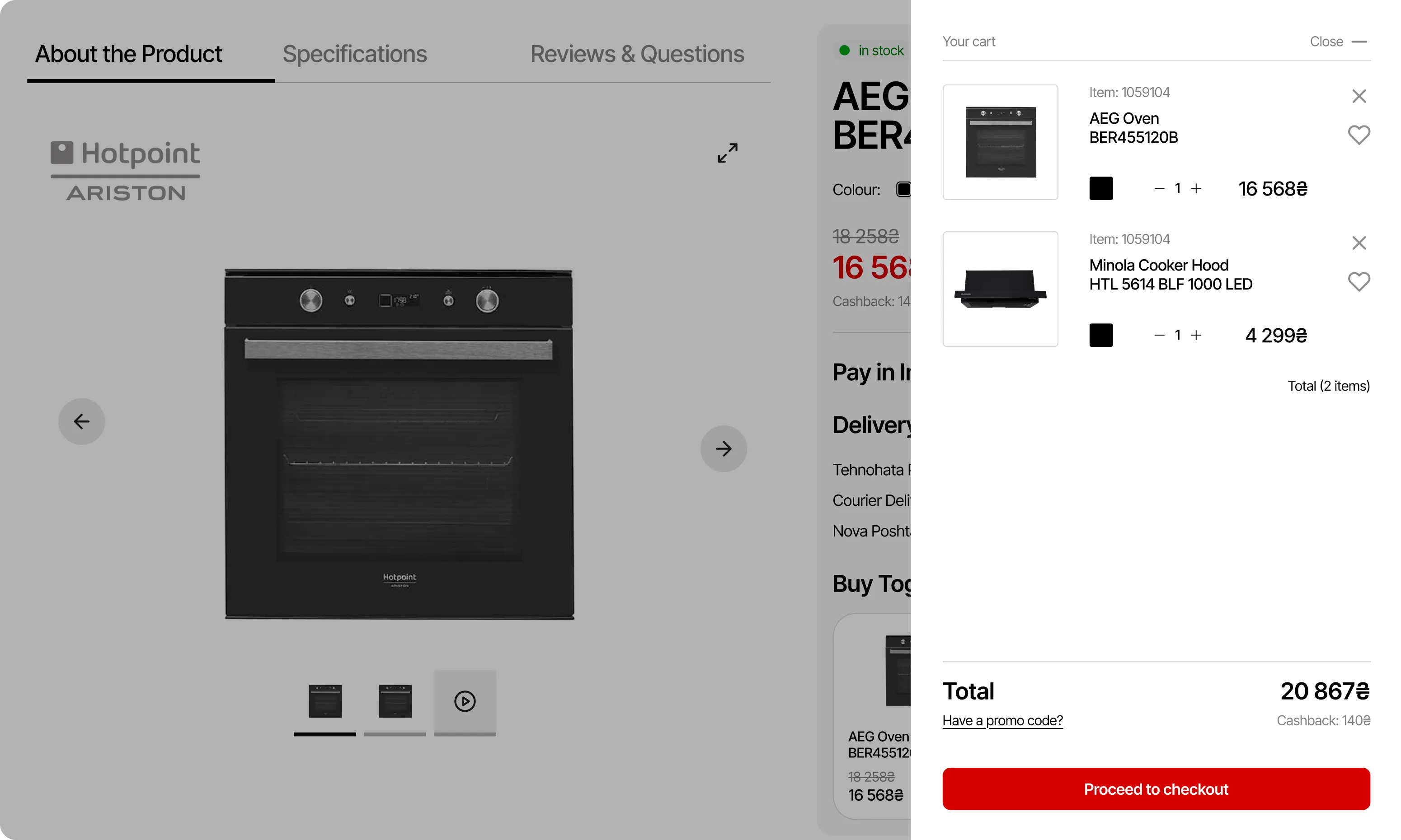
Added a "buy together & save" feature for users to purchase related items at a combined savings.
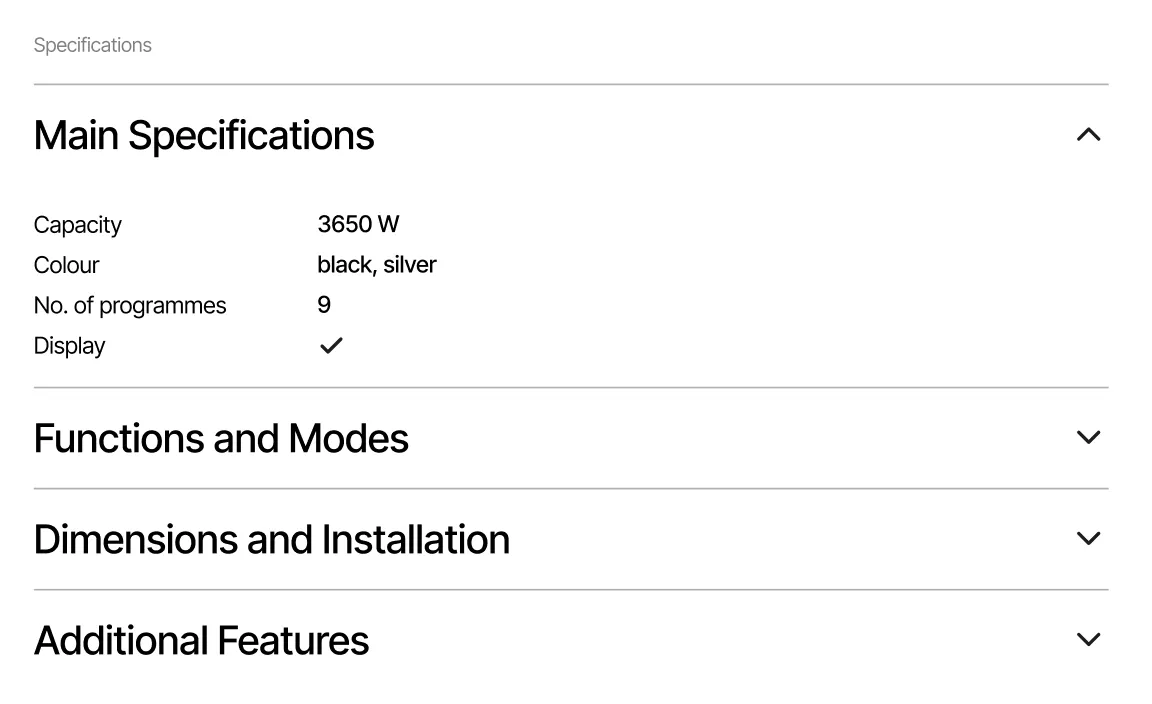
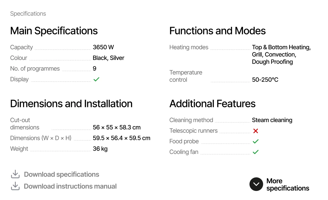
/02 PRODUCT SPECS
INSIGHT
Users found it inconvenient to open multiple accordions.
SOLUTION
Displayed key specs in a compact card with an option to expand for full details.
/03 TOP PRODUCTS
INSIGHT
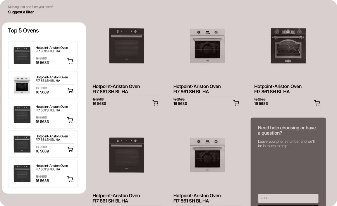
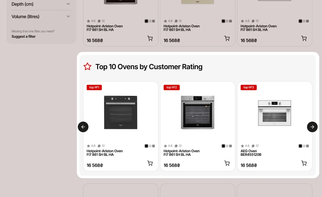
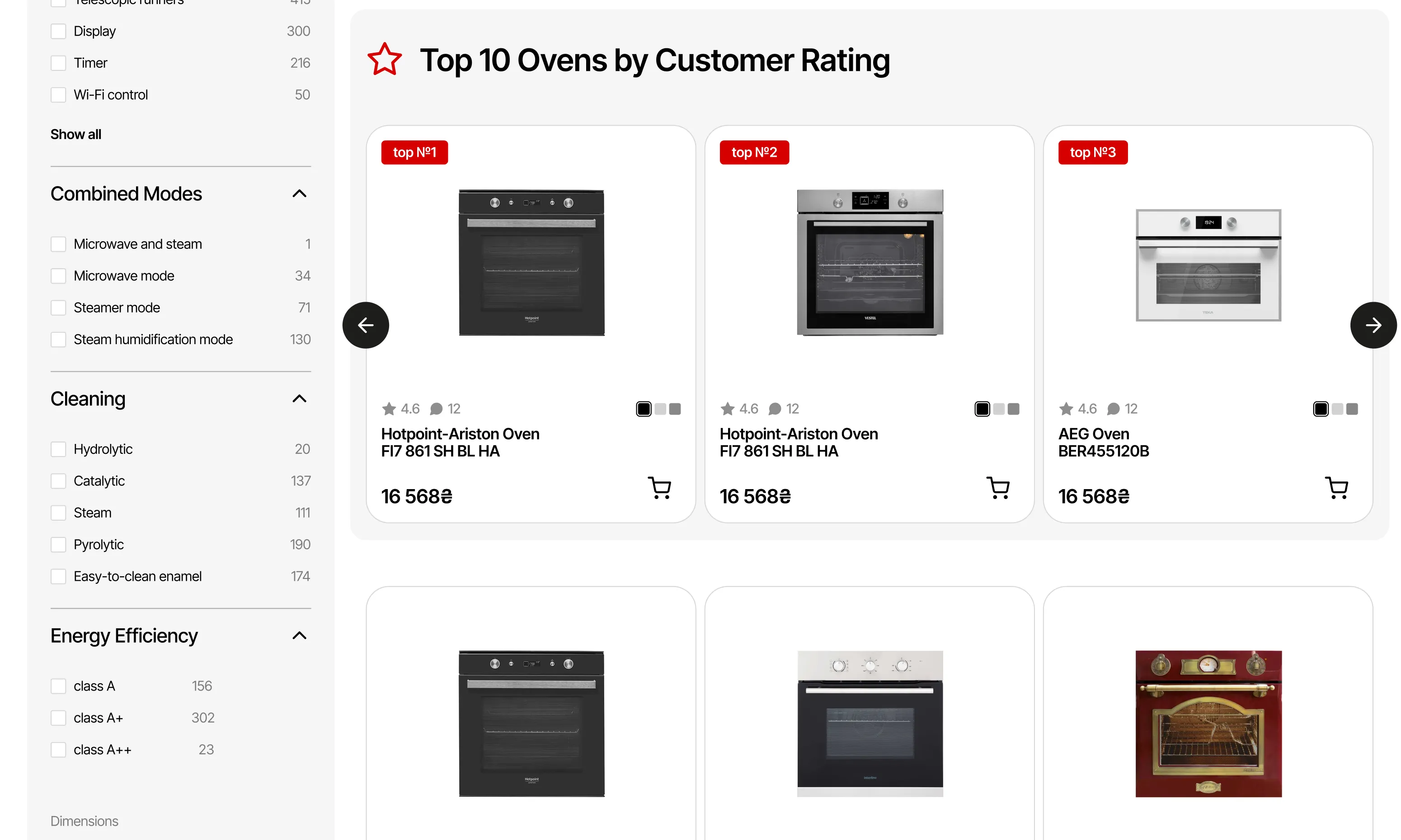
Users struggled to find top-rated products hidden below filters.
SOLUTION
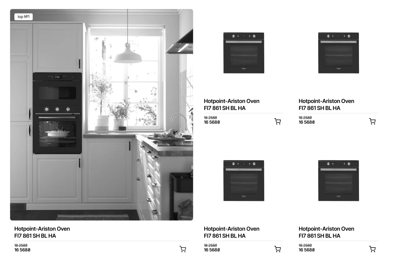
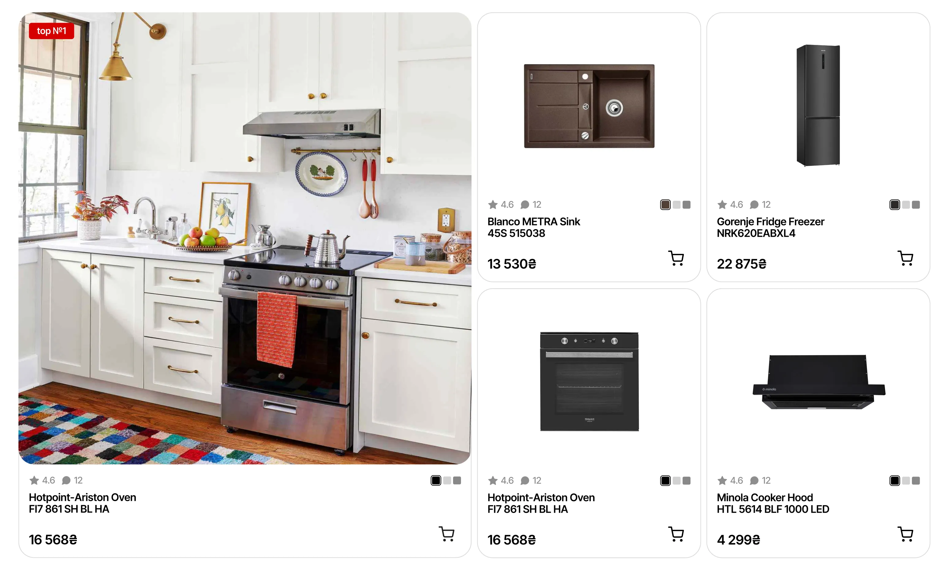
Added a larger 'Top Rated Products' section to help users find trusted items quickly.
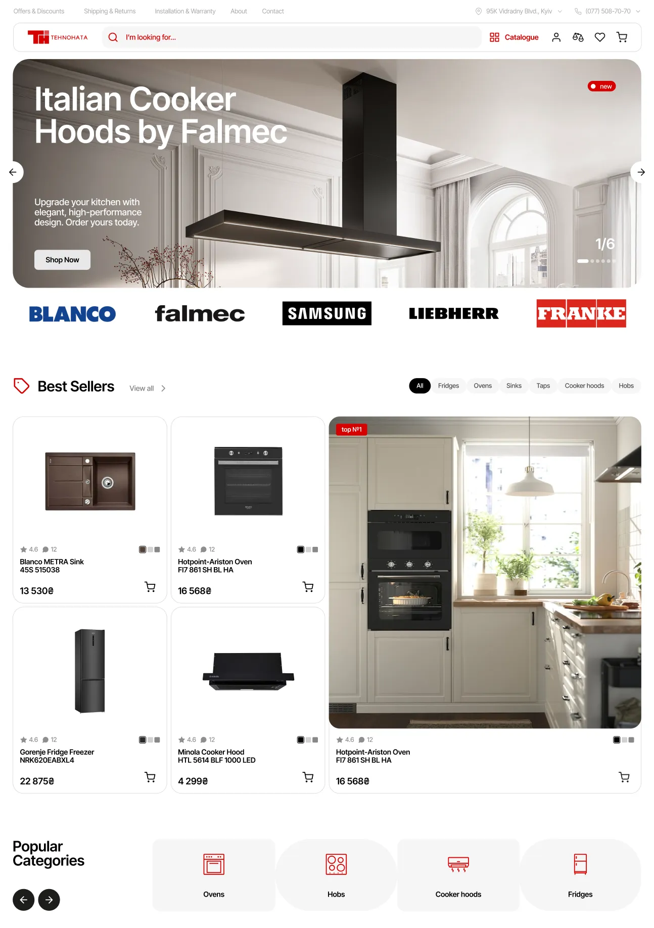
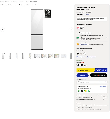
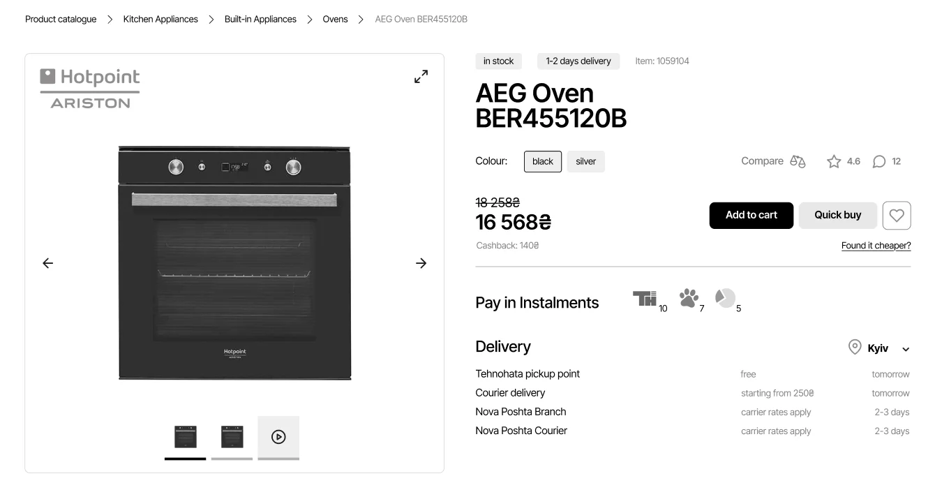
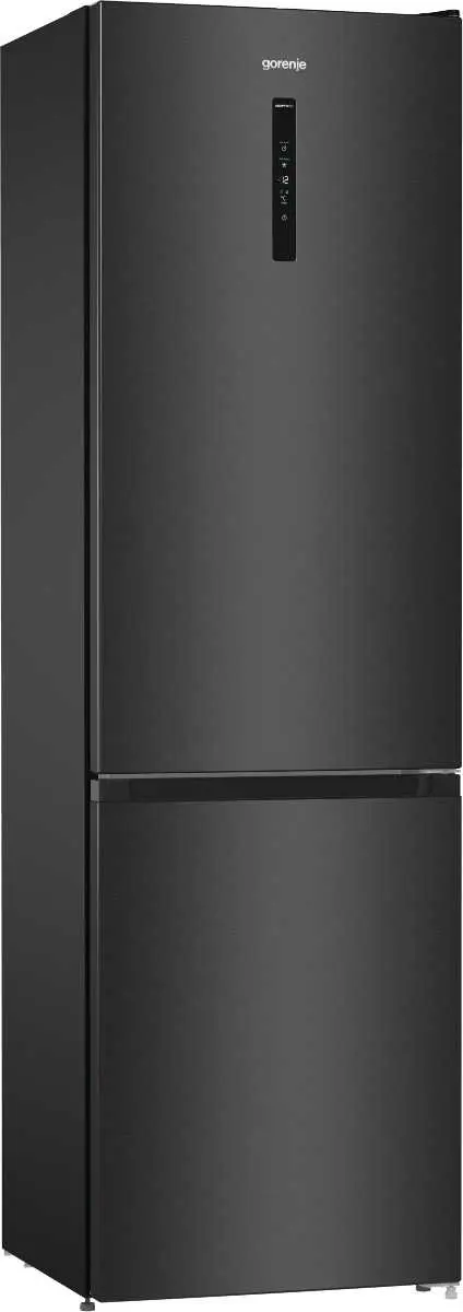
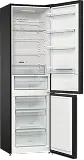
Product page has a more modern layout with key CTA fixed on the screen. It is now visually organised and easy to scan. Specs are clear and concise. “Buy together & save” feature increases revenue by offering a bundle.
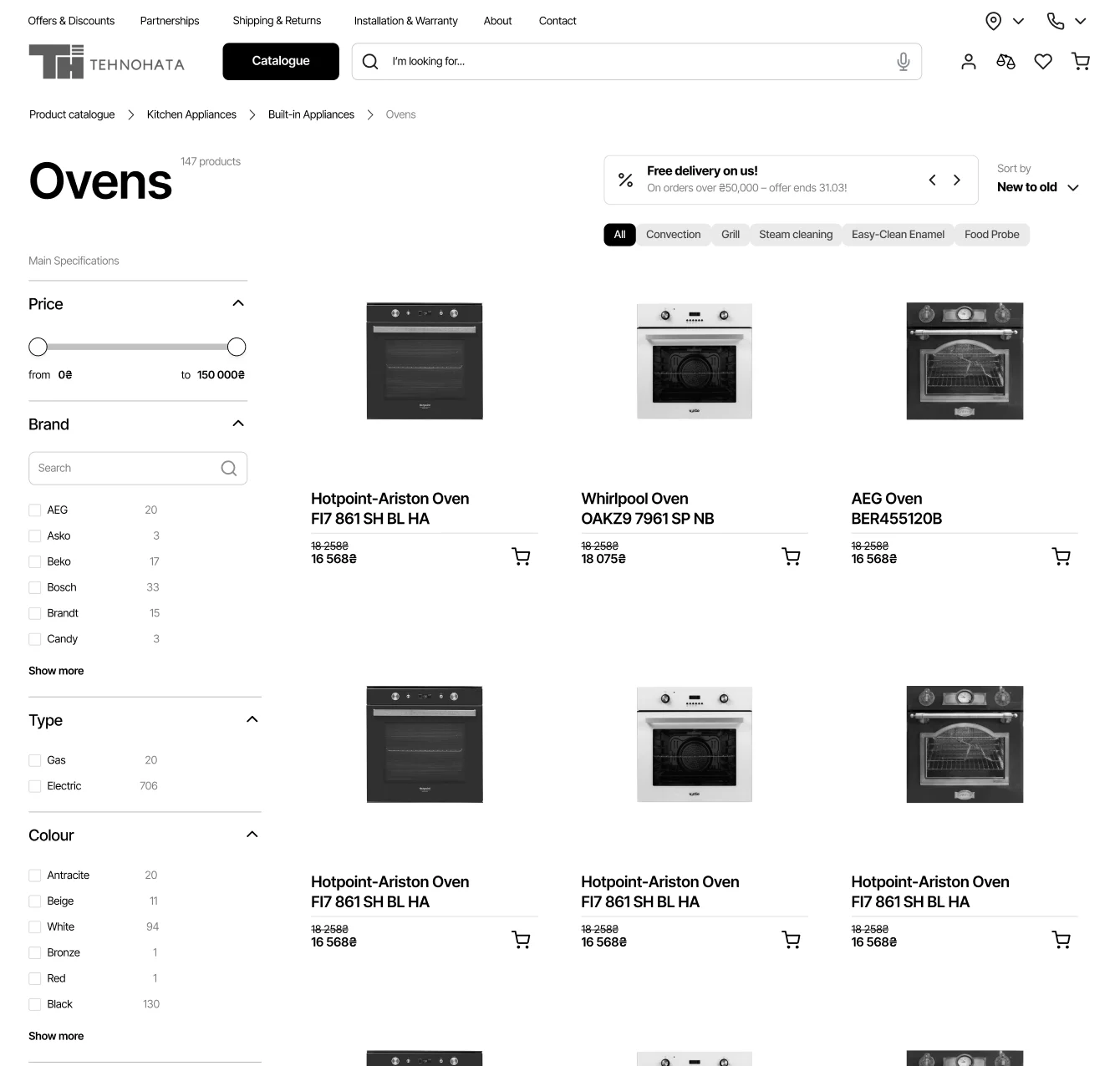
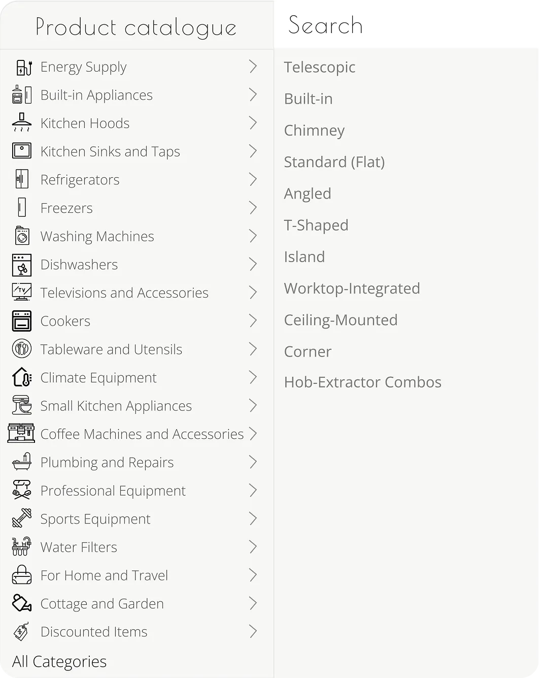
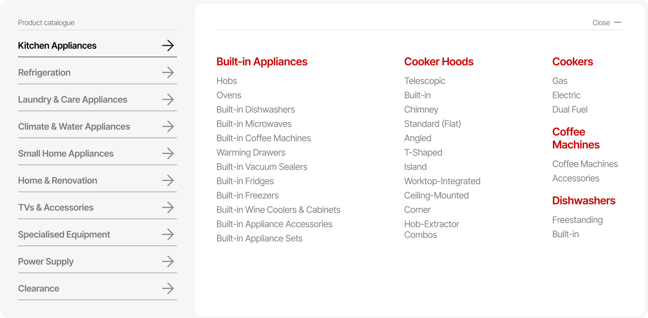
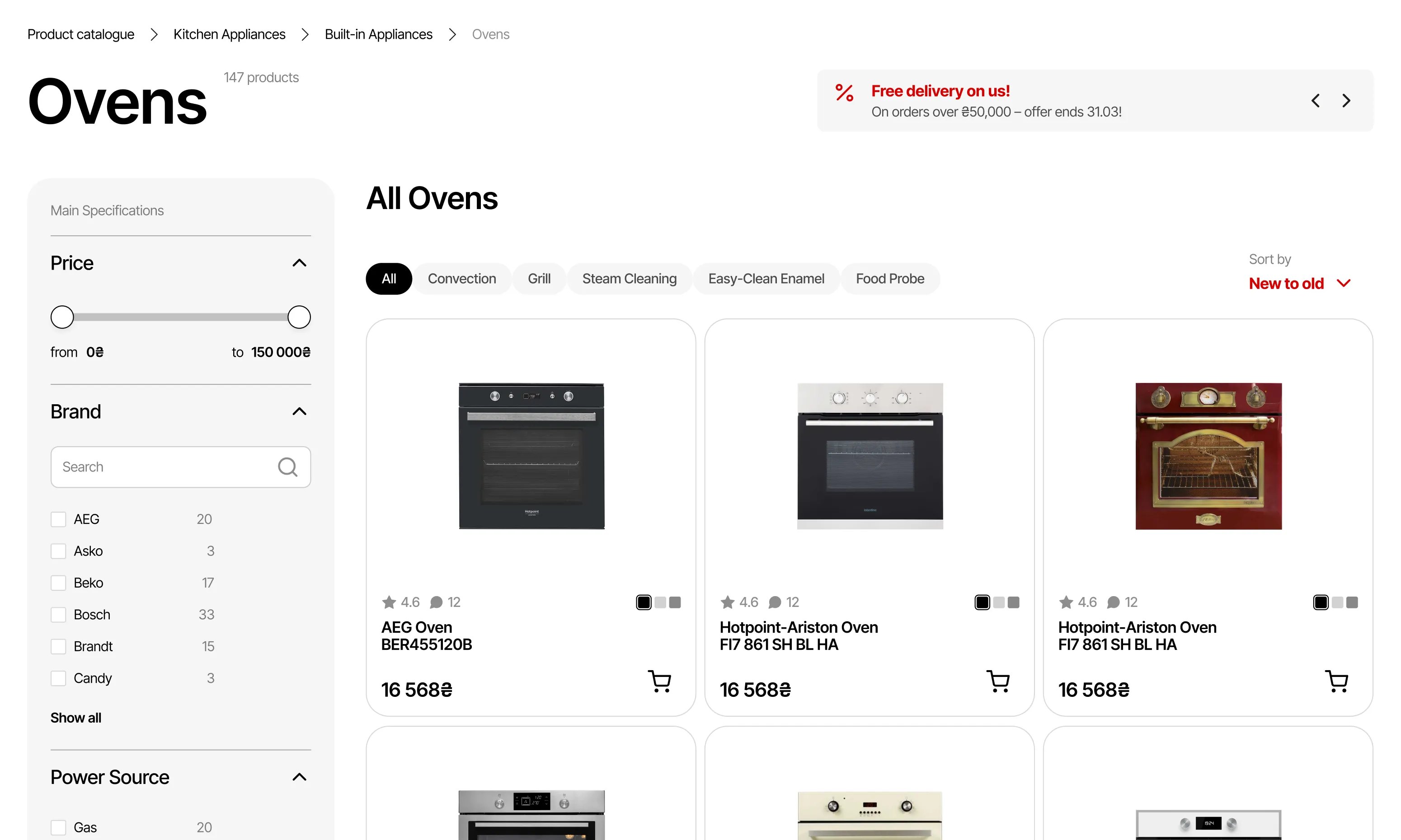
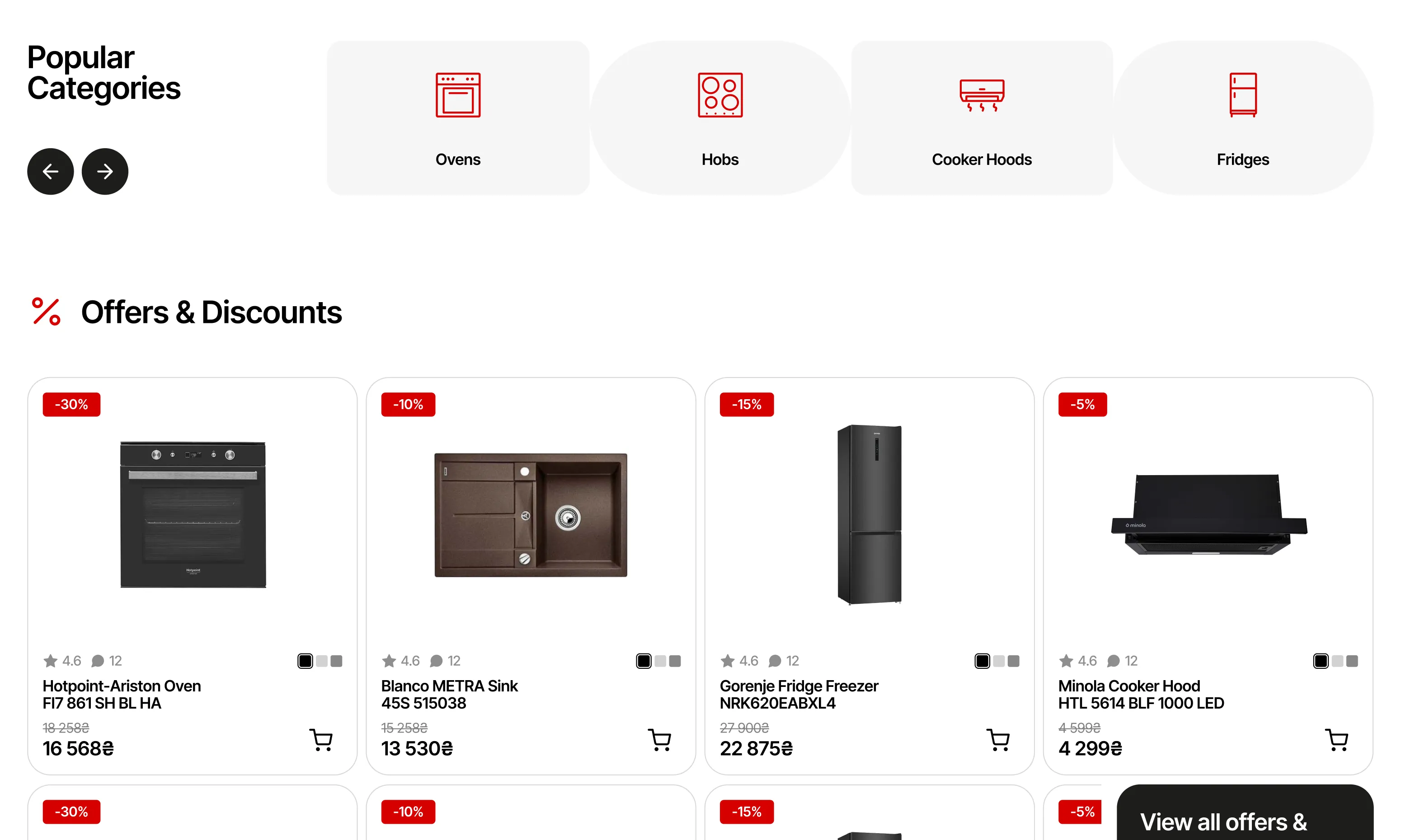
By introducing another level of hierarchy to the catalogue, I significantly reduced the main list of categories, making it easier to narrow down quickly. The horizontal catalogue uses space more efficiently and helps guide the users eye left to right.
BEFORE
AFTER
swipe


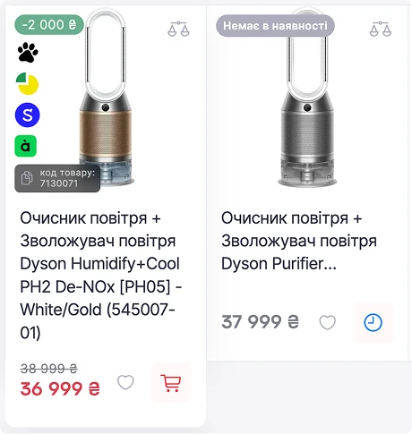
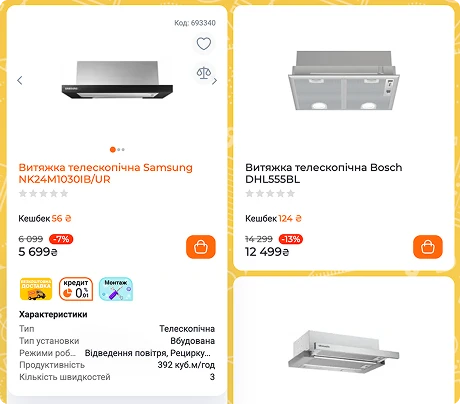
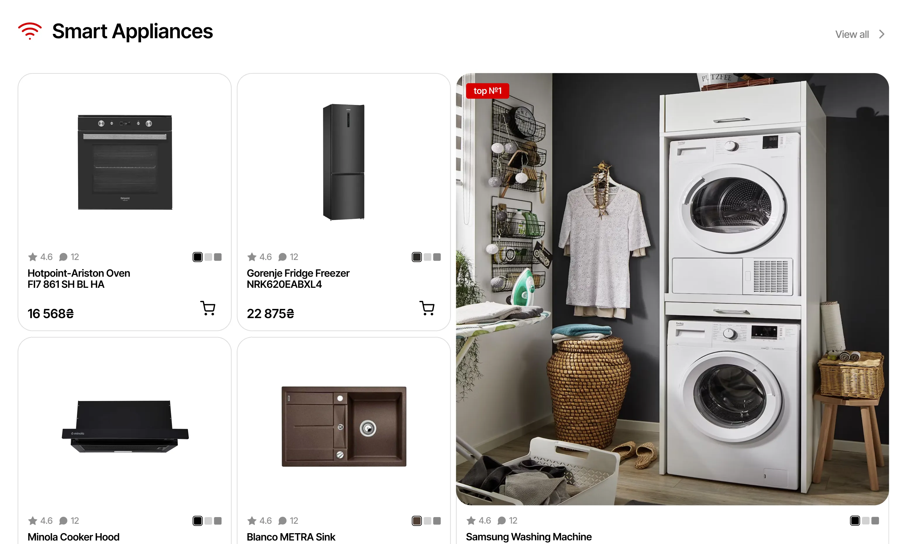
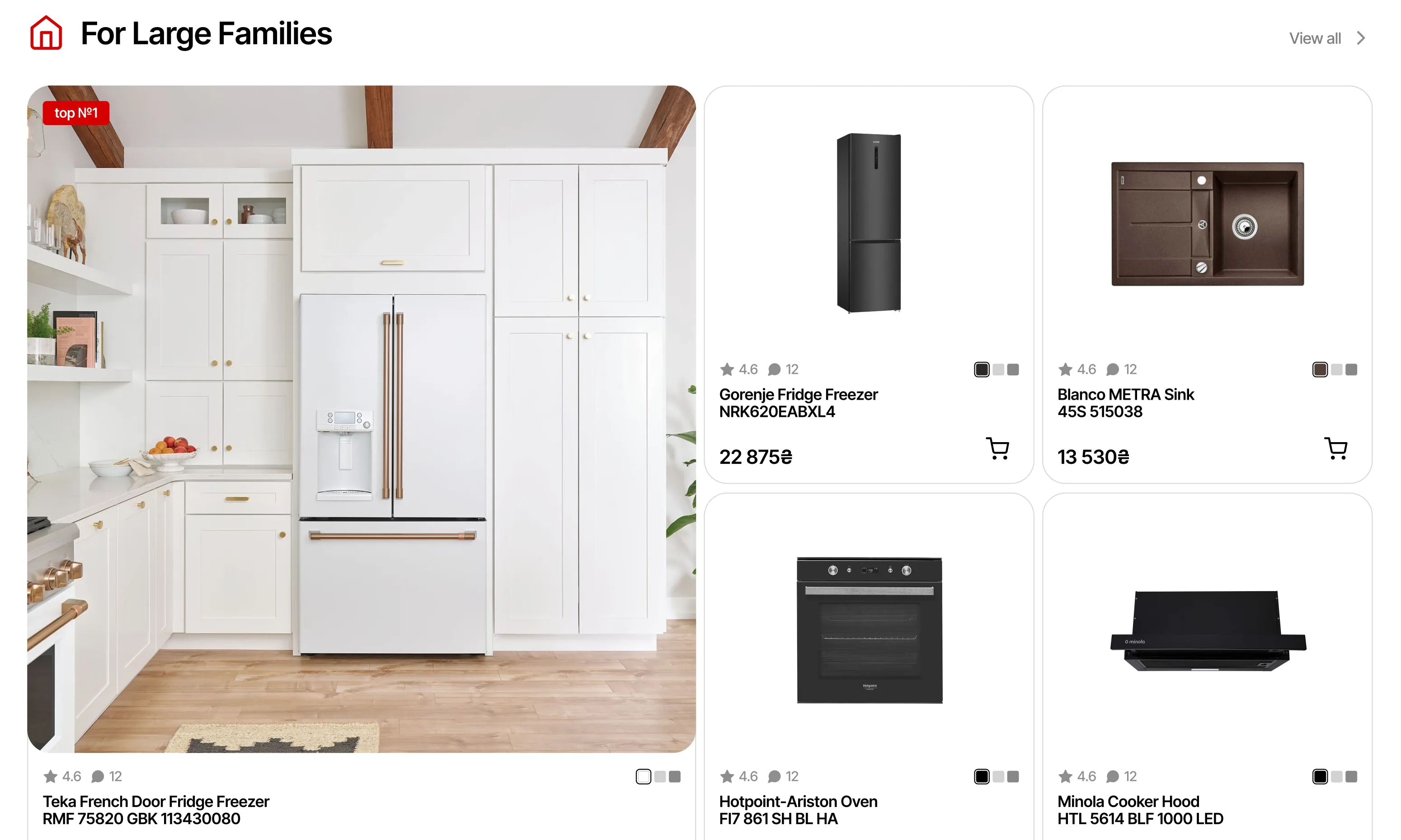
The new card is cleaner, with lots of room for product image and CTA clearly visible. Colour options, product rating and key specs shown on hover help user compare products at a glance.
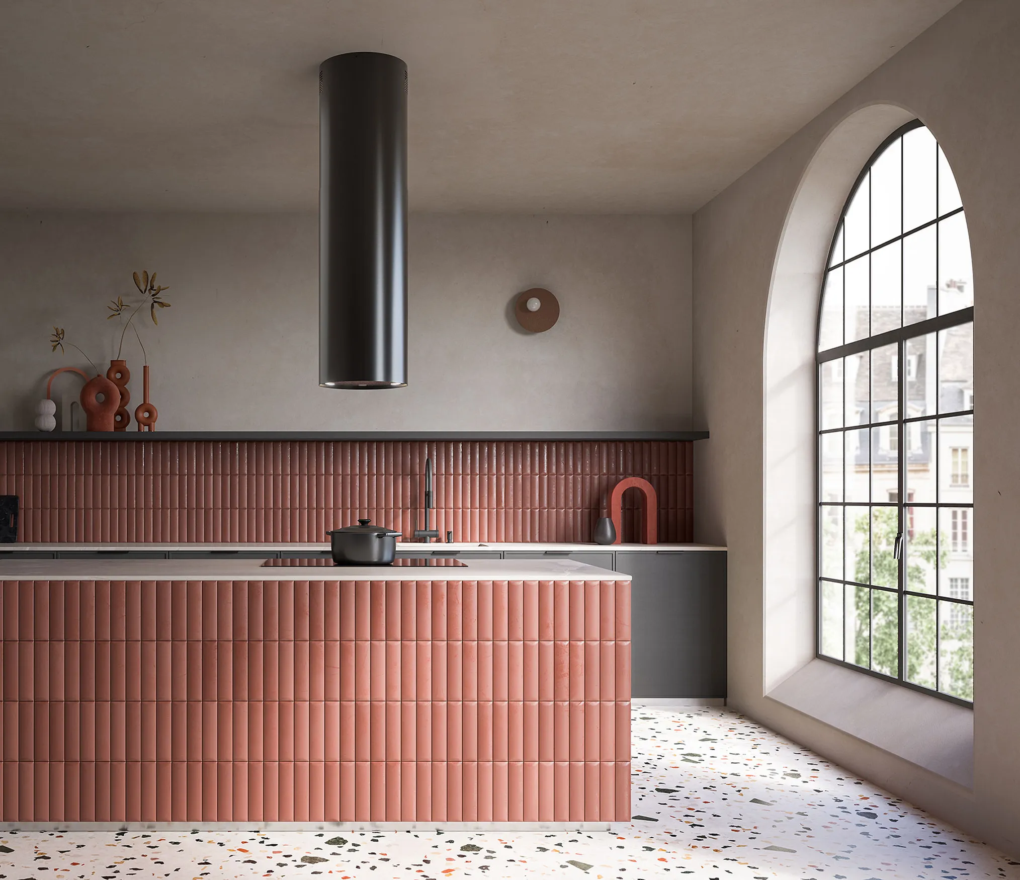


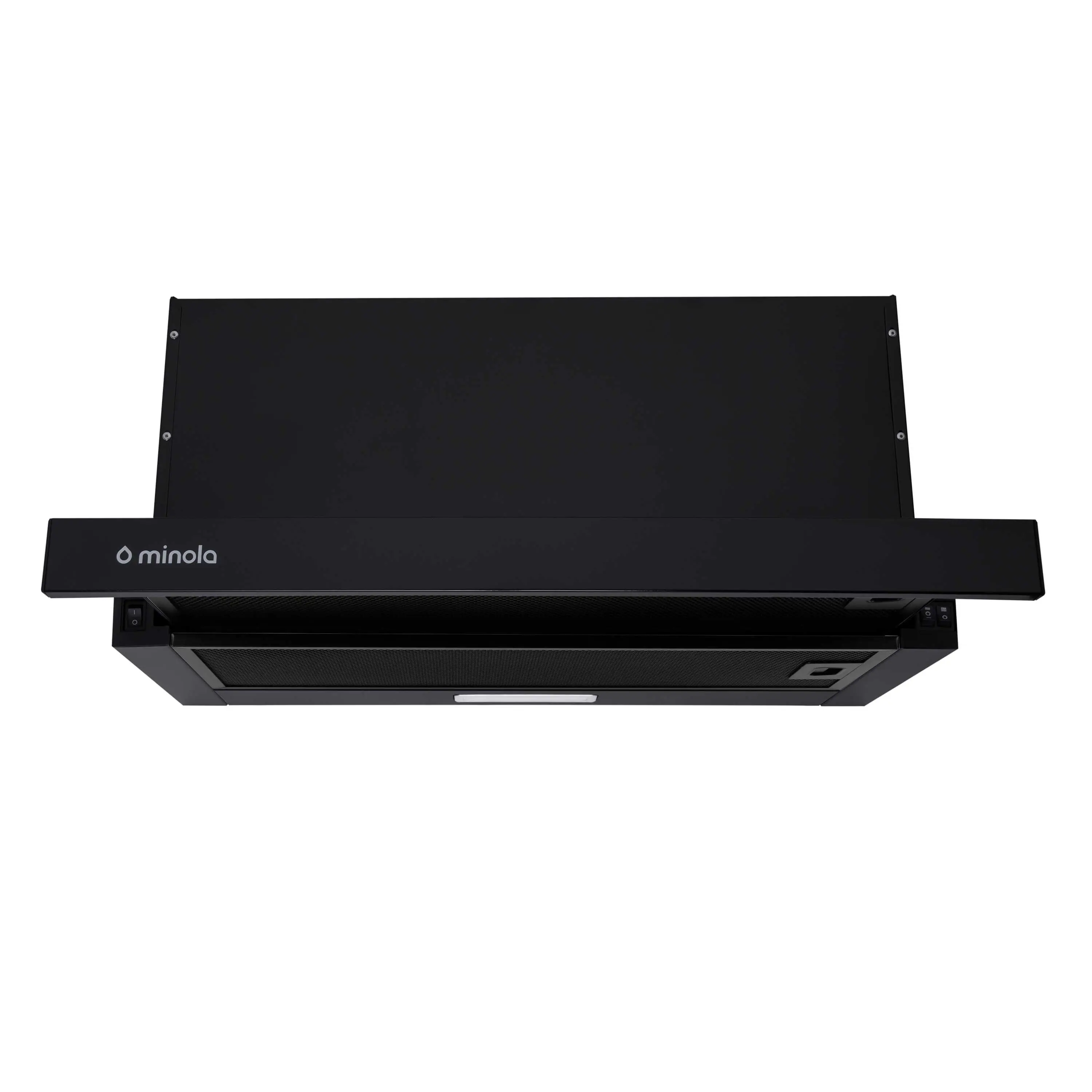
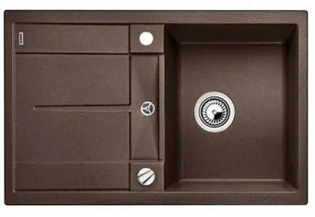
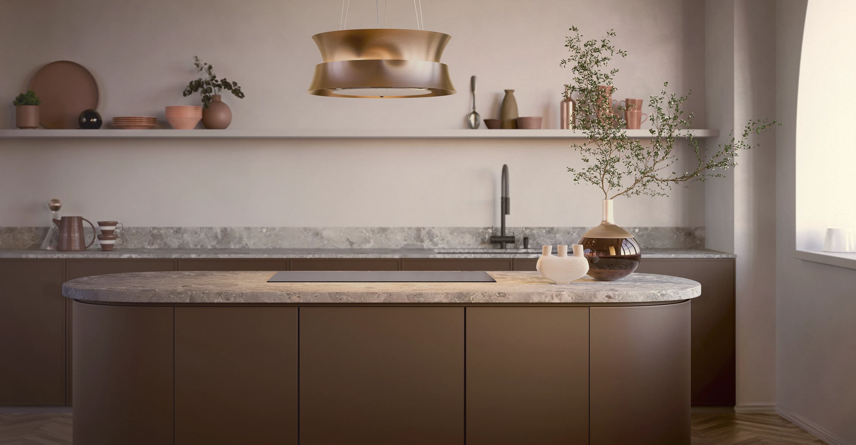
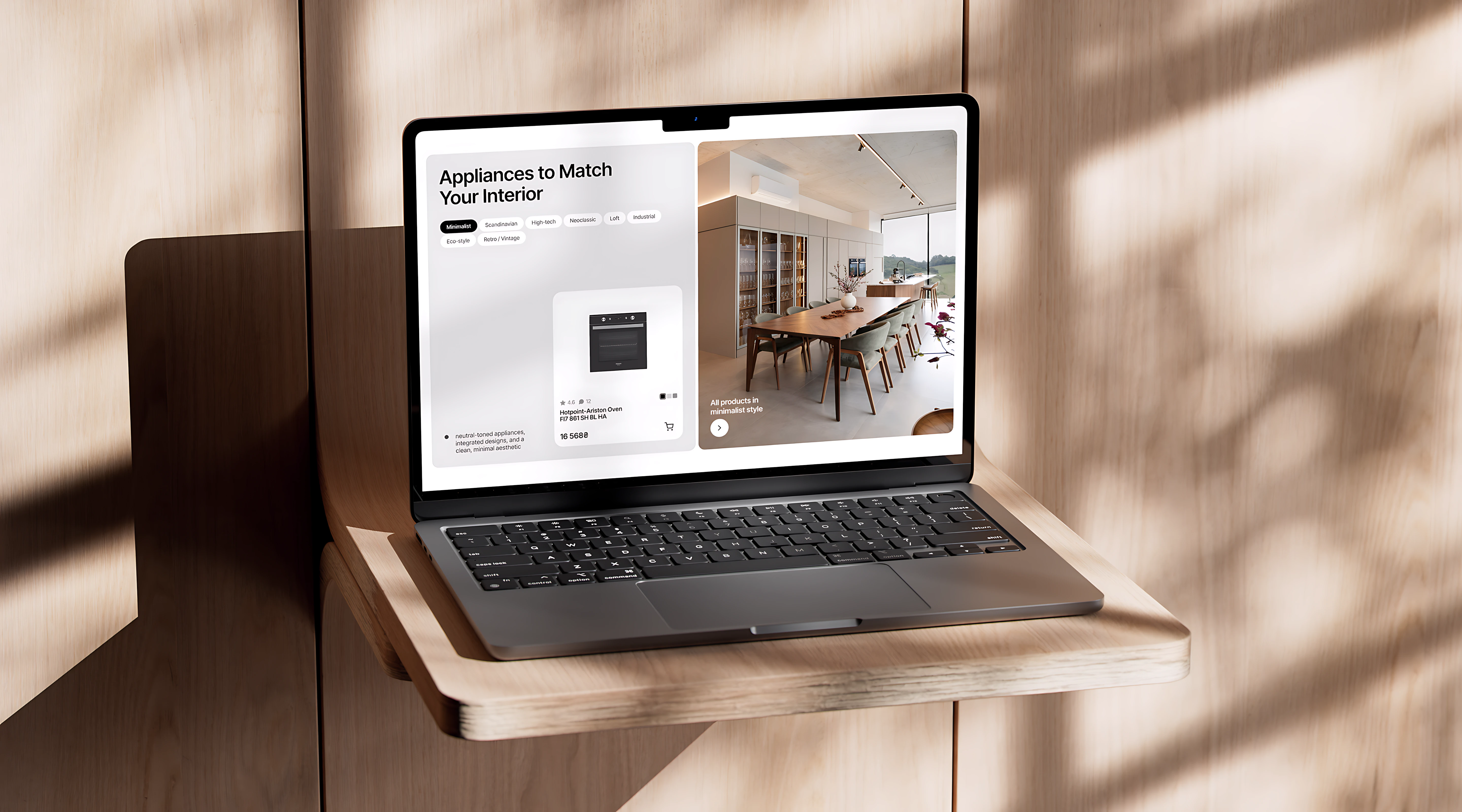
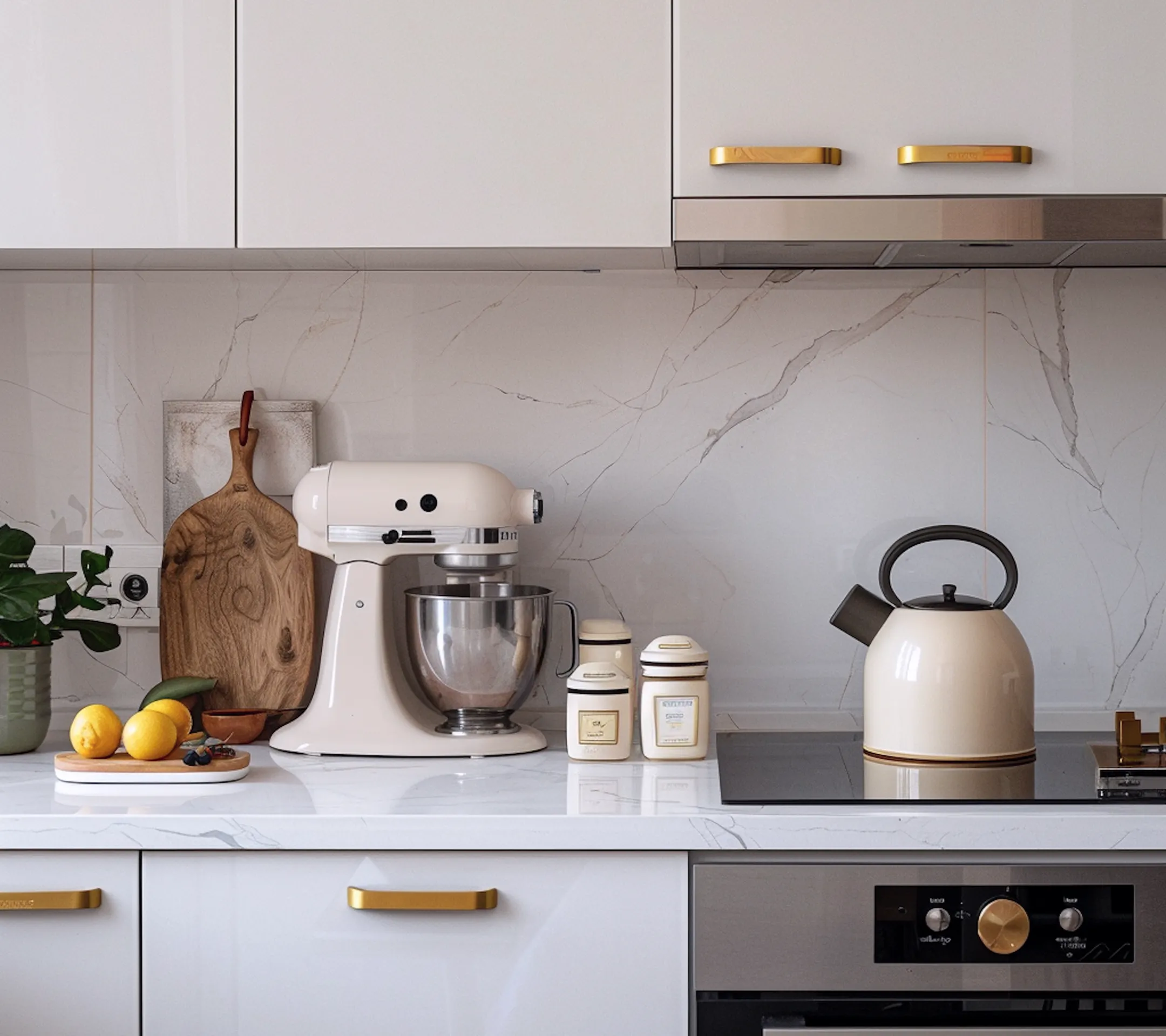
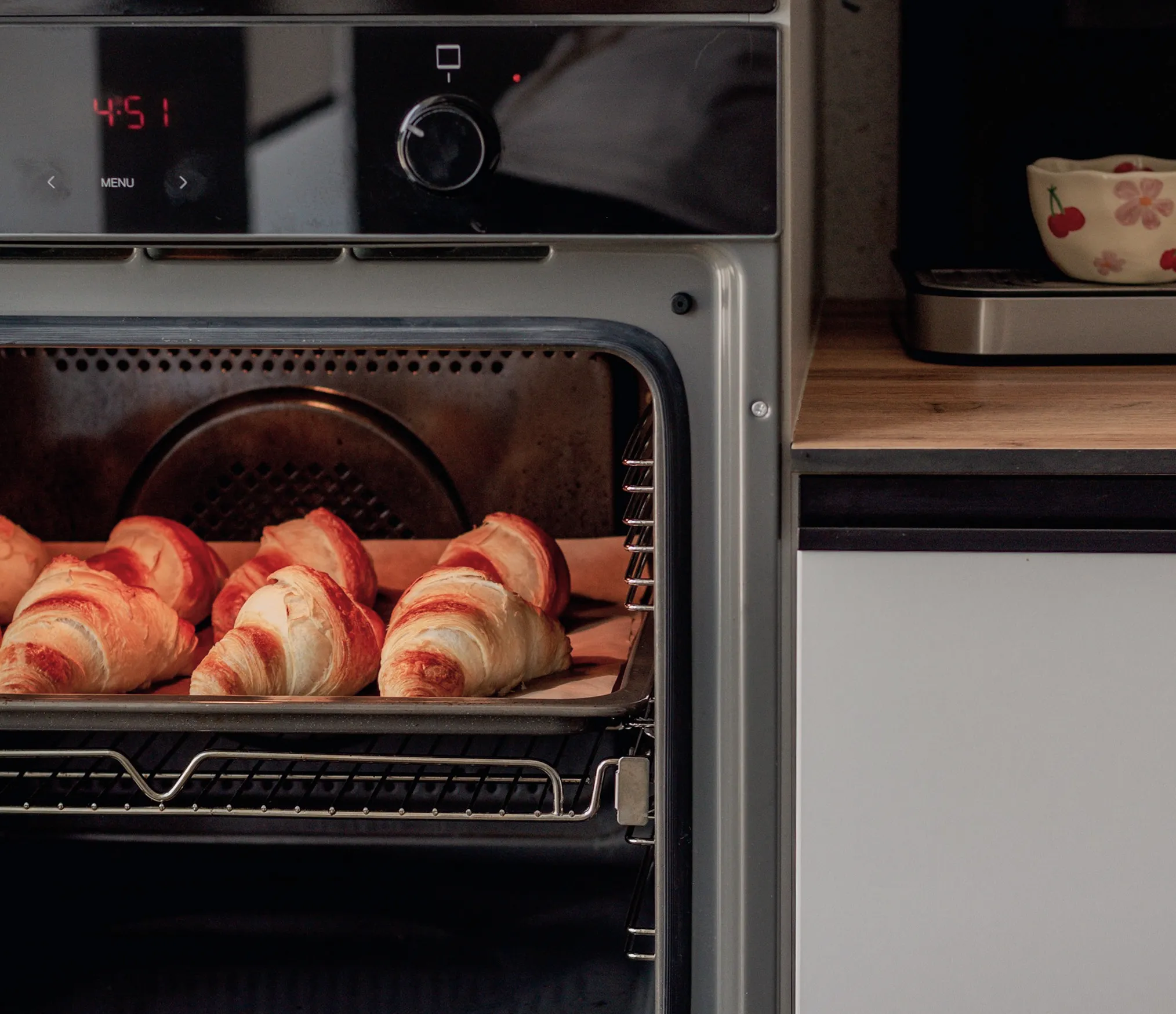
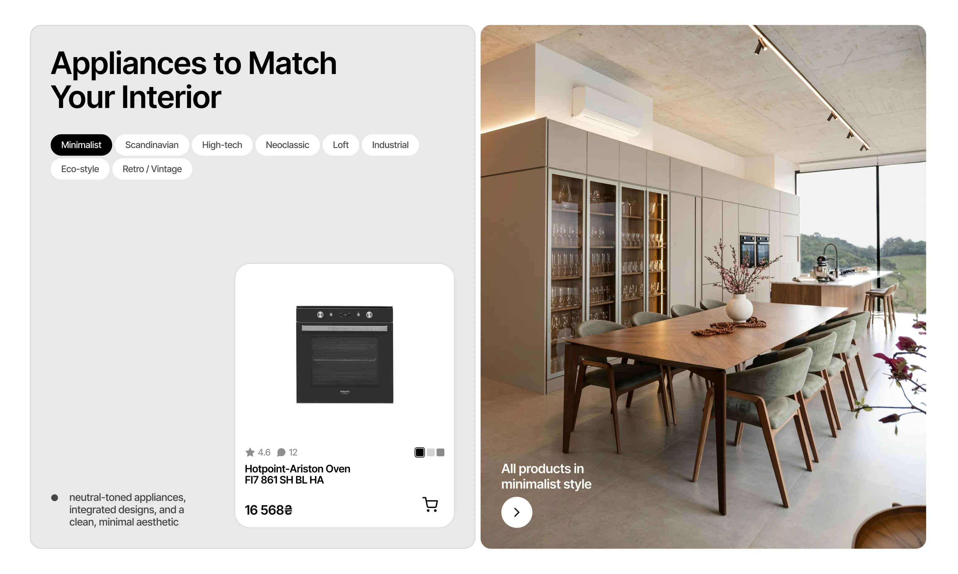
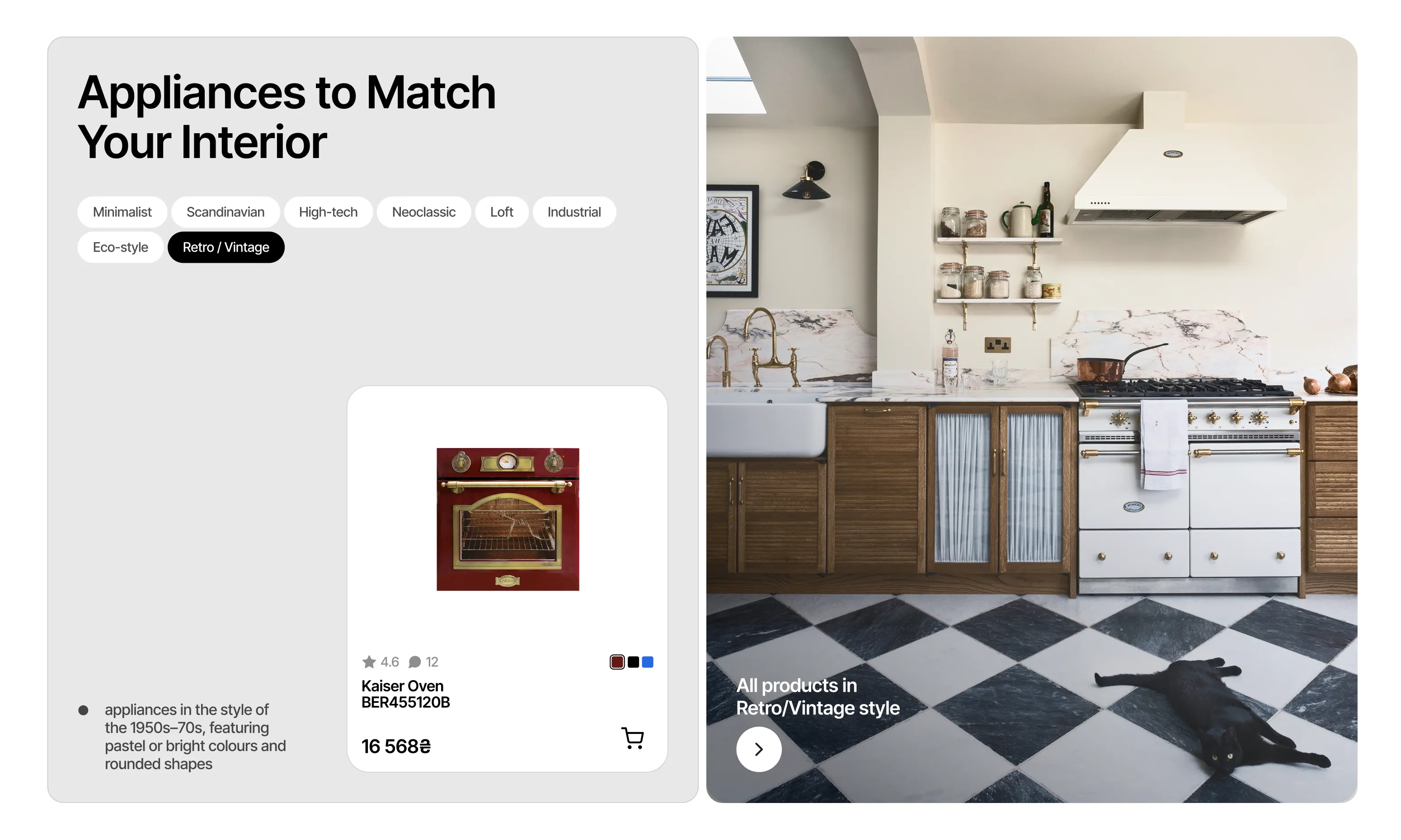
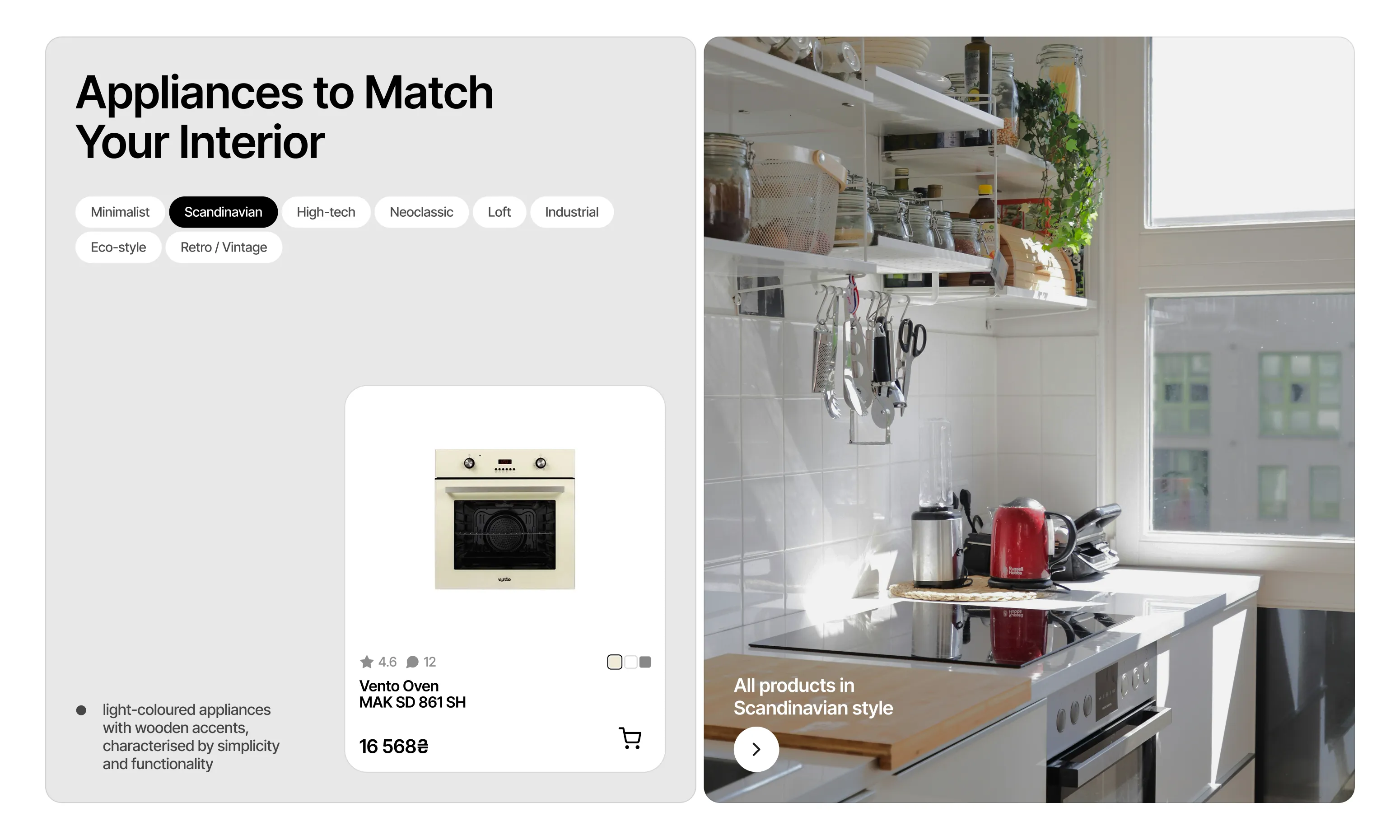
All products in minimalist style
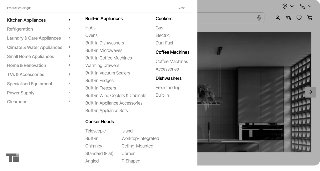
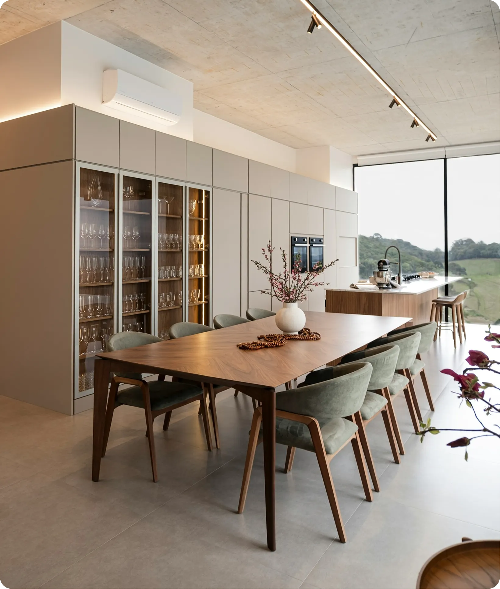
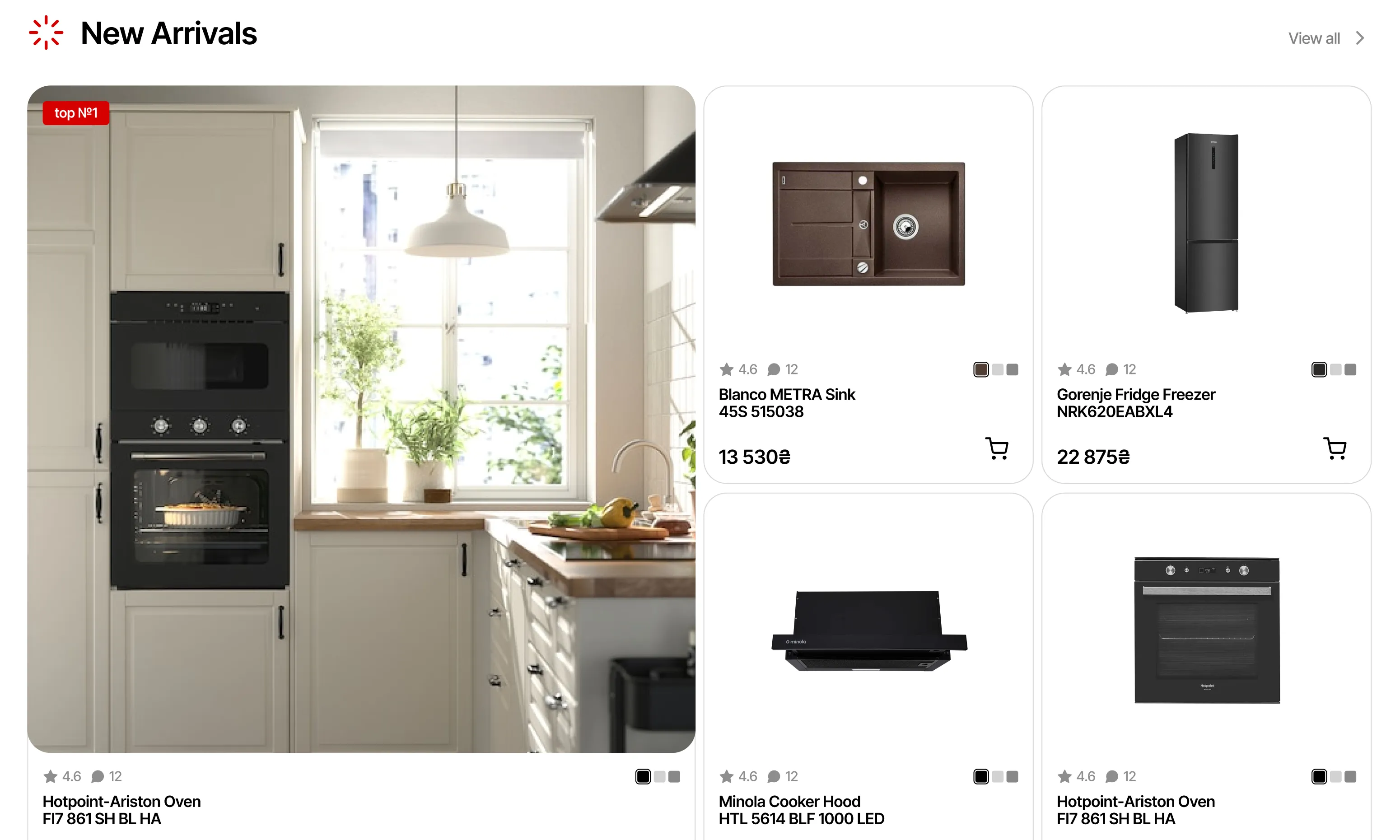
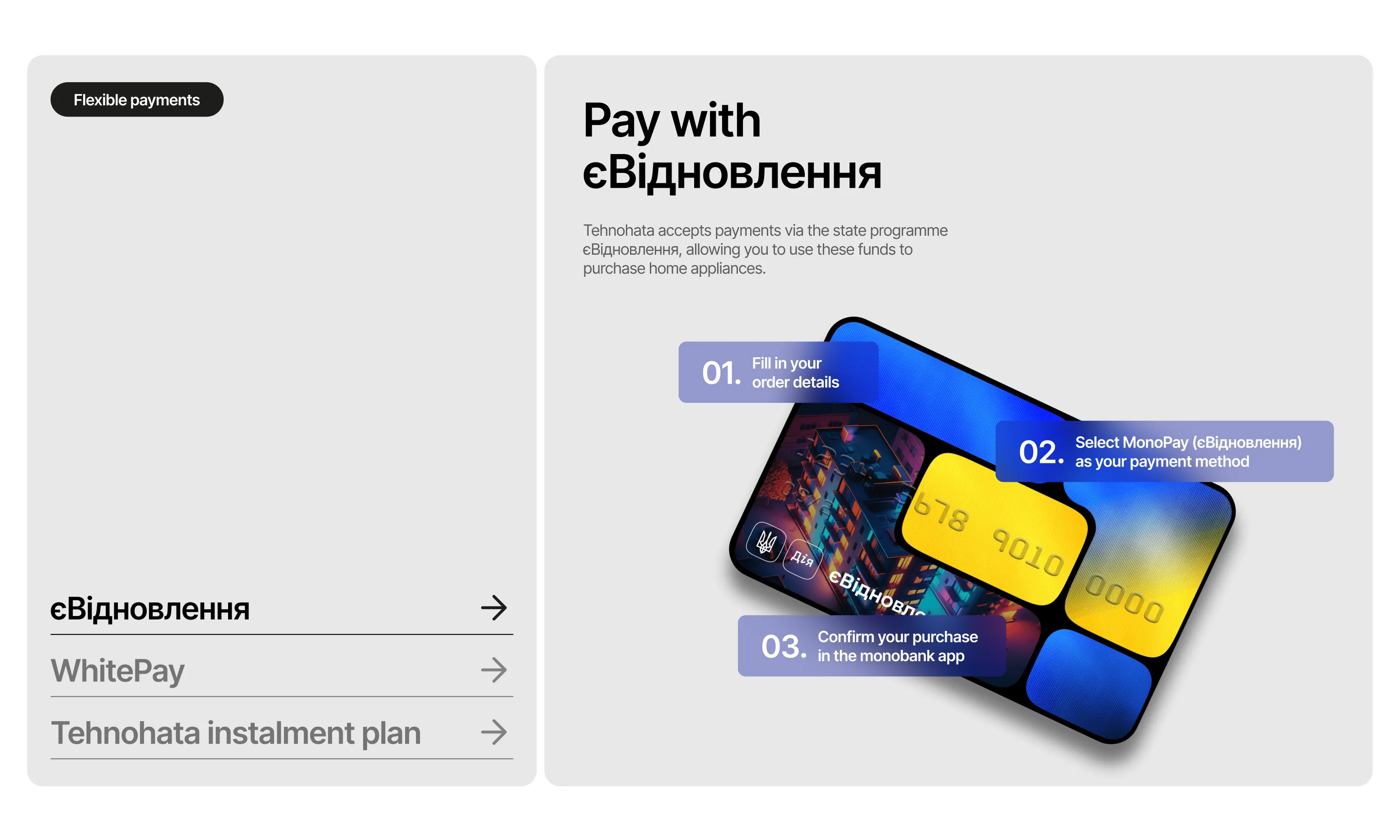
Homepage is designed to attract the user with a variety of themed product groupings to boost conversion. Store's advantages, deals, and flexible payment options are also presented here to increase trust and store's credibility.
Results & key learnings
The client appreciated the final design, highlighting clean UI, intuitive navigation, and improved product categories and groupings.
The final design was grounded in real user insights and aligned with best practice in e‑commerce, setting a strong foundation for future development. This project taught me how customer trust is built by reducing uncertainty — anticipating user questions and placing clear answers at the right moments along their journey.
KEEP EXPLORING

Landing page for a stylist to strengthen their personal brand and draw in clients.
VIEW CASE